AI Dynamic Island 01 React component
A Dynamic Island-style AI status pill that morphs between idle, listening, thinking, working (with an unfolding step list) and done states, with a canvas-drawn particle orb and rippling energy curves.
About the AI Dynamic Island 01 component
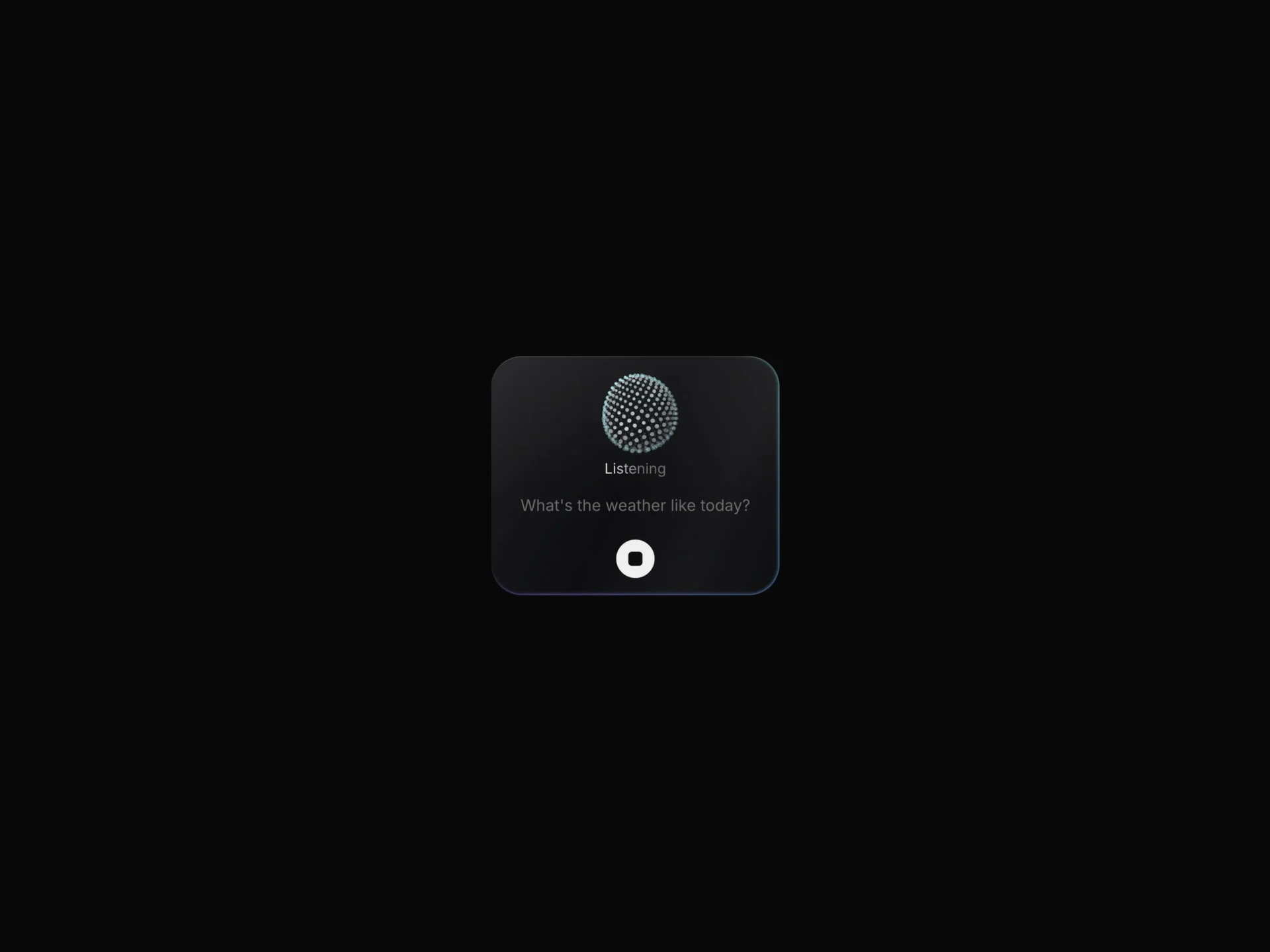
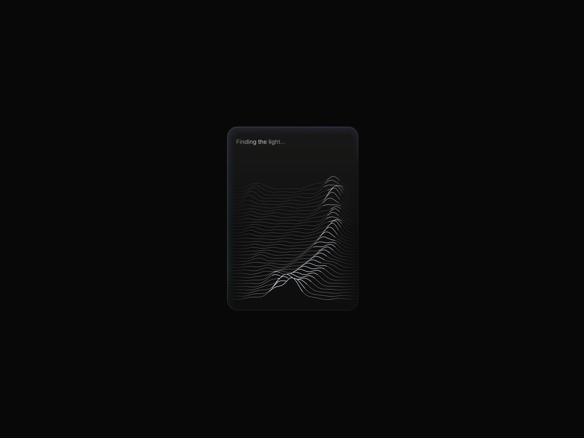
AI Dynamic Island 01 is a free, Dynamic Island style status pill for an AI agent. It springs between idle, listening, thinking, working and done: its width follows the length of each label, and in the working state it unfolds downward into a checklist where each step shows a spinner and then a check. A small canvas orb of particles with rippling curves leads the pill, a colored glow runs along its edge per state, and done swaps the orb for a check mark next to a View button.
status defaults to "auto", which plays the sequence once (loop repeats it) with stageSeconds per state and stepSeconds per step; a fixed state lets your app drive it. steps takes up to six labels, expandedWidth sets the minimum width of the unfolded list, and listenColors, thinkColors and doneColors color the glow. Clicking the idle pill starts it, the Stop button or Escape (with focus inside) stops it, onStart, onStop, onComplete and onView report each change, a live region reads the state and current step, and reduced motion removes the morphing and holds the orb still.
When to use it
Use it at the top of an app or chat window to show what an AI agent is doing, for example searching, reading sources and writing, without giving up a whole panel.
For a voice assistant that unfolds into a card with spoken questions and answers, use AI Dynamic Island 02.
Installation
Add the AI Dynamic Island 01 component to your project with the shadcn CLI. It lands in components/ai-dynamic-island-01.tsx as plain React + Tailwind CSS source you own and can edit.
npx shadcn@latest add @reactframe/ai-dynamic-island-01Or copy the source by hand and install its dependencies:
npm install clsx tailwind-mergeProps
<AIDynamicIsland01 /> accepts 44 props, all optional.
| Prop | Type | Default |
|---|---|---|
| status | "auto" | "idle" | "listening" | "thinking" | "working" | "done" | "auto" |
| interactive | boolean | true |
| loop | boolean | false |
| stageSeconds | number | 2.6 |
| stepSeconds | number | 1.7 |
| idleText | string | "Ask AI" |
| listeningText | string | "Listening" |
| thinkingText | string | "Thinking" |
| workingText | string | "Working on it" |
| doneText | string | "Ready" |
| viewLabel | string | "View" |
| steps | string[] | DEFAULT_STEPS |
- status"auto" | "idle" | "listening" | "thinking" | "working" | "done"Default: "auto"
- interactivebooleanDefault: true
- loopbooleanDefault: false
- stageSecondsnumberDefault: 2.6
- stepSecondsnumberDefault: 1.7
- idleTextstringDefault: "Ask AI"
- listeningTextstringDefault: "Listening"
- thinkingTextstringDefault: "Thinking"
- workingTextstringDefault: "Working on it"
- doneTextstringDefault: "Ready"
- viewLabelstringDefault: "View"
- stepsstring[]Default: DEFAULT_STEPS
Show all 44 propsShow fewer
| align | "top" | "center" | "bottom" | "top" |
| shadow | boolean | — |
| expandedWidth | number | 300 |
| orbSize | number | 0.62 |
| particleSize | number | 1 |
| curves | number | 3 |
| curveWidth | number | 1 |
| curveAmp | number | 1 |
| curveColor | string | "#FFFFFF" |
| dotColor | string | "#FFFFFF" |
| accentColor | string | "#9DB8FF" |
| accentAmount | number | 0.35 |
| font | React.CSSProperties | { fontSize: 15, lineHeight: 1.2 } |
| textColor | string | "#EDEDED" |
| mutedColor | string | "#6B6B6B" |
| listenColors | string[] | DEFAULT_LISTEN |
| thinkColors | string[] | DEFAULT_THINK |
| doneColors | string[] | DEFAULT_DONE |
| ringIntensity | number | 0.6 |
| ringSize | number | 10 |
| ringSpeed | number | 40 |
| background | string | "#0E0E10" |
| borderColor | string | "rgba(255,255,255,0.09)" |
| radius | number | 28 |
| padding | number | 8 |
| gap | number | 10 |
| onStart | () => void | — |
| onStop | () => void | — |
| onView | () => void | — |
| onComplete | () => void | — |
| className | string | — |
| style | React.CSSProperties | — |
- align"top" | "center" | "bottom"Default: "top"
- shadowboolean
- expandedWidthnumberDefault: 300
- orbSizenumberDefault: 0.62
- particleSizenumberDefault: 1
- curvesnumberDefault: 3
- curveWidthnumberDefault: 1
- curveAmpnumberDefault: 1
- curveColorstringDefault: "#FFFFFF"
- dotColorstringDefault: "#FFFFFF"
- accentColorstringDefault: "#9DB8FF"
- accentAmountnumberDefault: 0.35
- fontReact.CSSPropertiesDefault: { fontSize: 15, lineHeight: 1.2 }
- textColorstringDefault: "#EDEDED"
- mutedColorstringDefault: "#6B6B6B"
- listenColorsstring[]Default: DEFAULT_LISTEN
- thinkColorsstring[]Default: DEFAULT_THINK
- doneColorsstring[]Default: DEFAULT_DONE
- ringIntensitynumberDefault: 0.6
- ringSizenumberDefault: 10
- ringSpeednumberDefault: 40
- backgroundstringDefault: "#0E0E10"
- borderColorstringDefault: "rgba(255,255,255,0.09)"
- radiusnumberDefault: 28
- paddingnumberDefault: 8
- gapnumberDefault: 10
- onStart() => void
- onStop() => void
- onView() => void
- onComplete() => void
- classNamestring
- styleReact.CSSProperties
Kits
Sets of components designed to be used together on one site, AI Dynamic Island 01 included.
Collections
Use-case pages that compare AI Dynamic Island 01 with the other components that do a similar job.
npm dependencies
Installed for you by the shadcn CLI.
AI Dynamic Island 01 FAQ
- How do I show my agent's real progress?
- Set status yourself: "listening" or "thinking" when a request starts, "working" while tools run and "done" when it finishes. The checklist advances on a timer every stepSeconds (1.7) and stops on the last step, so it follows your stages loosely rather than one call at a time.
- Can I remove the View button?
- Yes, viewLabel="" hides it. Otherwise it appears in the done state and calls onView.
- Can it sit at the bottom of its container?
- align="bottom" or "center" sets where the island sits vertically in its box; the default is "top".
- How many steps can the working list show?
- Up to six; any extra entries in steps are ignored.