Animated Underline Link React component
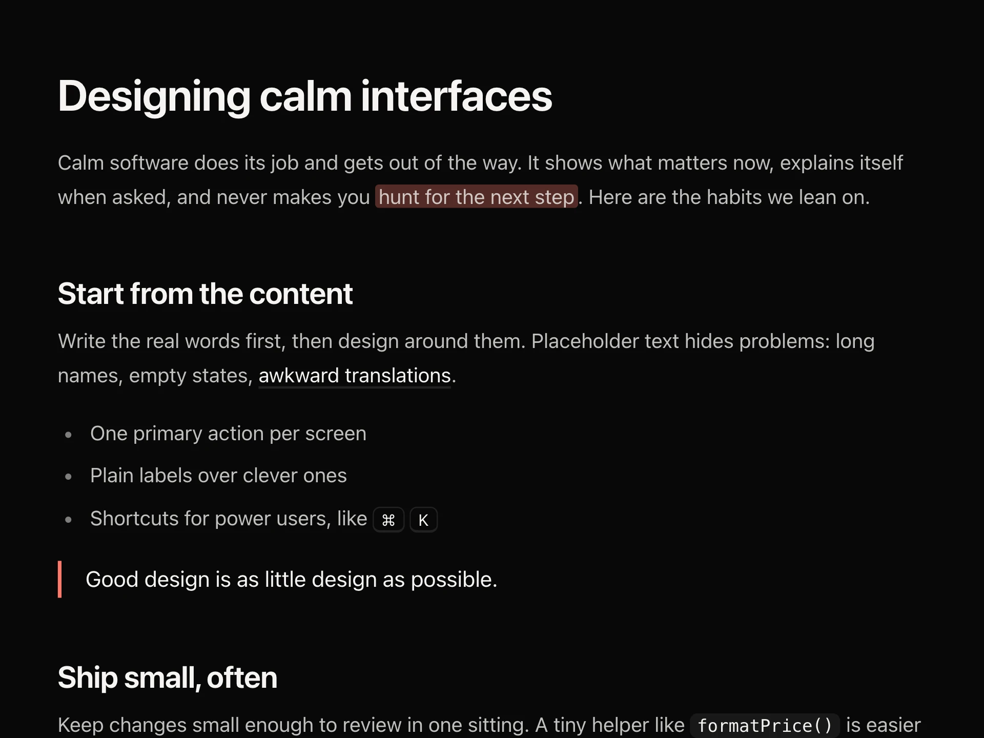
Text links with underlines that move: a line that slides in from the left and out to the right, opens from the centre, draws as a wave, fills behind the text, sweeps like a highlighter, or pushes an arrow, with a faint resting line so they still read as links.
When to use the Animated Underline Link component
Use Animated Underline Link for text links in articles, footers, navigation and calls to action, where a plain underline feels flat but a button would be too heavy.
Pick one style per context (for example slide in body text, center in navigation) and keep resting on in body copy so links are recognisable before hover.
Installation
Add the Animated Underline Link component to your project with the shadcn CLI. It lands in components/animated-underline-link.tsx as plain React + Tailwind CSS source you own and can edit.
npx shadcn@latest add https://reactframe.com/r/animated-underline-link.jsonOr copy the source by hand and install its dependencies:
npm install motion clsx tailwind-mergeProps
<AnimatedUnderlineLink /> accepts 8 props (required ones are marked *).
| Prop | Type | Default |
|---|---|---|
| href* | string | — |
| children* | React.ReactNode | — |
| variant | "slide" | "center" | "fill" | "wave" | "marker" | "arrow" | "slide" |
| color Line / fill colour. Defaults to the text colour. | string | "currentColor" |
| thickness Line thickness in px (slide, center, wave). | number | 1.5 |
| external Adds ↗ and opens in a new tab. | boolean | false |
| resting Keep a faint resting underline so it still reads as a link before hover. | boolean | true |
| className | string | — |
- href*string
- children*React.ReactNode
- variant"slide" | "center" | "fill" | "wave" | "marker" | "arrow"Default: "slide"
- color
Line / fill colour. Defaults to the text colour.
stringDefault: "currentColor" - thickness
Line thickness in px (slide, center, wave).
numberDefault: 1.5 - external
Adds ↗ and opens in a new tab.
booleanDefault: false - resting
Keep a faint resting underline so it still reads as a link before hover.
booleanDefault: true - classNamestring
FAQ
- Will people still see it's a link?
- Yes, with resting on (the default) line styles keep a faint underline and the marker keeps a small highlight until hover.
- Does it work with the keyboard?
- Focus plays the same animation as hover and shows a focus ring.
- Does it inherit my typography?
- It inherits the surrounding colour, size and weight; color and thickness only style the line or fill.