Basic Table React component
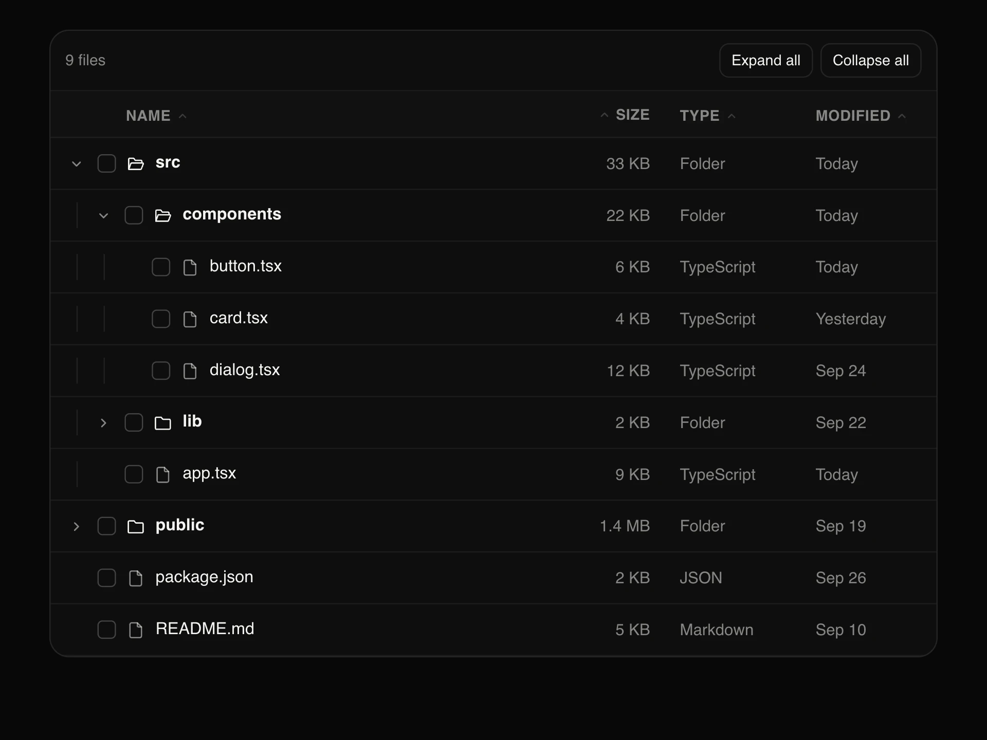
A clean, semantic table for showing data as it is: plain, striped or bordered, comfortable or compact, a caption and a totals row, custom cells such as status pills, a sticky header that casts a shadow once you scroll, and rows that fade in on load.
When to use the Basic Table component
Use Basic Table to present data that people read rather than manipulate: invoices, specs, pricing comparisons, schedules, results. It's real table markup, so it's accessible and copies cleanly.
When people need to sort, filter, select or paginate, use Data Table instead.
Installation
Add the Basic Table component to your project with the shadcn CLI. It lands in components/basic-table.tsx as plain React + Tailwind CSS source you own and can edit.
npx shadcn@latest add https://reactframe.com/r/basic-table.jsonOr copy the source by hand and install its dependencies:
npm install motion clsx tailwind-mergeProps
<BasicTable /> accepts 12 props, all optional.
| Prop | Type | Default |
|---|---|---|
| columns | TableColumn[] | DEFAULT_COLUMNS |
| rows | Record<string, React.ReactNode>[] | DEFAULT_ROWS |
| caption A title above the table (also its accessible caption). | string | "Recent invoices" |
| footer Values for a summary row at the bottom, by column key. | Record<string, React.ReactNode> | { customer: "6 invoices", amount: "$8,380.00" } |
| variant | "plain" | "striped" | "bordered" | "plain" |
| density | "comfortable" | "compact" | "comfortable" |
| hoverable | boolean | true |
| stickyHeader Keep the header visible while the body scrolls (needs maxHeight). | boolean | false |
| maxHeight | number | — |
| animateIn Rows fade in one after another on mount. | boolean | true |
| theme | "dark" | "light" | "dark" |
| className | string | — |
- columnsTableColumn[]Default: DEFAULT_COLUMNS
- rowsRecord<string, React.ReactNode>[]Default: DEFAULT_ROWS
- caption
A title above the table (also its accessible caption).
stringDefault: "Recent invoices" - footer
Values for a summary row at the bottom, by column key.
Record<string, React.ReactNode>Default: { customer: "6 invoices", amount: "$8,380.00" } - variant"plain" | "striped" | "bordered"Default: "plain"
- density"comfortable" | "compact"Default: "comfortable"
- hoverablebooleanDefault: true
- stickyHeader
Keep the header visible while the body scrolls (needs maxHeight).
booleanDefault: false - maxHeightnumber
- animateIn
Rows fade in one after another on mount.
booleanDefault: true - theme"dark" | "light"Default: "dark"
- classNamestring
FAQ
- How do I show badges or links in cells?
- Give a column a render function; it receives the cell value and the whole row, so you can return a status pill, a link or anything else.
- Does the header stay visible on long tables?
- Set stickyHeader and a maxHeight. The body scrolls under the header, which picks up a soft shadow once you scroll.
- Is it accessible?
- It uses caption, thead, th scope=col and scope=row, tbody and tfoot, so screen readers announce headers with every cell.