Button Group React component
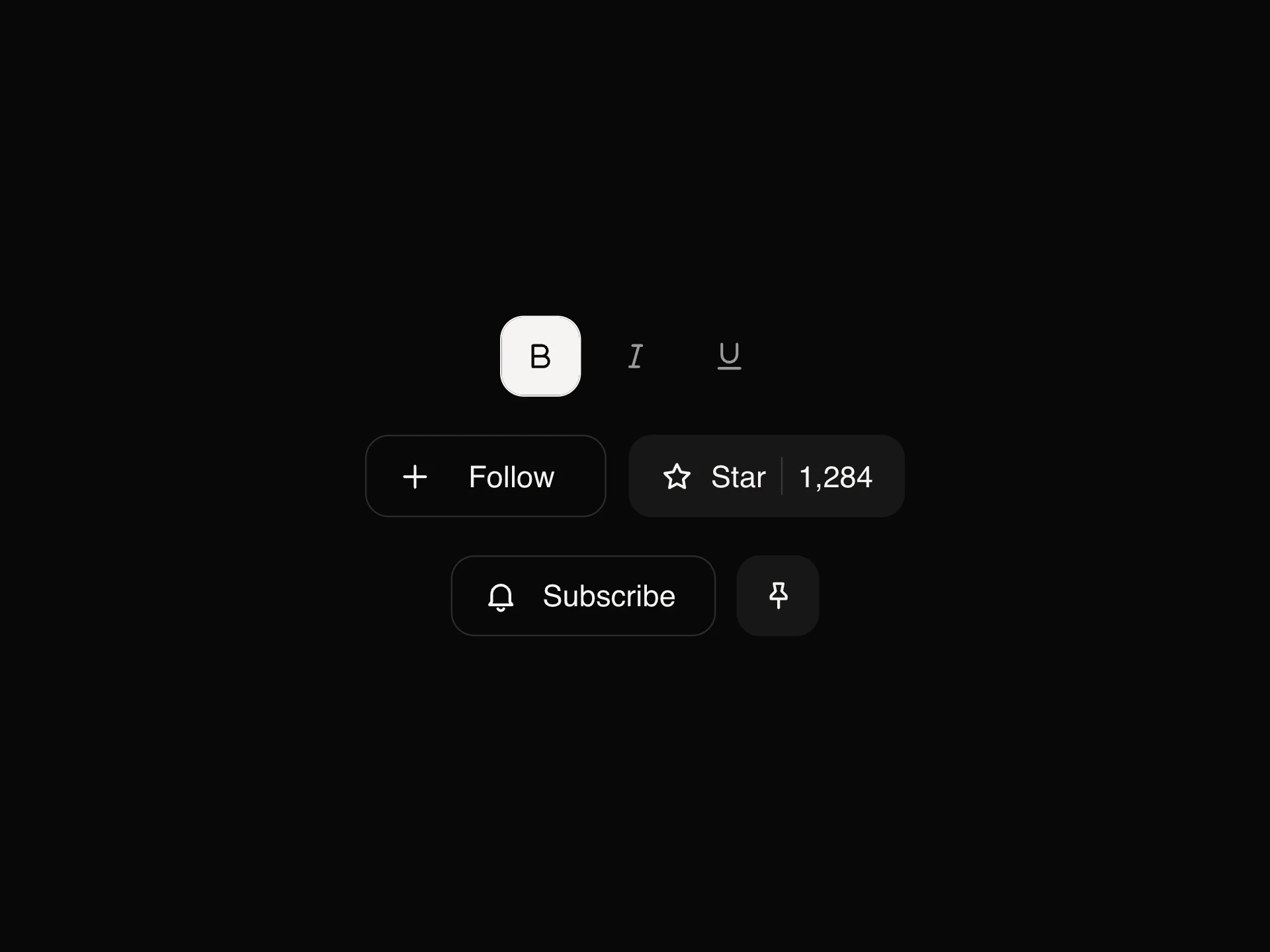
Buttons joined into one control: plain action groups like Previous / Today / Next, a single-choice group whose fill slides between options, multi-toggle groups, and a split button whose chevron opens a menu of alternative actions.
When to use the Button Group component
Use Button Group for related actions that belong together (pagination, zoom in / out, alignment) or a compact choice between views. Use the split button when one action is the usual choice but there are close alternatives.
For a larger switch between sections, use Tabs or Segmented Control. For one on/off action, use Toggle Button.
Installation
Add the Button Group component to your project with the shadcn CLI. It lands in components/button-group.tsx as plain React + Tailwind CSS source you own and can edit.
npx shadcn@latest add https://reactframe.com/r/button-group.jsonOr copy the source by hand and install its dependencies:
npm install motion clsx tailwind-mergeFAQ
- Can the group act like a radio set?
- Yes. selection="single" makes one button pressed at a time with a sliding fill; "multiple" lets each button toggle on its own.
- What does the split button remember?
- Picking an option from the menu makes it the main action, so the next click runs it. Use value and onValueChange to store it.
- Is the menu keyboard accessible?
- Arrow keys open it and move through options, Enter or Space picks one, Escape closes it and returns focus to the chevron.