Color Reveal Grid React component
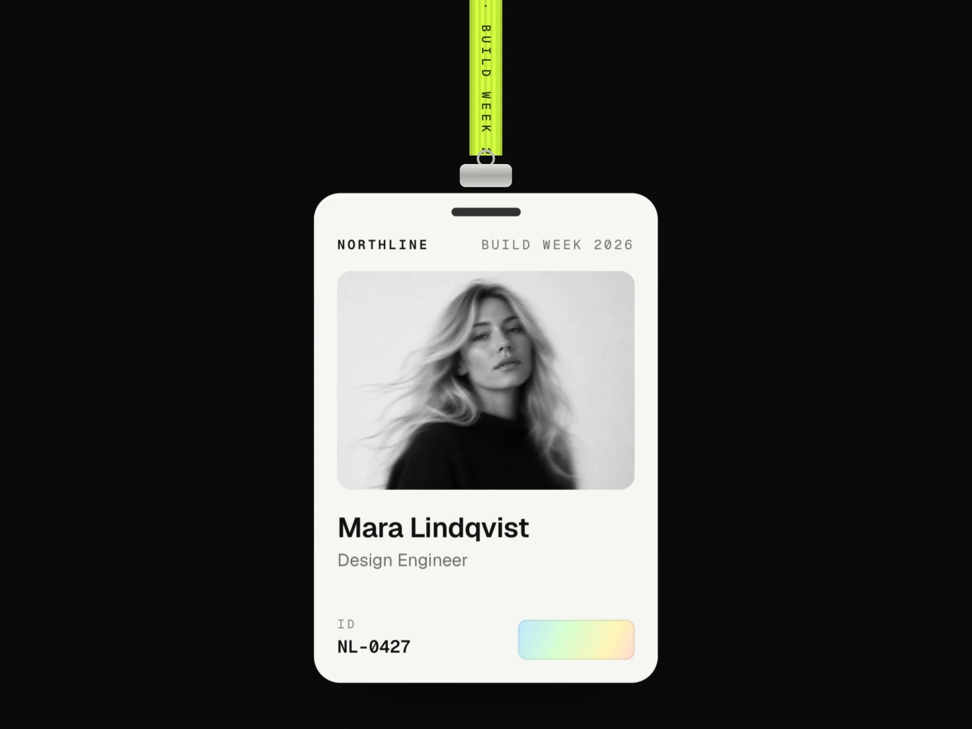
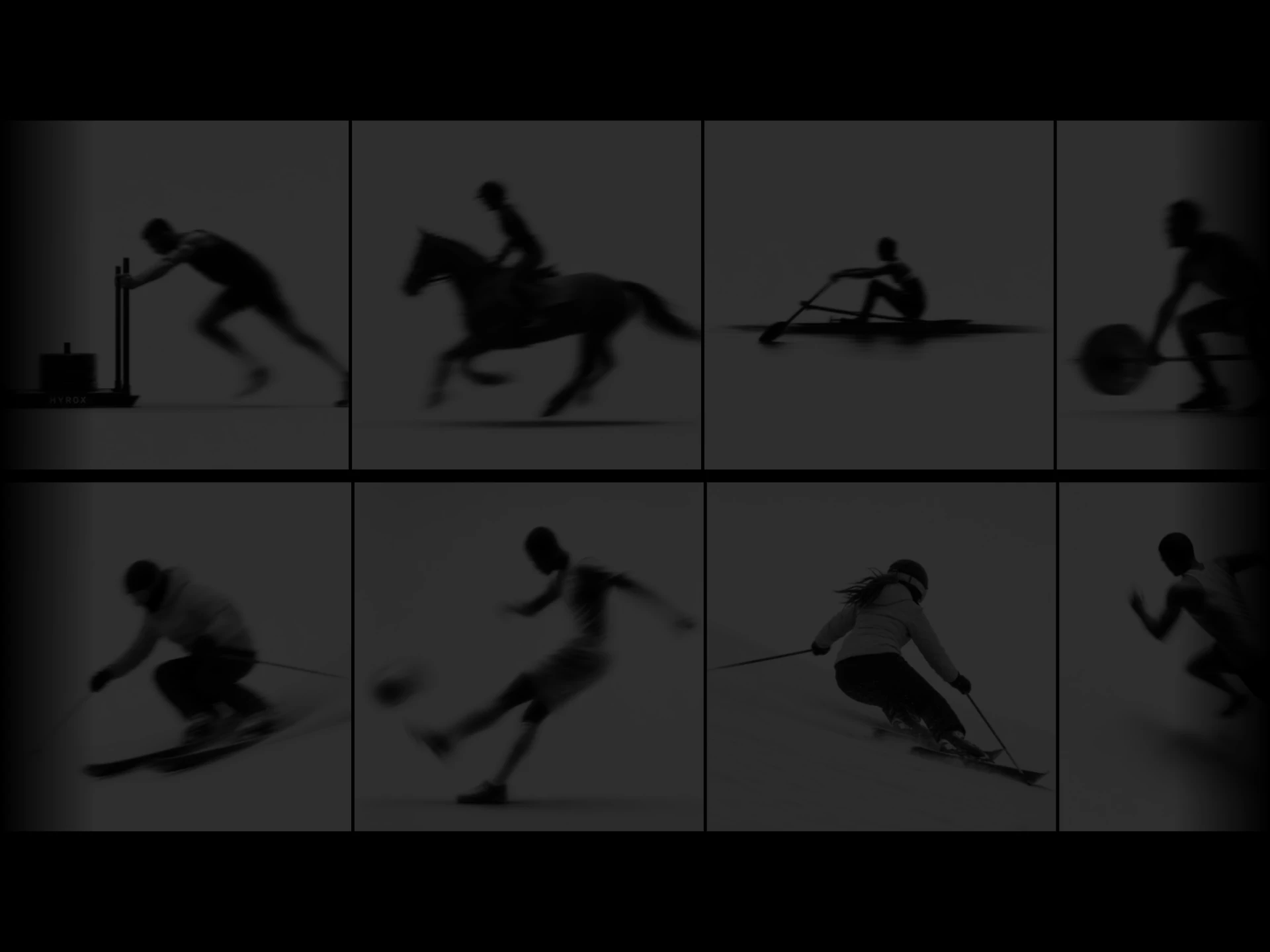
A grid of black-and-white photos where colour floods in from the exact point the pointer enters a tile, a little colour seeps into the neighbouring tiles, and it drains back out toward where the pointer leaves; captions slide up over each revealed photo.
About the Color Reveal Grid component
Color Reveal Grid shows a set of photos in black and white and lets colour pour in where you point. The colour spreads out from the exact spot your pointer crosses into a tile, a little of it seeps into the tiles next door, and when you move away it drains back out toward where you left.
Each revealed photo zooms in slightly and shows its caption. It works with a tap on phones and with the keyboard, and tiles can link somewhere.
When to use it
Use it for photography portfolios, travel and hospitality galleries, project grids, team photos or any set of images that look good in monochrome until someone shows interest.
It needs colourful photos to pay off; with images that are already muted, a plain hover zoom is enough.
Installation
Add the Color Reveal Grid component to your project with the shadcn CLI. It lands in components/color-reveal-grid.tsx as plain React + Tailwind CSS source you own and can edit.
npx shadcn@latest add @reactframe/color-reveal-gridOr copy the source by hand and install its dependencies:
npm install clsx tailwind-mergeProps
<ColorRevealGrid /> accepts 9 props, all optional. It also accepts the usual <div> attributes, like className, style, id and aria-*, and passes them to its root element.
| Prop | Type | Default |
|---|---|---|
| items | { src: string; alt?: string; title: string; meta?: string; href?: string }[] | ITEMS |
| columns Most columns on wide containers; narrower containers drop to fit tiles of at least minTileWidth. | number | 4 |
| minTileWidth | number | 150 |
| gap | number | 10 |
| radius | number | 14 |
| aspectRatio Tile width / height. | number | 4 / 5 |
| bleed Let a little colour seep into the tiles next to the hovered one. | boolean | true |
| duration Reveal time in ms. | number | 700 |
| theme | "dark" | "light" | "dark" |
- items{ src: string; alt?: string; title: string; meta?: string; href?: string }[]Default: ITEMS
- columns
Most columns on wide containers; narrower containers drop to fit tiles of at least minTileWidth.
numberDefault: 4 - minTileWidthnumberDefault: 150
- gapnumberDefault: 10
- radiusnumberDefault: 14
- aspectRatio
Tile width / height.
numberDefault: 4 / 5 - bleed
Let a little colour seep into the tiles next to the hovered one.
booleanDefault: true - duration
Reveal time in ms.
numberDefault: 700 - theme"dark" | "light"Default: "dark"
npm dependencies
Installed for you by the shadcn CLI.
Color Reveal Grid FAQ
- Do I need separate black-and-white images?
- No. Each tile uses the same image twice: one copy is turned greyscale with a CSS filter and the other is revealed in colour.
- Can I turn off the colour seeping into neighbours?
- Yes, set bleed={false} and only the hovered tile changes.
- How are the columns decided?
- Up to columns (4 by default), dropping to fewer when the container is too narrow for tiles of at least minTileWidth (150px).
- Does it work on phones?
- Tap a tile to reveal it from where you tapped, tap it again to return it to black and white.