Icon List React component
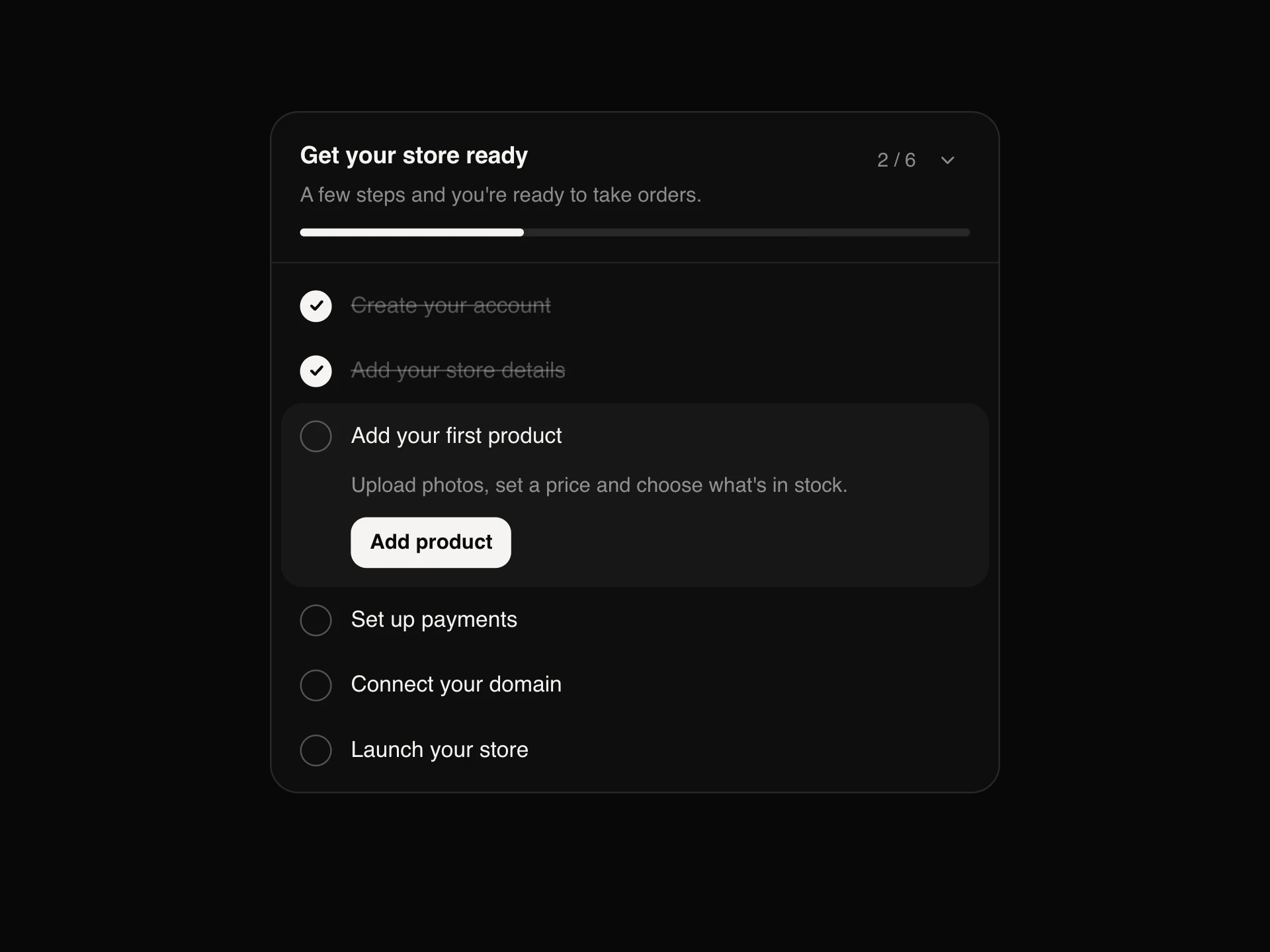
A list with an icon on every line for features, benefits and what's included: checks that draw themselves in as the rows fade up, dimmed and struck-through lines for what isn't included, optional descriptions, and one or two columns.
When to use the Icon List component
Use Icon List for scannable lists of features, benefits or requirements: pricing plans, landing page sections, 'what you get' summaries, onboarding requirements. The icon on every line makes it quicker to read than plain bullets.
Mark what a plan doesn't include with icon="x" and muted, so comparisons stay honest without a separate table.
Installation
Add the Icon List component to your project with the shadcn CLI. It lands in components/icon-list.tsx as plain React + Tailwind CSS source you own and can edit.
npx shadcn@latest add https://reactframe.com/r/icon-list.jsonOr copy the source by hand and install its dependencies:
npm install motion clsx tailwind-mergeProps
<IconList /> accepts 9 props, all optional.
| Prop | Type | Default |
|---|---|---|
| items | { text: string; description?: string; icon?: IconListIcon | React.ReactNode; muted?: boolean }[] | DEFAULT_ITEMS |
| icon Default icon for items without their own. | "check" | "x" | "arrow" | "dot" | "plus" | "check" |
| variant plain: icon on its own. badge: icon inside a soft circle. | "plain" | "badge" | "badge" |
| columns | 1 | 2 | 1 |
| animateIn Rows fade up one after another the first time the list scrolls into view. | boolean | true |
| accent Colour for icons of items that aren't muted. Defaults to the text colour. | string | — |
| size | "sm" | "md" | "lg" | "md" |
| theme | "dark" | "light" | "dark" |
| className | string | — |
- items{ text: string; description?: string; icon?: IconListIcon | React.ReactNode; muted?: boolean }[]Default: DEFAULT_ITEMS
- icon
Default icon for items without their own.
"check" | "x" | "arrow" | "dot" | "plus"Default: "check" - variant
plain: icon on its own. badge: icon inside a soft circle.
"plain" | "badge"Default: "badge" - columns1 | 2Default: 1
- animateIn
Rows fade up one after another the first time the list scrolls into view.
booleanDefault: true - accent
Colour for icons of items that aren't muted. Defaults to the text colour.
string - size"sm" | "md" | "lg"Default: "md"
- theme"dark" | "light"Default: "dark"
- classNamestring
FAQ
- Can I use my own icons?
- Yes. Pass any React node as an item's icon (an SVG, an emoji, an icon from your icon set); the built-in check, x, arrow, plus and dot cover the common cases.
- When does the animation play?
- Once, the first time the list scrolls into view: rows fade up one after another and the icons draw in. Set animateIn={false} to show it immediately.
- How are items that aren't included read out?
- Muted items get a line through them visually and '(not included)' for screen readers, so the meaning doesn't depend on the styling.