Orbit Radial Chart React component
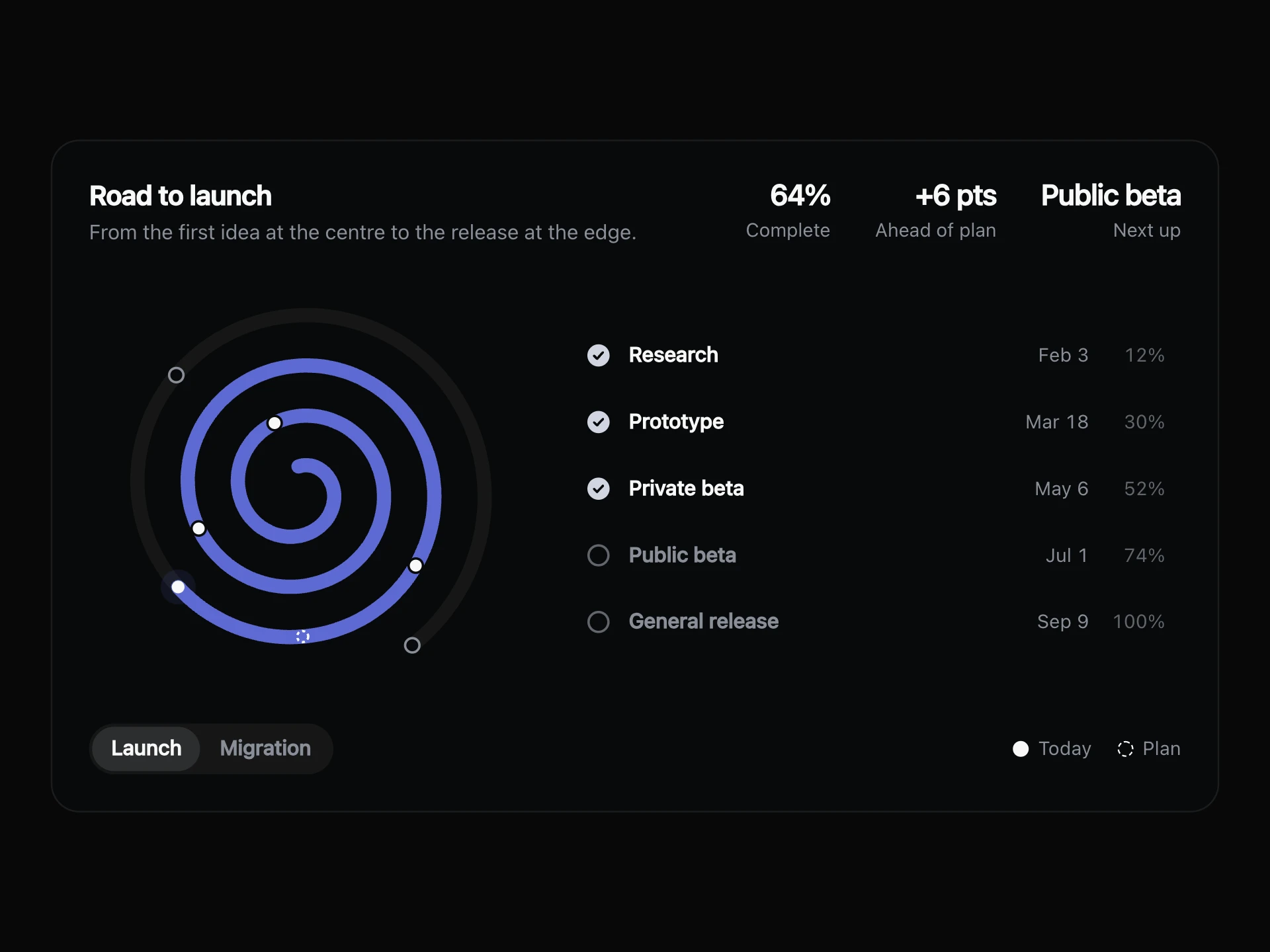
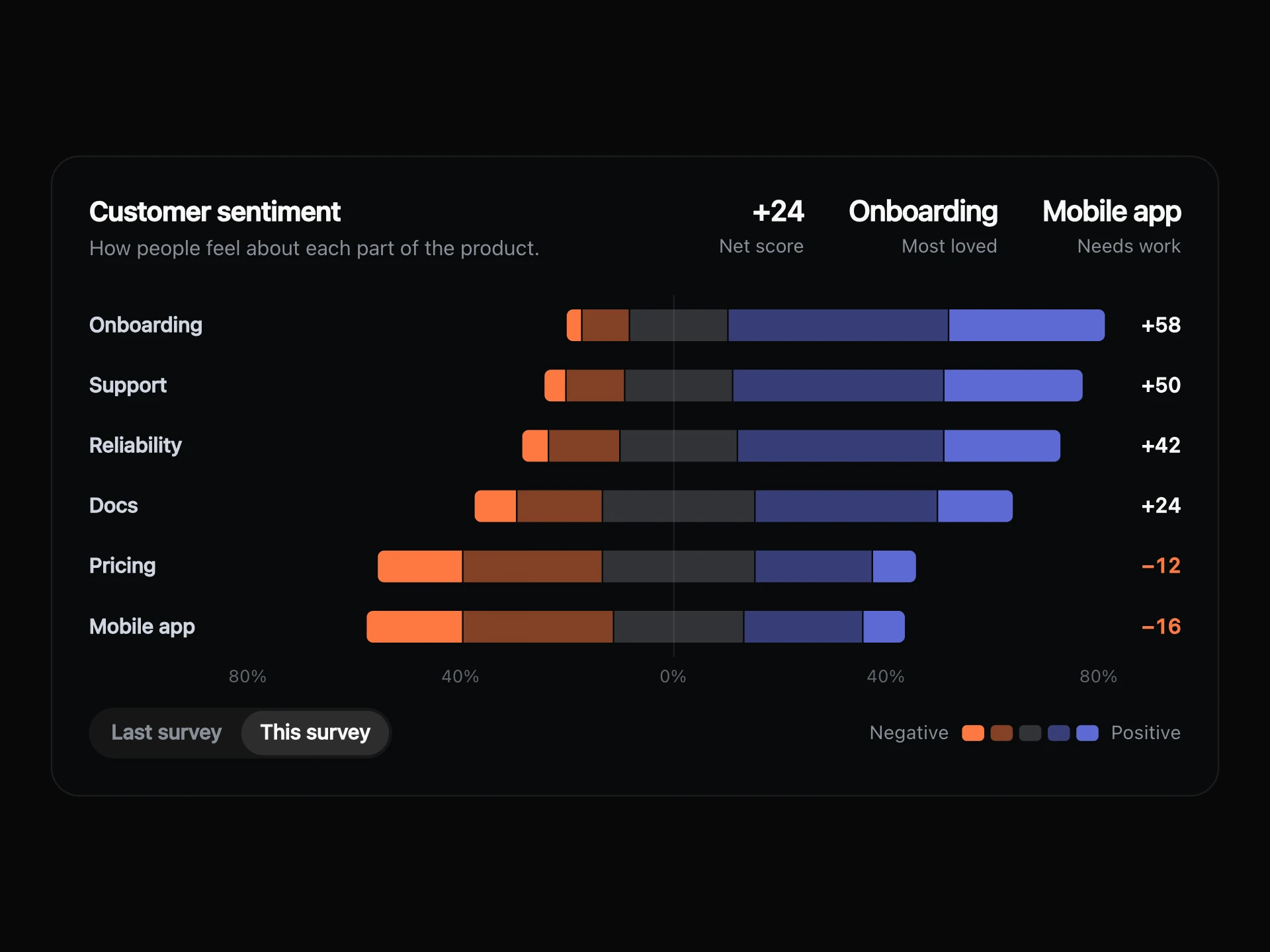
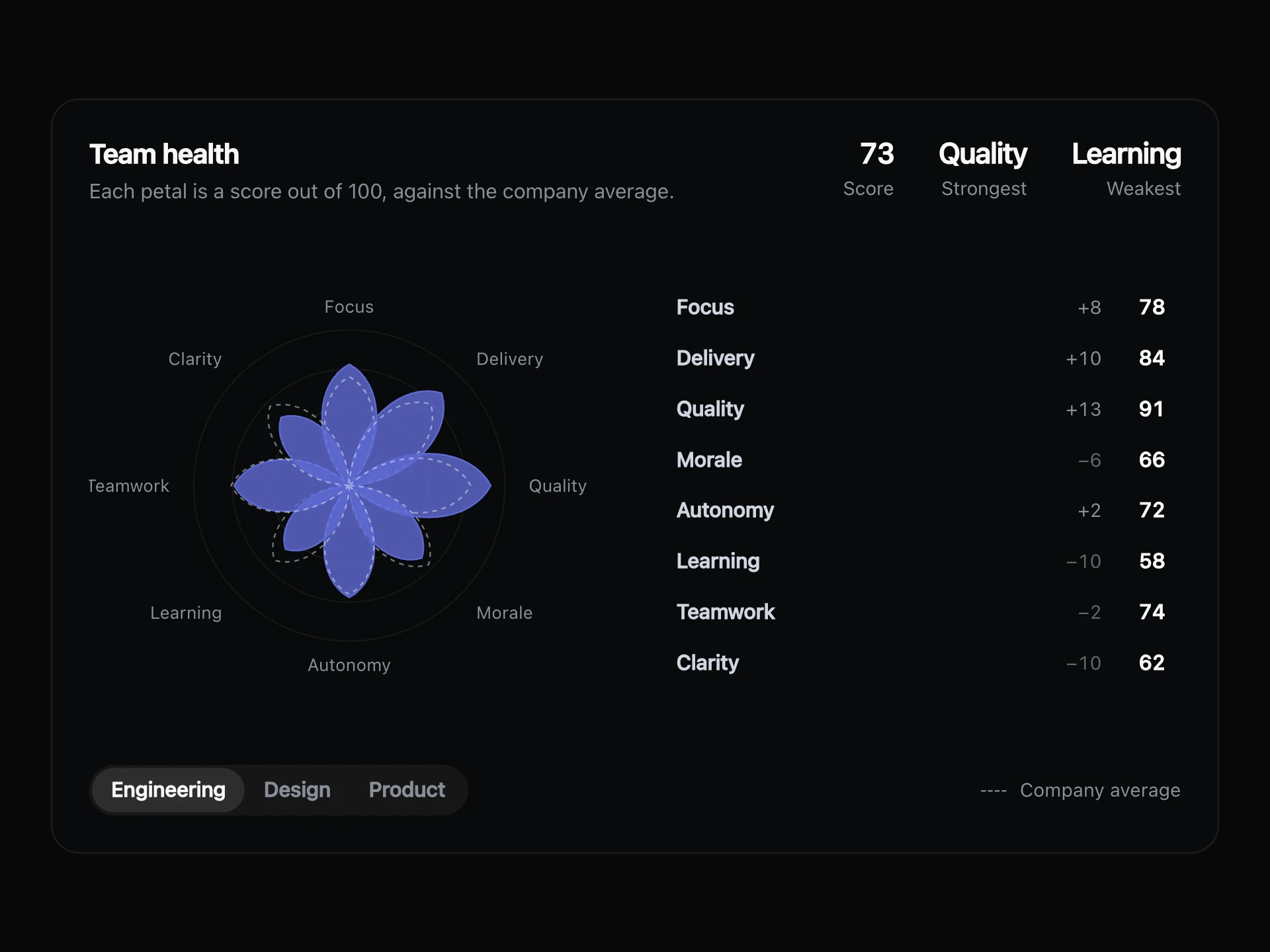
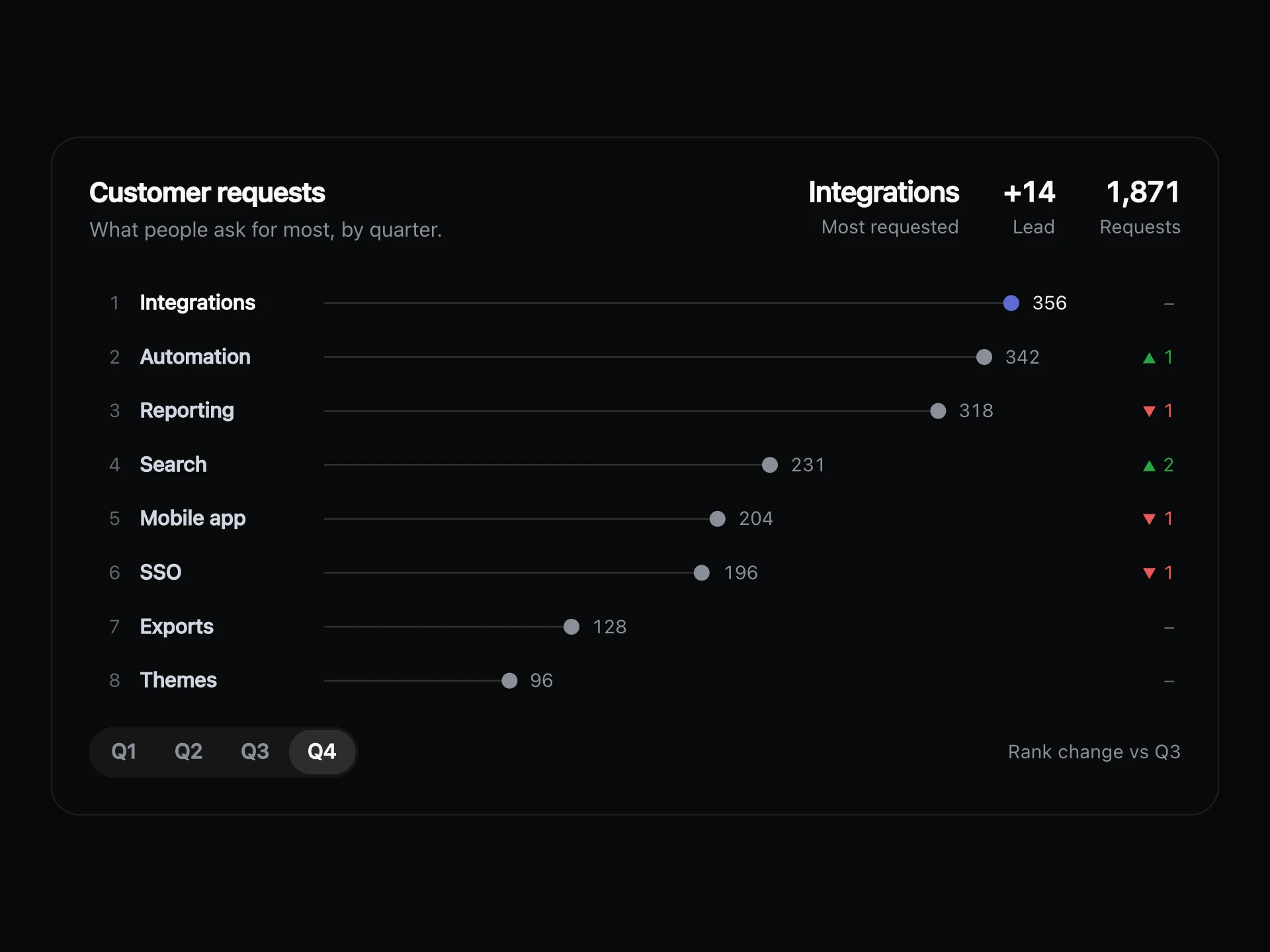
Goals as concentric orbits: each ring closes as its target is met, a small satellite circles every track, and pointing at a ring brings its number to the centre.
About the Orbit Radial Chart component
Orbit Radial Chart shows several goals as one small system. Each goal is a ring that closes as you get closer to its target, and a satellite circling every track keeps the chart feeling live without adding noise.
Point at a ring or a row and the others step back while its share moves to the centre. The list beside the rings gives the real numbers, so nothing has to be read off an arc.
When to use it
Use it for a handful of goals with clear targets, like OKRs, quotas, fundraising or fitness rings.
Stay at five or six rings. For more goals, a list with progress bars reads better.
Installation
Add the Orbit Radial Chart component to your project with the shadcn CLI. It lands in components/orbit-radial-chart.tsx as plain React + Tailwind CSS source you own and can edit.
npx shadcn@latest add @reactframe/orbit-radial-chartProps
<OrbitRadialChart /> accepts 8 props, all optional. It also accepts the usual <section> attributes, like className, style, id and aria-*, and passes them to its root element.
| Prop | Type | Default |
|---|---|---|
| theme | "dark" | "light" | "dark" |
| title | string | "Quarter goals" |
| subtitle | string | "Each ring closes when its goal is met." |
| views Sets of rings to switch between. They should list the same rings in the same order. | { label: string; rings: OrbitRing[] }[] | VIEWS |
| defaultView Index of the view shown first. | number | 0 |
| onTrackAt Share of the target that counts as on track. | number | 0.7 |
| color Colour of the rings. | string | — |
| formatValue | (value: number) => string | FORMAT |
- theme"dark" | "light"Default: "dark"
- titlestringDefault: "Quarter goals"
- subtitlestringDefault: "Each ring closes when its goal is met."
- views
Sets of rings to switch between. They should list the same rings in the same order.
{ label: string; rings: OrbitRing[] }[]Default: VIEWS - defaultView
Index of the view shown first.
numberDefault: 0 - onTrackAt
Share of the target that counts as on track.
numberDefault: 0.7 - color
Colour of the rings.
string - formatValue(value: number) => stringDefault: FORMAT
Orbit Radial Chart FAQ
- How many rings can it show?
- Five fits the default size well, and six is the most before the centre gets tight.
- What happens when a goal is passed?
- The ring stays closed at 100%, and the list still shows the real value.
- What does on track mean?
- A ring counts as on track once it reaches onTrackAt, a share of its target. The default is 0.7.
- What happens with reduced motion?
- The satellites stay still and the arcs appear at once.