Tabs React component
An accessible tab set with underline, pill and segmented variants, a sliding animated indicator, icons, counts, arrow-key navigation and animated content panels.
About the Tabs component
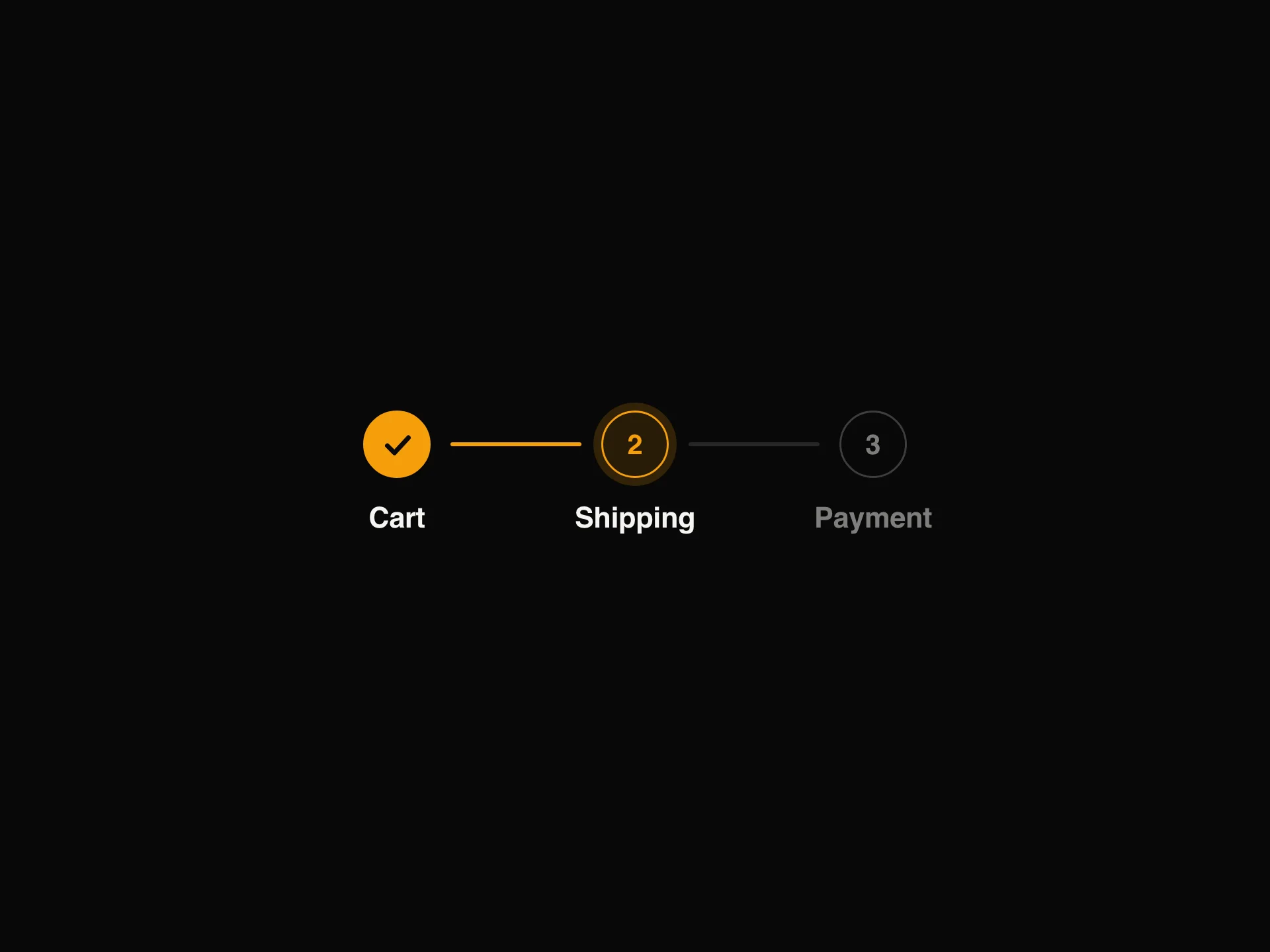
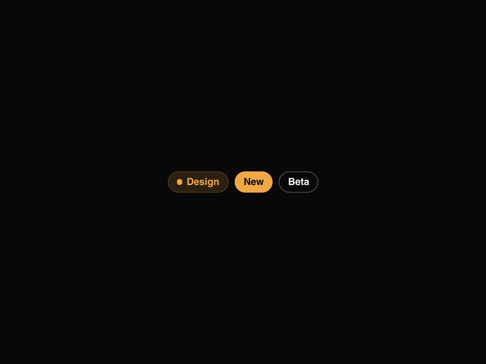
Tabs switches between related views that share one spot on the page. It comes in three looks: underline, a line that slides under the active tab, pill, a soft colored pill behind it, and segmented, a raised thumb on a shaded track like an iOS control. Each tab can have an icon and a count, and the active panel fades in when the tab changes.
items takes objects with value, label and optional icon, count, disabled and content. value or defaultValue with onValueChange set the active tab, starting on the first enabled one. variant picks the look, size sm, md or lg, accentColor the underline and pill color, and fullWidth spreads the tabs evenly across the container; otherwise a long row scrolls sideways. It follows the tabs pattern, with the arrow keys, Home and End moving between tabs.
When to use it
Use Tabs to switch between related views that share the same place on the page, like Overview, Settings and Billing, or code samples for different frameworks. The underline, pill and segmented variants cover everything from page-level navigation to compact toggles inside a card.
If people need to compare the sections side by side, show them stacked instead; tabs hide everything except the active panel.
Installation
Add the Tabs component to your project with the shadcn CLI. It lands in components/tabs.tsx as plain React + Tailwind CSS source you own and can edit.
npx shadcn@latest add @reactframe/tabsOr copy the source by hand and install its dependencies:
npm install motion clsx tailwind-mergeProps
<Tabs /> accepts 10 props, all optional.
| Prop | Type | Default |
|---|---|---|
| items | { value: string; label: string; icon?: React.ReactNode; count?: number; disabled?: boolean; content?: React.ReactNode }[] | DEFAULT_ITEMS |
| value | string | — |
| defaultValue | string | — |
| onValueChange | (value: string) => void | — |
| variant | "underline" | "pill" | "segmented" | "underline" |
| size | "sm" | "md" | "lg" | "md" |
| theme | "dark" | "light" | "dark" |
| accentColor | string | "#F2A841" |
| fullWidth | boolean | false |
| className | string | — |
- items{ value: string; label: string; icon?: React.ReactNode; count?: number; disabled?: boolean; content?: React.ReactNode }[]Default: DEFAULT_ITEMS
- valuestring
- defaultValuestring
- onValueChange(value: string) => void
- variant"underline" | "pill" | "segmented"Default: "underline"
- size"sm" | "md" | "lg"Default: "md"
- theme"dark" | "light"Default: "dark"
- accentColorstringDefault: "#F2A841"
- fullWidthbooleanDefault: false
- classNamestring
Kits
Sets of components designed to be used together on one site, Tabs included.
npm dependencies
Installed for you by the shadcn CLI.
Tabs FAQ
- Is it accessible?
- Yes. It uses the ARIA tablist, tab and tabpanel roles, and the arrow keys, Home and End move between tabs.
- Can I control the active tab?
- Yes. Pass value and onValueChange for a controlled component, or defaultValue for the initial tab.
- Can the tabs stretch to fill the container?
- Yes. Set fullWidth and the tabs share the available width evenly.
- Can I use only the tab row and render the content myself?
- Yes. Leave out content on every item and it renders just the tab list. Use value and onValueChange to show your own content, or to switch routes.