Alert Toast React component
A polished toast/alert notification, 5 tones, stacked or inline layout, icons, primary/secondary actions, dismiss and auto-dismiss, light/dark theme, plus a showcase mode rendering every variant side by side.
About the Alert Toast component
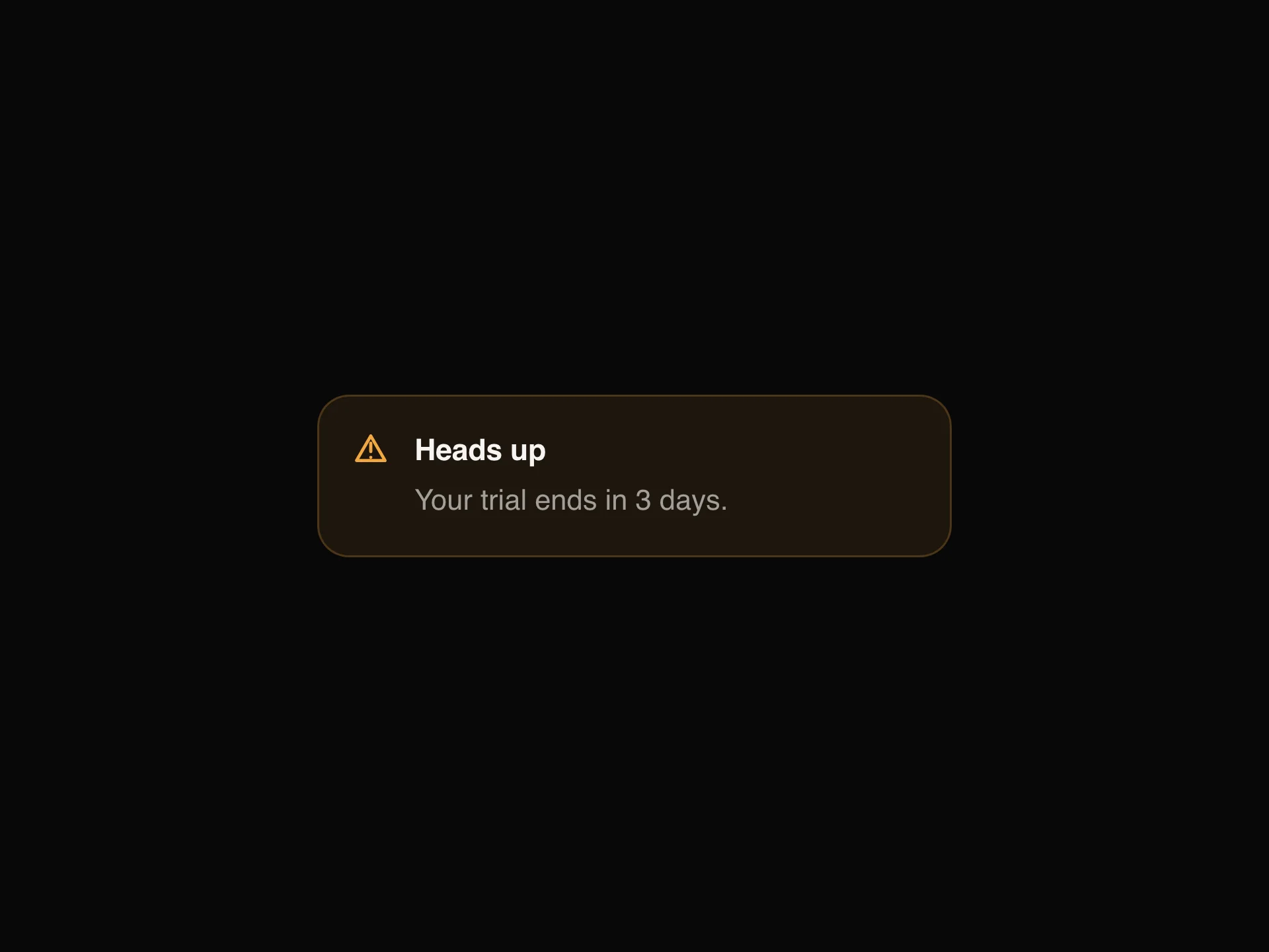
Alert Toast is a single notification card with a title, a description, an icon and optional buttons, in five tones: neutral, info, success, warning and error. It slides in when it appears, can show a colored accent bar on its left edge, and closes with its close button or by itself after a few seconds. The title and description can be stacked or sit side by side.
The props are grouped. content sets the title, description and layout. appearance sets the tone, a tinted or subtle background, the accent bar, the icon (none, info, success, error or a custom emoji), the light or dark theme and the corner radius. actions adds a primary and a secondary button with their labels, handled by onPrimaryClick and onSecondaryClick, and dismiss sets dismissible, autoDismiss and duration in seconds. onDismiss fires when it closes, and enterDelay delays its entrance.
When to use it
Use Alert Toast to confirm that something happened, like a saved form, a finished upload or a failed payment, without interrupting the flow. Five tones (neutral, info, success, warning, error) map to the usual message types, and optional primary and secondary actions handle an Undo or View link.
Turn on autoDismiss for routine confirmations; keep errors on screen until the visitor closes them.
Installation
Add the Alert Toast component to your project with the shadcn CLI. It lands in components/alert-toast.tsx as plain React + Tailwind CSS source you own and can edit.
npx shadcn@latest add @reactframe/alert-toastOr copy the source by hand and install its dependencies:
npm install motion clsx tailwind-mergeProps
<AlertToast /> accepts 10 props, all optional.
| Prop | Type | Default |
|---|---|---|
| content | object | { title: "New update available", description: "A new version of the app is ready to insta… |
| content.title | string | — |
| content.description | string | — |
| content.layout | "stacked" | "inline" | — |
| appearance | object | { tone: "info", background: "tinted", accentBar: true, icon: "info", customIcon: "🙁", th… |
| appearance.tone | "neutral" | "info" | "warning" | "success" | "error" | — |
| appearance.background | "subtle" | "tinted" | — |
| appearance.accentBar | boolean | — |
| appearance.icon | "none" | "info" | "success" | "error" | "custom" | — |
| appearance.customIcon | string | — |
| appearance.theme | "light" | "dark" | — |
| appearance.radius | number | — |
- contentobjectDefault: { title: "New update available", description: "A new version of the app is ready to insta…
- content.titlestring
- content.descriptionstring
- content.layout"stacked" | "inline"
- appearanceobjectDefault: { tone: "info", background: "tinted", accentBar: true, icon: "info", customIcon: "🙁", th…
- appearance.tone"neutral" | "info" | "warning" | "success" | "error"
- appearance.background"subtle" | "tinted"
- appearance.accentBarboolean
- appearance.icon"none" | "info" | "success" | "error" | "custom"
- appearance.customIconstring
- appearance.theme"light" | "dark"
- appearance.radiusnumber
Show all 29 propsShow fewer
| actions | object | { showPrimary: false, primaryLabel: "Update now", primaryExternal: false, showSecondary: … |
| actions.showPrimary | boolean | — |
| actions.primaryLabel | string | — |
| actions.primaryExternal | boolean | — |
| actions.showSecondary | boolean | — |
| actions.secondaryLabel | string | — |
| actions.secondaryEmphasis | boolean | — |
| dismiss | object | { dismissible: true, autoDismiss: false, duration: 4 } |
| dismiss.dismissible | boolean | — |
| dismiss.autoDismiss | boolean | — |
| dismiss.duration | number | — |
| onDismiss | () => void | — |
| onPrimaryClick | () => void | — |
| onSecondaryClick | () => void | — |
| spacing | number | 0 |
| enterDelay | number | 0 |
| className | string | — |
- actionsobjectDefault: { showPrimary: false, primaryLabel: "Update now", primaryExternal: false, showSecondary: …
- actions.showPrimaryboolean
- actions.primaryLabelstring
- actions.primaryExternalboolean
- actions.showSecondaryboolean
- actions.secondaryLabelstring
- actions.secondaryEmphasisboolean
- dismissobjectDefault: { dismissible: true, autoDismiss: false, duration: 4 }
- dismiss.dismissibleboolean
- dismiss.autoDismissboolean
- dismiss.durationnumber
- onDismiss() => void
- onPrimaryClick() => void
- onSecondaryClick() => void
- spacingnumberDefault: 0
- enterDelaynumberDefault: 0
- classNamestring
npm dependencies
Installed for you by the shadcn CLI.
Alert Toast FAQ
- Can the toast close by itself?
- Yes. Set dismiss={{ autoDismiss: true, duration: 4 }} and it closes after the given number of seconds; onDismiss fires either way.
- Can I add an Undo button?
- Yes. Turn on actions.showPrimary, set primaryLabel to "Undo" and handle onPrimaryClick.
- Does it have a dark theme?
- Yes. Set appearance.theme to "dark"; the default is light.
- Why does my error toast show an info icon?
- The icon does not follow the tone; it is info by default. Set appearance={{ tone: "error", icon: "error" }}, or icon: "success" for a success toast. Each object can be partial, and missing fields keep their defaults.