Progress Circle Bars React component
A circular progress indicator with ring, gauge, and dashes arc styles, scroll-triggered count-up animation, color thresholds, a comparison target marker, and a completion pulse.
About the Progress Circle Bars component
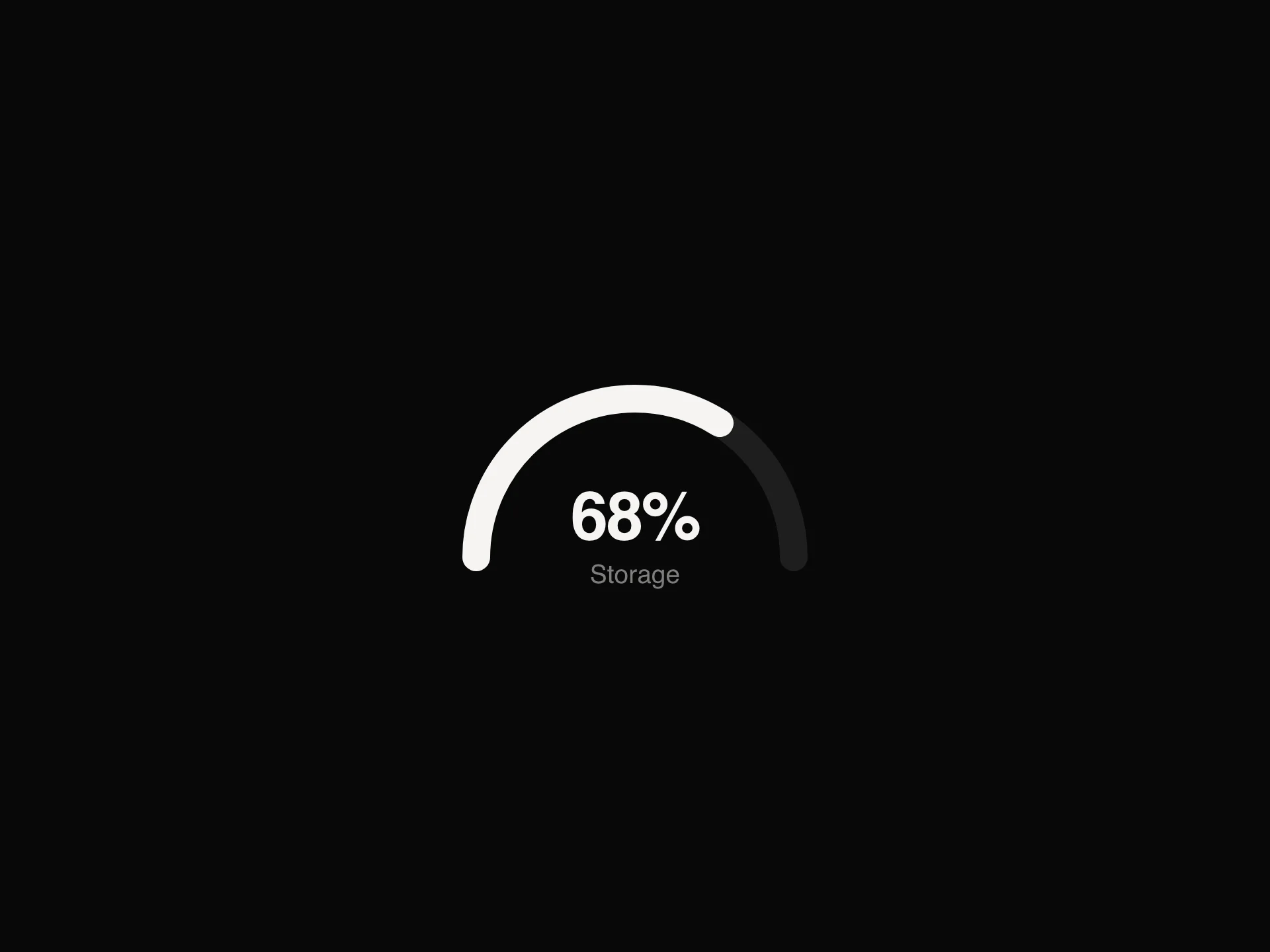
Progress Circle Bars is a free circular progress indicator in three styles: a full ring, a three-quarter gauge, or a circle of tick-like dashes (the default). The arc fills and the number counts up when it scrolls into view, and at 100% it gives one soft pulse.
percentage (clamped to 0 to 100), label, arcStyle, sizePreset, valueStyle ("center", "badge" or "none"), prefix and suffix set the content, and colorStart / colorEnd or the threshold props set the color. The wrapper is role="img" with an aria-label like "Circle: 75%".
When to use it
Use it for profile completion, course progress, goals, scores and skill levels on dashboards and landing pages.
For several labelled bars, use Linear Progress Bars; for a measured value with good and bad zones, use Meter.
Installation
Add the Progress Circle Bars component to your project with the shadcn CLI. It lands in components/progress-circle-bars.tsx as plain React + Tailwind CSS source you own and can edit.
npx shadcn@latest add @reactframe/progress-circle-barsOr copy the source by hand and install its dependencies:
npm install motion clsx tailwind-mergeProps
<ProgressCircleBars /> accepts 41 props, all optional. It also accepts the usual <div> attributes, like className, style, id and aria-*, and passes them to its root element.
| Prop | Type | Default |
|---|---|---|
| sizePreset | "2xl" | "xl" | "lg" | "md" | "sm" | "xs" | "2xs" | "custom" | "lg" |
| arcStyle | "ring" | "gauge" | "dashes" | "dashes" |
| circleSize | number | 120 |
| strokeWidth | number | 12 |
| dashCount | number | 60 |
| showCenterLabel | boolean | true |
| label | string | "Circle" |
| percentage | number | 75 |
| showLabel | boolean | true |
| valueStyle | "center" | "badge" | "none" | "center" |
| countUp | boolean | true |
| prefix | string | "" |
- sizePreset"2xl" | "xl" | "lg" | "md" | "sm" | "xs" | "2xs" | "custom"Default: "lg"
- arcStyle"ring" | "gauge" | "dashes"Default: "dashes"
- circleSizenumberDefault: 120
- strokeWidthnumberDefault: 12
- dashCountnumberDefault: 60
- showCenterLabelbooleanDefault: true
- labelstringDefault: "Circle"
- percentagenumberDefault: 75
- showLabelbooleanDefault: true
- valueStyle"center" | "badge" | "none"Default: "center"
- countUpbooleanDefault: true
- prefixstringDefault: ""
Show all 41 propsShow fewer
| suffix | string | "%" |
| badgeBg | string | "#111111" |
| badgeTextColor | string | "#ffffff" |
| colorStart | string | "#F39C12" |
| colorEnd | string | "#F39C12" |
| thresholdsEnabled | boolean | false |
| thresholdLowMax | number | 40 |
| thresholdLowColor | string | "#ef4444" |
| thresholdMidMax | number | 70 |
| thresholdMidColor | string | "#f59e0b" |
| thresholdHighColor | string | "#10b981" |
| trackColor | string | "#f0f0f8" |
| trackBorderWidth | number | 0 |
| trackBorderColor | string | "#e5e7eb" |
| labelColor | string | "#111111" |
| labelSize | number | 11 |
| labelFontFamily | string | "Inter, sans-serif" |
| percentageColor | string | "#111111" |
| percentageSize | number | 24 |
| percentageFontFamily | string | "Inter, sans-serif" |
| spacing | number | 10 |
| scrollReveal | boolean | true |
| duration | number | 1.4 |
| delay | number | 0.1 |
| completionPulse | boolean | true |
| comparisonEnabled | boolean | false |
| comparisonValue | number | 90 |
| comparisonColor | string | "#d1d5db" |
| comparisonStrokeScale | number | 0.45 |
- suffixstringDefault: "%"
- badgeBgstringDefault: "#111111"
- badgeTextColorstringDefault: "#ffffff"
- colorStartstringDefault: "#F39C12"
- colorEndstringDefault: "#F39C12"
- thresholdsEnabledbooleanDefault: false
- thresholdLowMaxnumberDefault: 40
- thresholdLowColorstringDefault: "#ef4444"
- thresholdMidMaxnumberDefault: 70
- thresholdMidColorstringDefault: "#f59e0b"
- thresholdHighColorstringDefault: "#10b981"
- trackColorstringDefault: "#f0f0f8"
- trackBorderWidthnumberDefault: 0
- trackBorderColorstringDefault: "#e5e7eb"
- labelColorstringDefault: "#111111"
- labelSizenumberDefault: 11
- labelFontFamilystringDefault: "Inter, sans-serif"
- percentageColorstringDefault: "#111111"
- percentageSizenumberDefault: 24
- percentageFontFamilystringDefault: "Inter, sans-serif"
- spacingnumberDefault: 10
- scrollRevealbooleanDefault: true
- durationnumberDefault: 1.4
- delaynumberDefault: 0.1
- completionPulsebooleanDefault: true
- comparisonEnabledbooleanDefault: false
- comparisonValuenumberDefault: 90
- comparisonColorstringDefault: "#d1d5db"
- comparisonStrokeScalenumberDefault: 0.45
Kits
Sets of components designed to be used together on one site, Progress Circle Bars included.
Collections
Use-case pages that compare Progress Circle Bars with the other components that do a similar job.
npm dependencies
Installed for you by the shadcn CLI.
Progress Circle Bars FAQ
- Why don't circleSize and strokeWidth change anything?
- They only apply with sizePreset="custom". The presets 2xl, xl, lg (default, 120px), md, sm, xs and 2xs set both values.
- How do color thresholds work?
- With thresholdsEnabled, values below thresholdLowMax (40) use thresholdLowColor, below thresholdMidMax (70) thresholdMidColor, and the rest thresholdHighColor.
- Can I show a target next to the value?
- Set comparisonEnabled and comparisonValue (default 90). It draws a thinner arc in comparisonColor, sized by comparisonStrokeScale.
- Can it animate on load instead of on scroll?
- Set scrollReveal={false}. duration (1.4s) and delay (0.1s) control the fill, and countUp={false} shows the final number right away.