Avatar React component
A user avatar with image, initials or icon fallback, 5 sizes, circle, rounded and square shapes, a presence status dot with pulse, an accent ring and an optional click state.
About the Avatar component
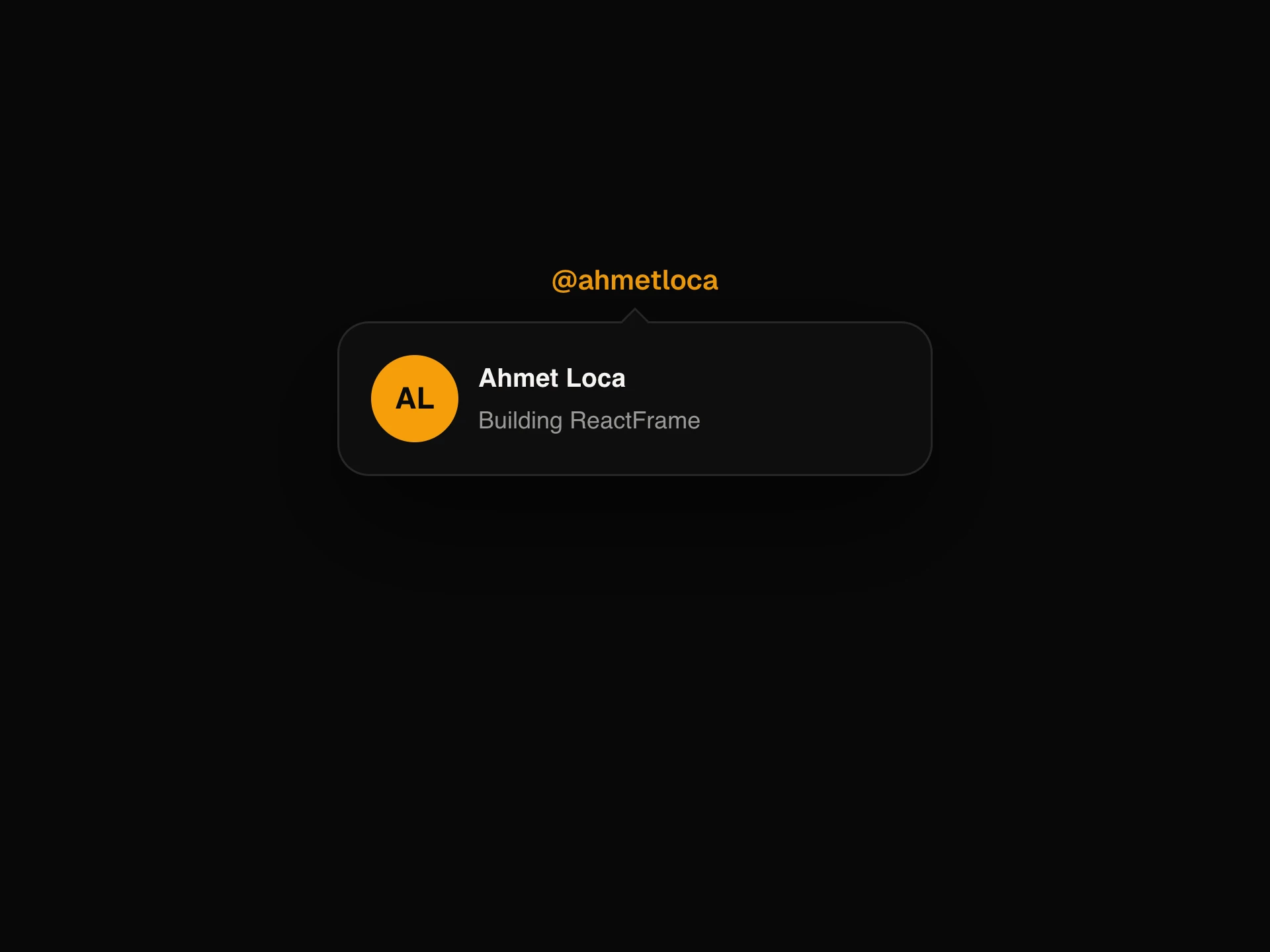
Avatar shows a person's photo, and falls back to their initials on a color picked from their name, or to a person icon when there is no name. The photo fades in once it has loaded. If it fails to load, the fallback stays, so a broken URL never shows a broken image.
size takes xs, sm, md, lg or xl (24 to 80px) or any number of pixels, and shape is circle, rounded or square. status adds an online, offline, busy or away dot, and pulse animates the online dot. ring draws an outline in ringColor with a thin gap between it and the photo. With onClick it becomes a button that scales slightly on hover and tap.
When to use it
Use it in navbars, comment threads, chat lists, team pages and account menus, anywhere a person needs a face or a recognisable initial.
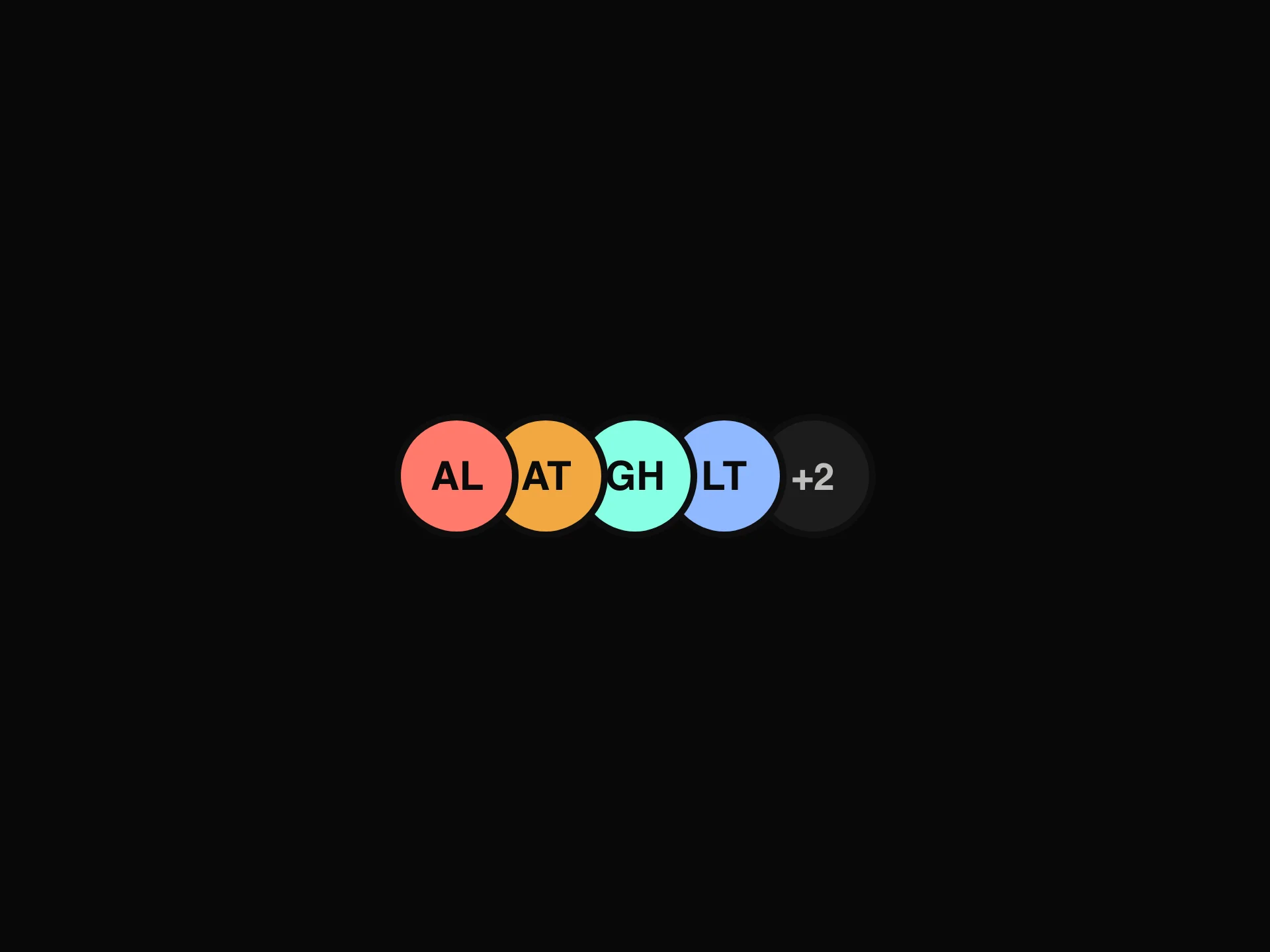
To show several people in a row with a +N count, use Avatar Group.
Installation
Add the Avatar component to your project with the shadcn CLI. It lands in components/avatar.tsx as plain React + Tailwind CSS source you own and can edit.
npx shadcn@latest add @reactframe/avatarOr copy the source by hand and install its dependencies:
npm install motion clsx tailwind-mergeProps
<Avatar /> accepts 13 props, all optional.
| Prop | Type | Default |
|---|---|---|
| src | string | — |
| alt | string | — |
| name | string | — |
| size | "xs" | "sm" | "md" | "lg" | "xl" | number | "md" |
| shape | "circle" | "rounded" | "square" | "circle" |
| status | "online" | "offline" | "busy" | "away" | — |
| pulse | boolean | false |
| ring | boolean | false |
| ringColor | string | "#F2A841" |
| theme | "dark" | "light" | "dark" |
| color | string | — |
| onClick | () => void | — |
- srcstring
- altstring
- namestring
- size"xs" | "sm" | "md" | "lg" | "xl" | numberDefault: "md"
- shape"circle" | "rounded" | "square"Default: "circle"
- status"online" | "offline" | "busy" | "away"
- pulsebooleanDefault: false
- ringbooleanDefault: false
- ringColorstringDefault: "#F2A841"
- theme"dark" | "light"Default: "dark"
- colorstring
- onClick() => void
Show all 13 propsShow fewer
| className | string | — |
- classNamestring
npm dependencies
Installed for you by the shadcn CLI.
Avatar FAQ
- What shows when there is no photo?
- With name, the initials (the first letters of the first and last word, or the first two letters of a single word) on one of seven colors picked from the name, so the same person always gets the same color. Without name, a person icon on a neutral background. color overrides the background.
- What if the image URL is broken?
- The image's error handler switches to the fallback, so the initials or the icon stay visible. Passing a new src resets this and tries the new image.
- Can I use a custom size?
- Yes. Pass a number, such as size={64}. The initials, the status dot and the ring all scale with it.
- How do I show online status?
- Set status to online, offline, busy or away. pulse adds a ripple, and it only plays on online.
- Is it accessible?
- alt, or name when alt is missing, becomes the accessible label and the image's alt text. With onClick it renders a real button that can be reached and pressed with the keyboard.