Context Menu React component
A right-click context menu with checkbox and radio items, nested submenus, viewport edge clamping and full keyboard navigation.
About the Context Menu component
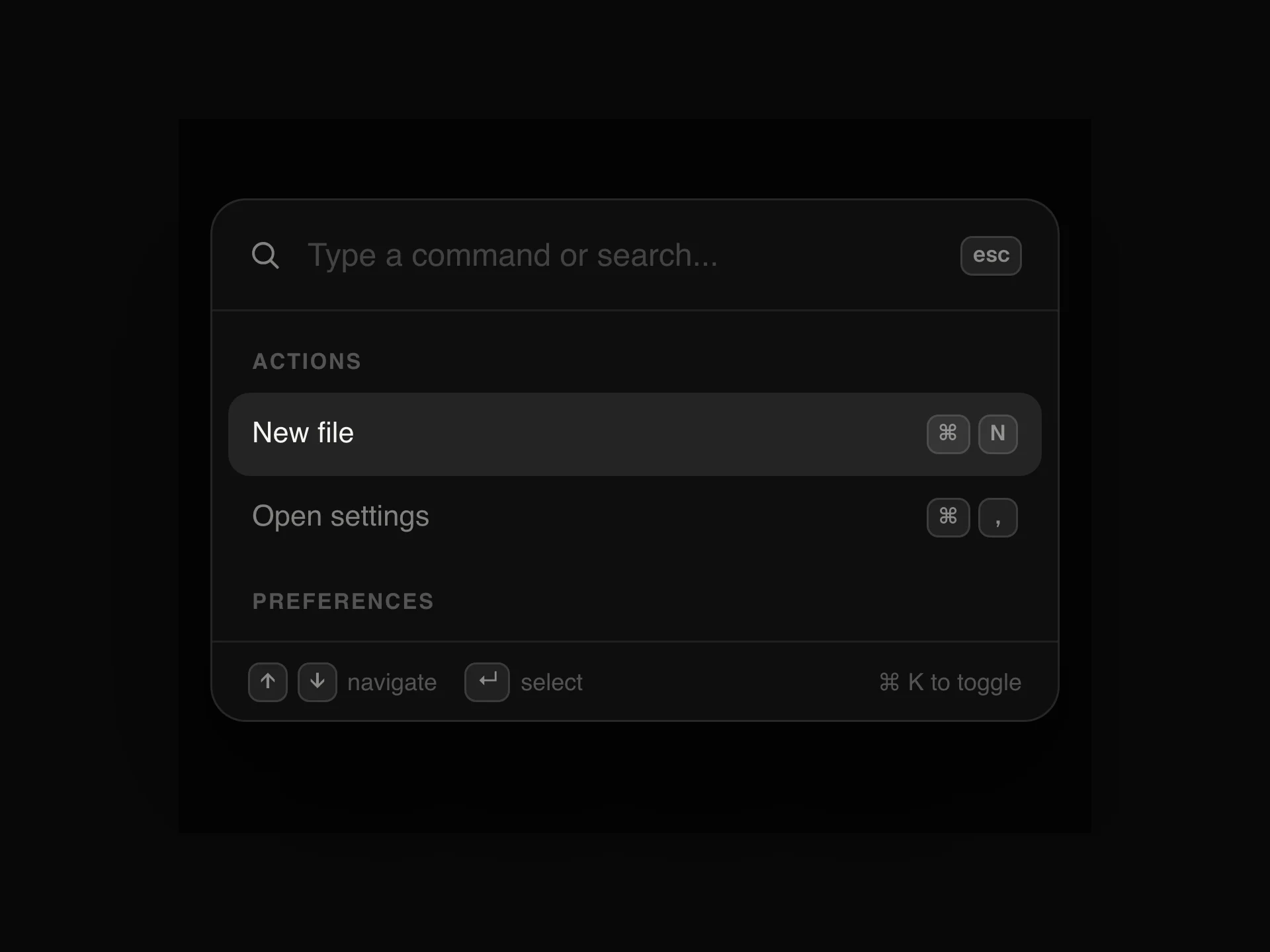
Context Menu replaces the browser's right-click menu on any area you wrap with it. The menu opens at the pointer, moves back inside the window if it would overflow the right or bottom edge, and closes on a click elsewhere, on scroll and on resize.
Each entry in items has a kind: item, checkbox, radio, separator, label or submenu, with optional shortcut text and disabled and danger flags. Submenus open on hover or with the right arrow key and can be nested. The arrow keys, Home and End move through the items and skip separators, labels and disabled entries, Enter or Space picks one and Escape closes the menu. Rows use the menuitem, menuitemcheckbox and menuitemradio roles with aria-checked.
When to use it
Use it where people expect a right-click: file and folder lists, table rows, items on a canvas or a board, chat messages and editors.
For a menu that opens from a visible button, use Dropdown Menu. For an app-style File, Edit and View bar, use Menubar.
Installation
Add the Context Menu component to your project with the shadcn CLI. It lands in components/context-menu.tsx as plain React + Tailwind CSS source you own and can edit.
npx shadcn@latest add @reactframe/context-menuOr copy the source by hand and install its dependencies:
npm install motion clsx tailwind-mergeProps
<ContextMenu /> accepts 8 props (required ones are marked *).
| Prop | Type | Default |
|---|---|---|
| items* | ContextMenuItem[] | — |
| children* | React.ReactNode | — |
| onSelect | (item: ContextMenuItem) => void | — |
| disabled | boolean | false |
| size | "sm" | "md" | "lg" | "md" |
| width | number | 220 |
| theme | "dark" | "light" | "dark" |
| className | string | — |
- items*ContextMenuItem[]
- children*React.ReactNode
- onSelect(item: ContextMenuItem) => void
- disabledbooleanDefault: false
- size"sm" | "md" | "lg"Default: "md"
- widthnumberDefault: 220
- theme"dark" | "light"Default: "dark"
- classNamestring
npm dependencies
Installed for you by the shadcn CLI.
Context Menu FAQ
- How do I know which item was picked?
- onSelect receives the whole item, so switch on item.id. The menu closes after a pick, except on a submenu row, which opens its submenu instead.
- Why doesn't a checkbox tick when I click it?
- checked comes from your items array, and the menu does not store it. In onSelect, flip checked for that id (or move the radio selection) in your state and pass the updated items back.
- Can I turn it off in some places?
- disabled turns the whole menu off, so the browser's own menu shows again. Single entries can be turned off with disabled: true.
- Does the wrapper change my layout?
- No. The wrapper is display: contents, so your children lay out as if it were not there.
- Does it work on phones?
- It listens for the browser's contextmenu event. Some mobile browsers fire it on a long press and some do not, so do not put actions only in this menu.