Back to Top React component
A floating scroll-to-top button that fades in past a threshold, with an optional progress ring showing how far down the page you are.
About the Back to Top component
Back to Top is a free floating round button. It springs into view once the page is scrolled past a threshold, and clicking it scrolls back to the top. An accent-colored ring around the arrow fills clockwise as the reader moves down the page.
threshold (default 400px), showProgress, smooth, position ("bottom-right", "bottom-left" or "bottom-center"), offset (default 24px), size, theme, accentColor and a custom icon are props. It watches the window by default, or any scrollable element passed as containerRef. The button shows only an icon, so label (default "Back to top") is used as its aria-label.
When to use it
Use it on long articles, documentation, changelogs and product listings where readers go far down the page.
To show reading progress at the top of the page instead, use Scroll Progress Bar.
Installation
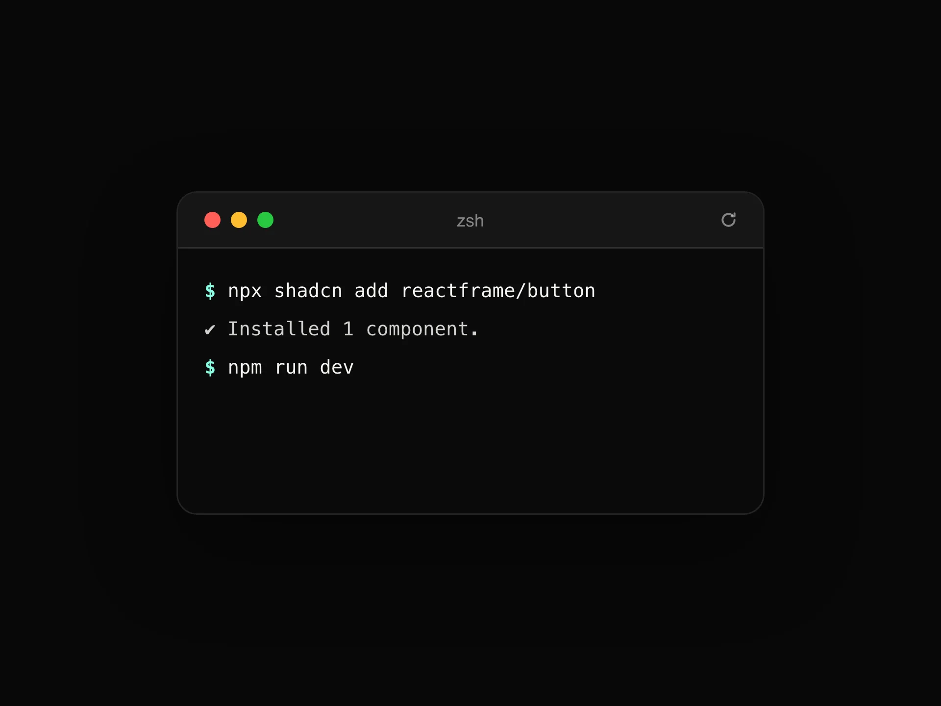
Add the Back to Top component to your project with the shadcn CLI. It lands in components/back-to-top.tsx as plain React + Tailwind CSS source you own and can edit.
npx shadcn@latest add @reactframe/back-to-topOr copy the source by hand and install its dependencies:
npm install motion clsx tailwind-mergeProps
<BackToTop /> accepts 13 props, all optional.
| Prop | Type | Default |
|---|---|---|
| threshold Scroll distance (px) before the button appears. | number | 400 |
| showProgress | boolean | true |
| smooth | boolean | true |
| containerRef Scrollable element to track/scroll; defaults to the window. | React.RefObject<HTMLElement | null> | — |
| icon | React.ReactNode | — |
| label | string | "Back to top" |
| position | "bottom-right" | "bottom-left" | "bottom-center" | "bottom-right" |
| offset | number | 24 |
| size | "sm" | "md" | "lg" | "md" |
| theme | "dark" | "light" | "dark" |
| accentColor | string | "#F2A841" |
| contained Positions absolutely within a relative-positioned parent instead of fixed to the viewport — for demos. | boolean | false |
- threshold
Scroll distance (px) before the button appears.
numberDefault: 400 - showProgressbooleanDefault: true
- smoothbooleanDefault: true
- containerRef
Scrollable element to track/scroll; defaults to the window.
React.RefObject<HTMLElement | null> - iconReact.ReactNode
- labelstringDefault: "Back to top"
- position"bottom-right" | "bottom-left" | "bottom-center"Default: "bottom-right"
- offsetnumberDefault: 24
- size"sm" | "md" | "lg"Default: "md"
- theme"dark" | "light"Default: "dark"
- accentColorstringDefault: "#F2A841"
- contained
Positions absolutely within a relative-positioned parent instead of fixed to the viewport — for demos.
booleanDefault: false
Show all 13 propsShow fewer
| className | string | — |
- classNamestring
npm dependencies
Installed for you by the shadcn CLI.
Back to Top FAQ
- Does it work inside a scrollable div?
- Yes. Pass containerRef pointing to that element, and add contained to position the button inside it instead of fixing it to the viewport.
- Can I turn off smooth scrolling?
- Yes, smooth={false} jumps straight to the top.
- Will it sit above my other content?
- It uses z-[9997], so it stays above most page content. You can override that with className.