Section Container React component
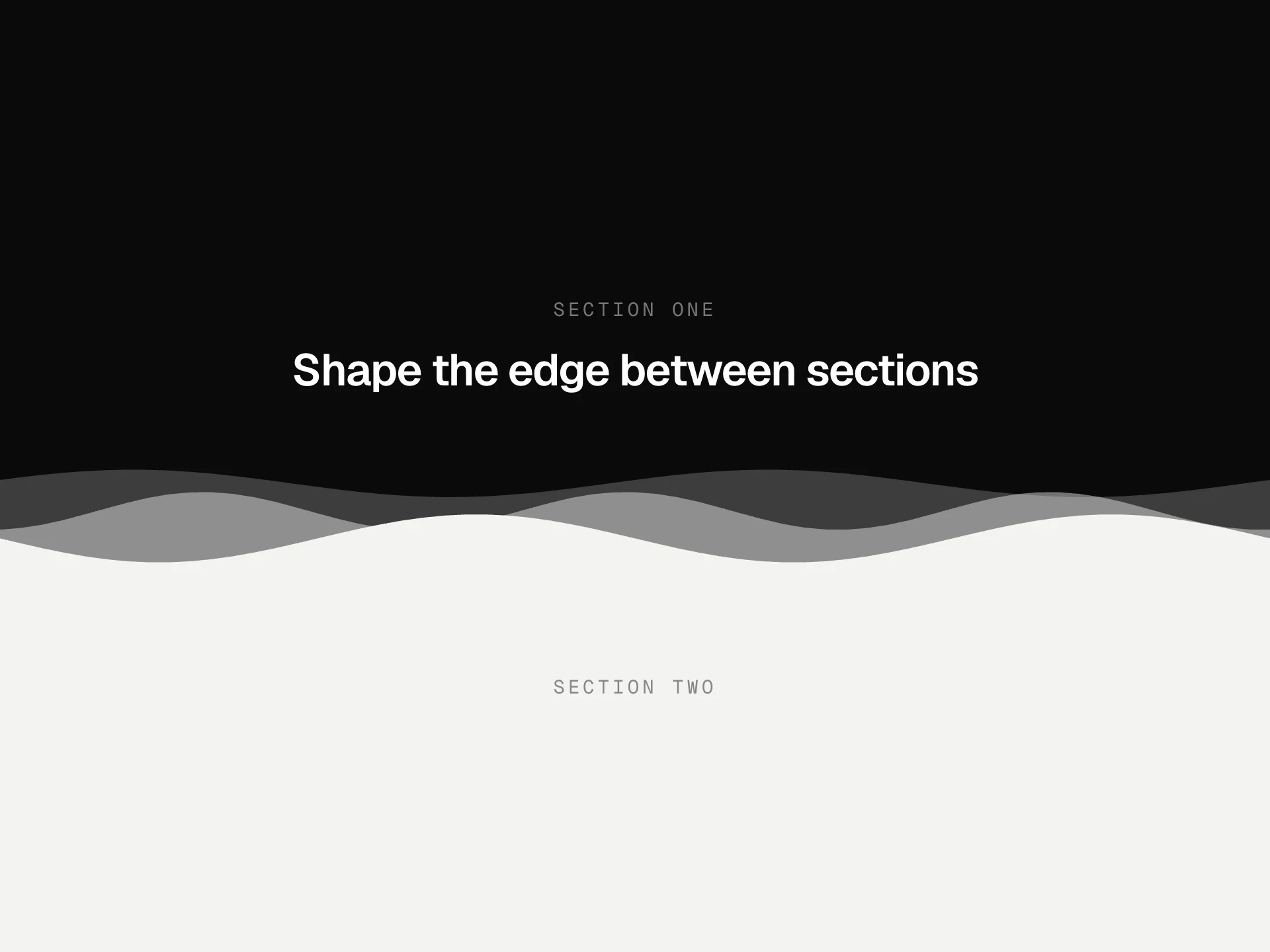
A page-section wrapper that keeps widths, padding and headings consistent: an optional eyebrow, title and description, grid, dot or glow backgrounds that fade out at the edges, framed side rails with corner marks, and a gentle reveal as it scrolls in.
When to use the Section Container component
Use Section Container around every block of a landing or marketing page so widths, side margins, vertical rhythm and headings stay the same from top to bottom.
Mix backgrounds sparingly: a grid or glow behind the hero or one key section, plain for the rest.
Installation
Add the Section Container component to your project with the shadcn CLI. It lands in components/section-container.tsx as plain React + Tailwind CSS source you own and can edit.
npx shadcn@latest add https://reactframe.com/r/section-container.jsonOr copy the source by hand and install its dependencies:
npm install motion clsx tailwind-mergeProps
<SectionContainer /> accepts 14 props, all optional.
| Prop | Type | Default |
|---|---|---|
| children | React.ReactNode | — |
| id | string | — |
| eyebrow Small label above the title. | string | "Why teams switch" |
| title | string | "Everything you need, nothing you don't" |
| description | string | "Sections share one width, one rhythm and one set of margins, so the page reads as a whol… |
| align | "left" | "center" | "center" |
| size Content width: sm 640, md 880, lg 1120, xl 1280, full. | "sm" | "md" | "lg" | "xl" | "full" | "lg" |
| spacing Vertical padding. | "sm" | "md" | "lg" | "md" |
| background | "none" | "subtle" | "grid" | "dots" | "glow" | "grid" |
| framed Thin side rails with + marks at the corners (the framed-grid look). | boolean | true |
| divider A hairline across the top of the section. | boolean | true |
| animateIn | boolean | true |
- childrenReact.ReactNode
- idstring
- eyebrow
Small label above the title.
stringDefault: "Why teams switch" - titlestringDefault: "Everything you need, nothing you don't"
- descriptionstringDefault: "Sections share one width, one rhythm and one set of margins, so the page reads as a whol…
- align"left" | "center"Default: "center"
- size
Content width: sm 640, md 880, lg 1120, xl 1280, full.
"sm" | "md" | "lg" | "xl" | "full"Default: "lg" - spacing
Vertical padding.
"sm" | "md" | "lg"Default: "md" - background"none" | "subtle" | "grid" | "dots" | "glow"Default: "grid"
- framed
Thin side rails with + marks at the corners (the framed-grid look).
booleanDefault: true - divider
A hairline across the top of the section.
booleanDefault: true - animateInbooleanDefault: true
Show all 14 propsShow fewer
| theme | "dark" | "light" | "dark" |
| className | string | — |
- theme"dark" | "light"Default: "dark"
- classNamestring
FAQ
- What does framed add?
- Thin vertical rails along the content column with small + marks at its corners. Stacked sections line up into one continuous frame, a common look for technical and developer products.
- Do the patterns need images?
- No. Grid, dots and glow are CSS gradients, faded out at the edges with a mask, so they cost nothing to load and follow the theme.
- Is the heading accessible?
- The title is an h2 and the section is labelled by it, so screen reader users can jump between sections by name.