Bento Grid React component
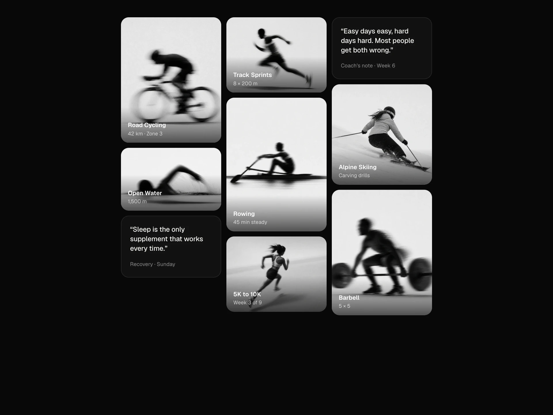
A bento layout of feature cells that span columns and rows, fall back to two and then one column as the container narrows, fade in one after another, and light up under the pointer, with a demo set of small live visuals.
When to use the Bento Grid component
Use Bento Grid for feature overviews, product highlights and 'why us' sections where some points deserve more room than others. Big cells carry the headline feature; small ones round out the story.
Give each cell one idea and a visual; for a stream of same-sized items use a regular grid or Masonry Grid.
Installation
Add the Bento Grid component to your project with the shadcn CLI. It lands in components/bento-grid.tsx as plain React + Tailwind CSS source you own and can edit.
npx shadcn@latest add https://reactframe.com/r/bento-grid.jsonOr copy the source by hand and install its dependencies:
npm install motion clsx tailwind-mergeProps
<BentoGrid /> accepts 6 props, all optional.
| Prop | Type | Default |
|---|---|---|
| children BentoCell children. Leave out for the demo layout. | React.ReactNode | — |
| columns Columns on wide containers; drops to 2, then 1, as the container narrows. | number | 4 |
| rowHeight | number | 170 |
| gap | number | 12 |
| theme | "dark" | "light" | "dark" |
| className | string | — |
- children
BentoCell children. Leave out for the demo layout.
React.ReactNode - columns
Columns on wide containers; drops to 2, then 1, as the container narrows.
numberDefault: 4 - rowHeightnumberDefault: 170
- gapnumberDefault: 12
- theme"dark" | "light"Default: "dark"
- classNamestring
FAQ
- How do cells get bigger?
- Set colSpan and rowSpan on a BentoCell. Spans are clamped to the available columns, so a 2-wide cell still fits when the grid drops to one column.
- What happens on small screens?
- The grid watches its own width: below 820px it uses two columns and below 520px one, where cells take their natural height.
- Can cells be links?
- Yes. Give a cell an href and the whole cell becomes the link, with the same hover light.