Bouncing Card Fan React component
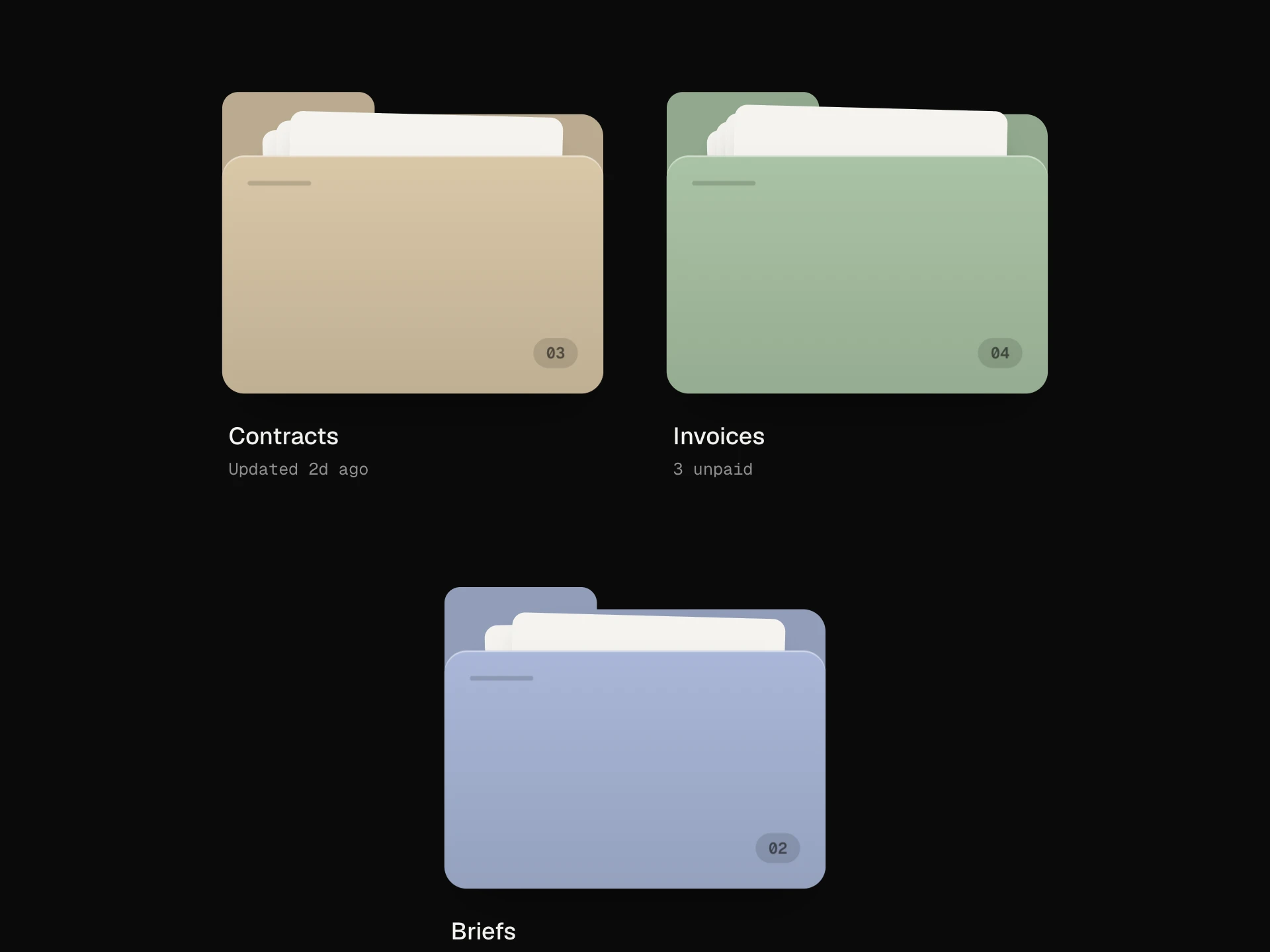
A squared-up deck of photo cards that springs open into a fan on hover with a bouncy, centre-out stagger; the card under the pointer rises and nudges its neighbours aside, a click pops one up as the pick, and it opens with a tap on touch screens.
About the Bouncing Card Fan component
Bouncing Card Fan keeps a handful of options tucked away as a neat deck, then springs them open like a hand of cards when you point at it. The cards bounce into place one after another from the middle out, the one under your pointer lifts and nudges its neighbours aside, and clicking a card pops it up as your pick.
It's a playful way to choose between a few things — collections, plans, moods, categories — and it works by tap on phones and with the keyboard too.
When to use it
Use it for picking one of three to seven visual options: portfolio collections, playlist moods, product lines, gift cards or onboarding choices.
With more options, or when people need to read details before choosing, a grid or list is easier to scan.
Installation
Add the Bouncing Card Fan component to your project with the shadcn CLI. It lands in components/bouncing-card-fan.tsx as plain React + Tailwind CSS source you own and can edit.
npx shadcn@latest add @reactframe/bouncing-card-fanOr copy the source by hand and install its dependencies:
npm install motion clsx tailwind-mergeProps
<BouncingCardFan /> accepts 12 props, all optional. It also accepts the usual <div> attributes, like className, style, id and aria-*, and passes them to its root element.
| Prop | Type | Default |
|---|---|---|
| cards | { id: string; image: string; imageAlt?: string; title: string; meta?: string }[] | CARDS |
| spread Total angle the open fan covers, in degrees. | number | 46 |
| bounce 0 = no overshoot, 1 = very springy. | number | 0.5 |
| cardWidth | number | 190 |
| cardRatio Card height / width. | number | 1.36 |
| open Keep the fan open instead of opening on hover. | boolean | — |
| selectedId Controlled selected card id. | string | null | — |
| defaultSelectedId | string | null | null |
| onSelect | (card: FanCard | null) => void | — |
| radius | number | 16 |
| theme | "dark" | "light" | "dark" |
| label | string | "Collections" |
- cards{ id: string; image: string; imageAlt?: string; title: string; meta?: string }[]Default: CARDS
- spread
Total angle the open fan covers, in degrees.
numberDefault: 46 - bounce
0 = no overshoot, 1 = very springy.
numberDefault: 0.5 - cardWidthnumberDefault: 190
- cardRatio
Card height / width.
numberDefault: 1.36 - open
Keep the fan open instead of opening on hover.
boolean - selectedId
Controlled selected card id.
string | null - defaultSelectedIdstring | nullDefault: null
- onSelect(card: FanCard | null) => void
- radiusnumberDefault: 16
- theme"dark" | "light"Default: "dark"
- labelstringDefault: "Collections"
npm dependencies
Installed for you by the shadcn CLI.
Bouncing Card Fan FAQ
- Can it stay open?
- Yes, pass open to keep the fan spread. Otherwise it opens on hover, on keyboard focus, or on a first tap on touch screens, and a tap outside closes it.
- How do I make it more or less bouncy?
- bounce goes from 0 (no overshoot) to 1 (very springy); 0.5 is the default. spread sets how wide the open fan is, in degrees.
- How do I read the pick?
- onSelect gets the card (or null when it's unpicked). Pass selectedId to control it from outside, or defaultSelectedId to start with one picked.
- Will it fit on a phone?
- Yes. The fan is sized from its own geometry and scales itself down to fit narrower containers.