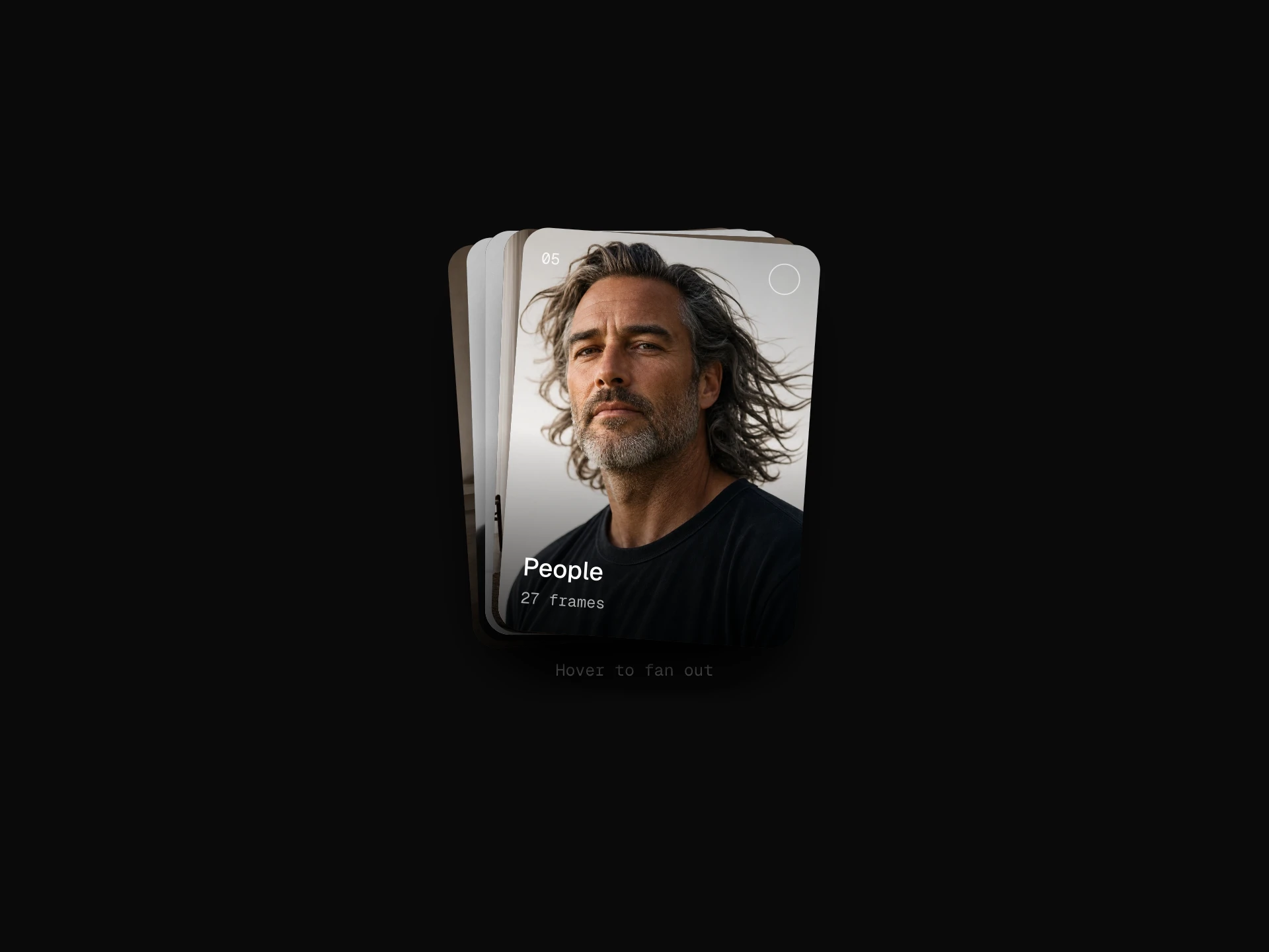
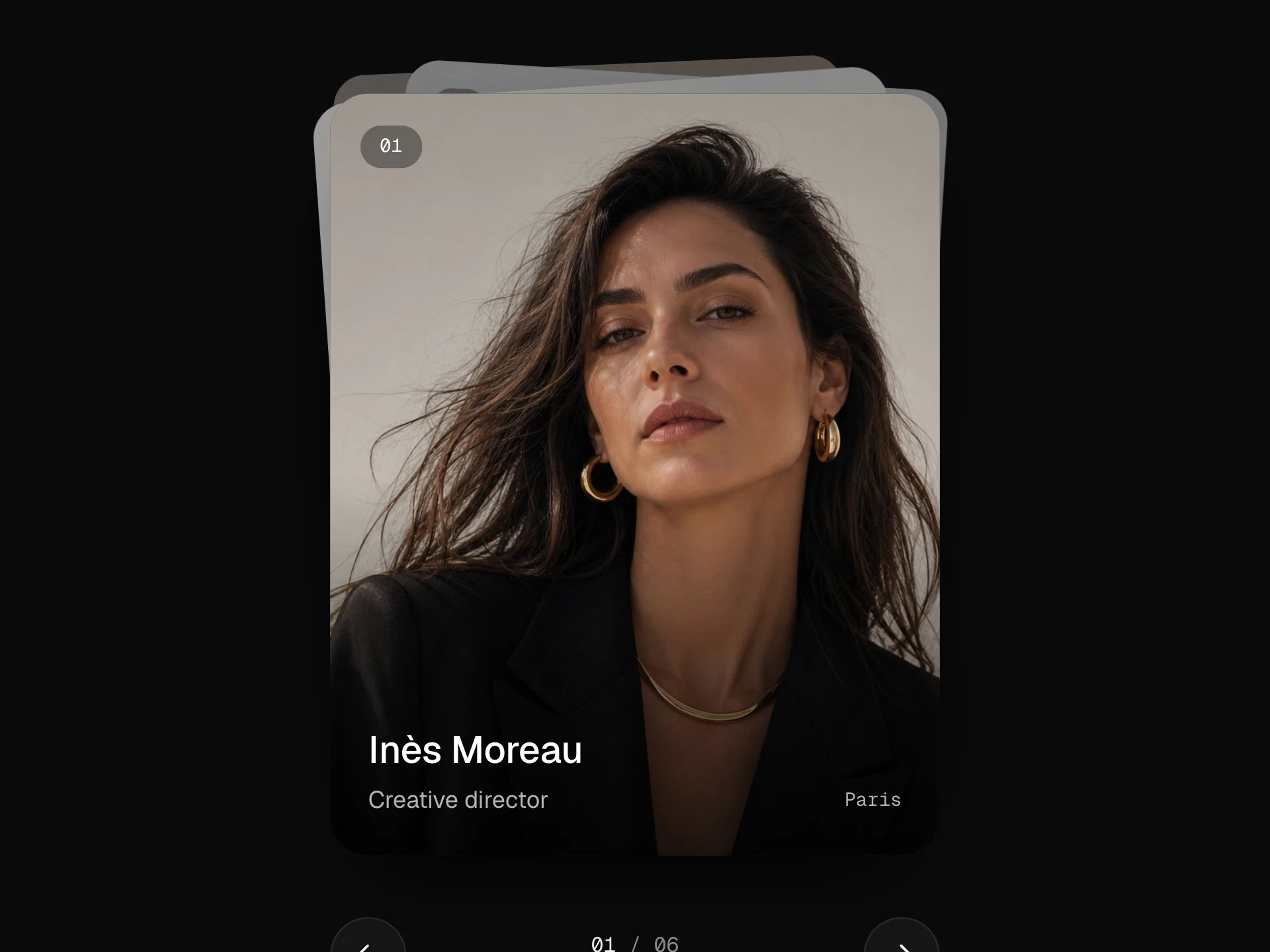
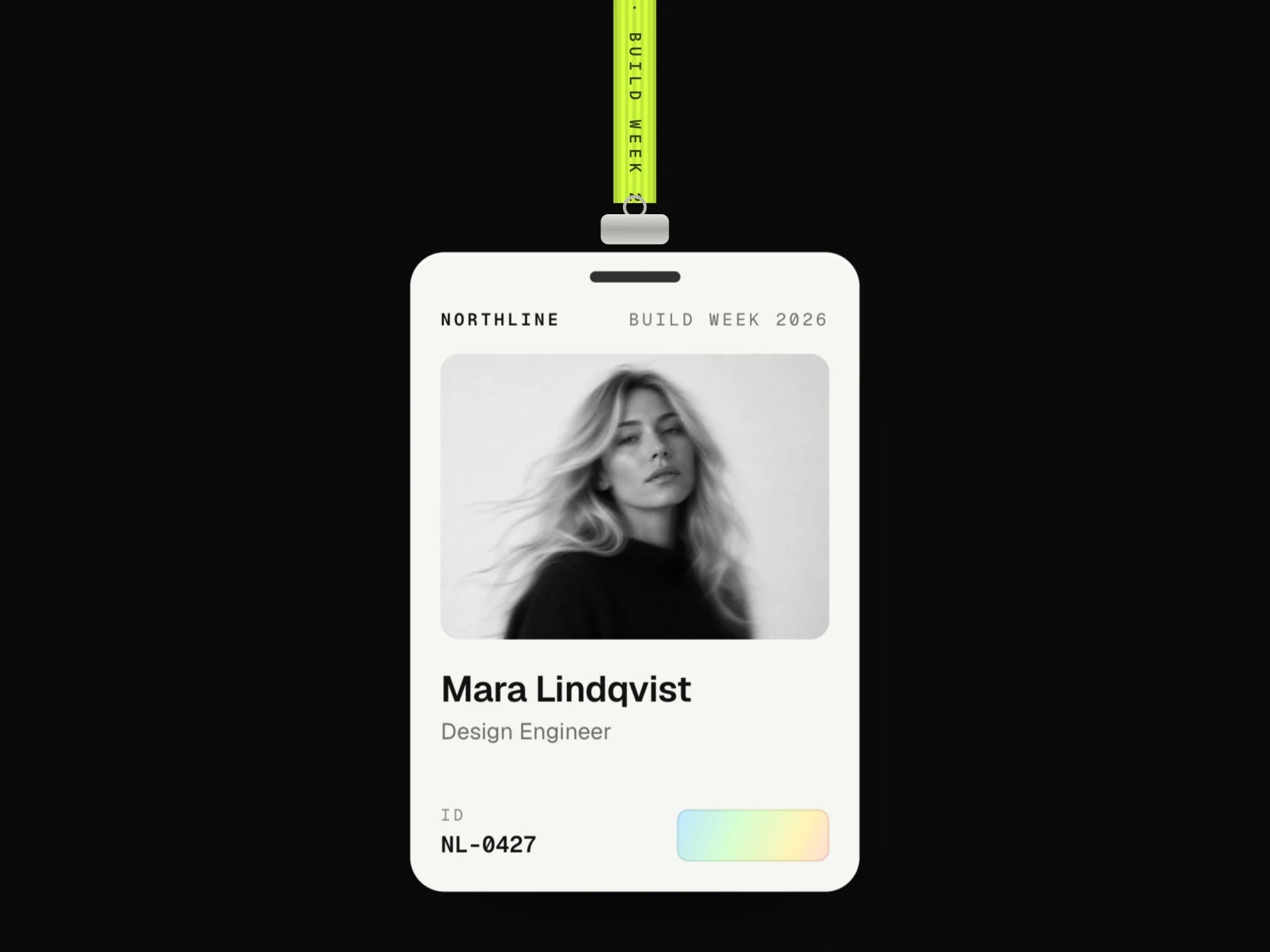
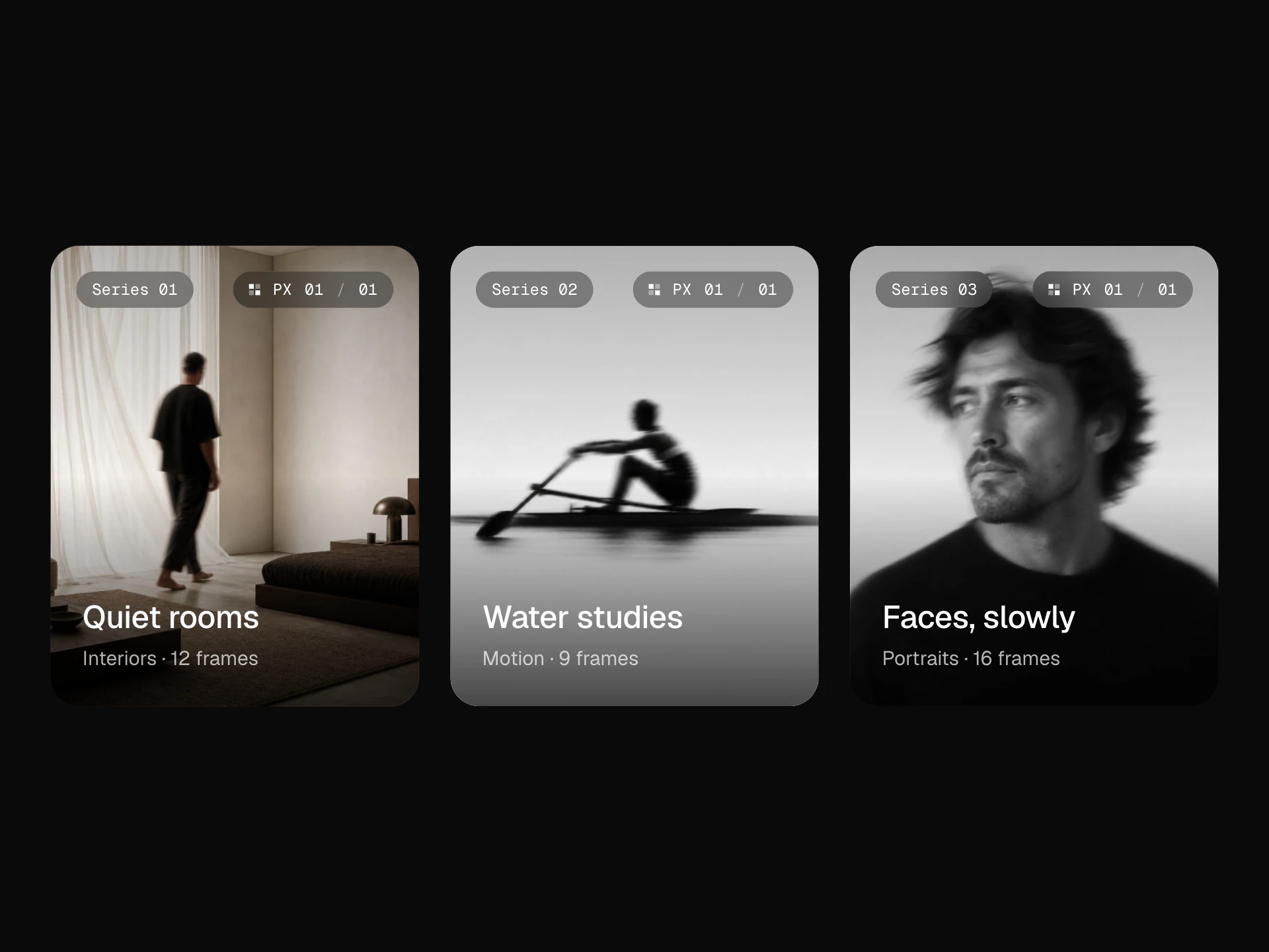
Distorted Photo Card React component
A photo card with a liquid WebGL lens that follows the pointer: the image swells under it, ripples outward, smears and splits into RGB when you move fast, with a hairline ring tracking the lens, lazy WebGL setup and a plain-image fallback.
About the Distorted Photo Card component
Distorted Photo Card puts a liquid lens under the pointer. The photo swells where you point, soft rings ripple out from it, and moving quickly smears the image and splits it into red, green and blue for a moment before it settles. A thin ring tracks the lens so it's clear what's happening.
It's drawn with a small WebGL shader, set up only when someone first points at the card, so a page full of them stays light. Where WebGL isn't available, or the image can't be used, visitors simply see the photo.
When to use it
Use it for portfolio pieces, editorial features, album or event artwork, or any hero image you want people to play with.
It's a showpiece: keep it to a handful per page, and don't use it for images people need to read, like screenshots or text-heavy graphics.
Installation
Add the Distorted Photo Card component to your project with the shadcn CLI. It lands in components/distorted-photo-card.tsx as plain React + Tailwind CSS source you own and can edit.
npx shadcn@latest add @reactframe/distorted-photo-cardOr copy the source by hand and install its dependencies:
npm install clsx tailwind-mergeProps
<DistortedPhotoCard /> accepts 14 props, all optional. It also accepts the usual <div> attributes, like className, style, id and aria-*, and passes them to its root element.
| Prop | Type | Default |
|---|---|---|
| image | string | "/demo/47.webp" |
| imageAlt | string | "" |
| title | string | "Afterimage" |
| subtitle | string | "Portrait study · 2026" |
| label Small mono label top-left. | string | "No. 01" |
| href | string | — |
| radius Lens radius as a fraction of the card height. | number | 0.32 |
| strength How strongly the lens magnifies, 0–1. | number | 0.42 |
| aberration RGB split that follows fast pointer movement, 0–1. | number | 0.8 |
| ripples Rings rippling out from the lens. | boolean | true |
| showRing Show the hairline ring that follows the lens. | boolean | true |
| aspectRatio Width / height of the card. | number | 4 / 5 |
- imagestringDefault: "/demo/47.webp"
- imageAltstringDefault: ""
- titlestringDefault: "Afterimage"
- subtitlestringDefault: "Portrait study · 2026"
- label
Small mono label top-left.
stringDefault: "No. 01" - hrefstring
- radius
Lens radius as a fraction of the card height.
numberDefault: 0.32 - strength
How strongly the lens magnifies, 0–1.
numberDefault: 0.42 - aberration
RGB split that follows fast pointer movement, 0–1.
numberDefault: 0.8 - ripples
Rings rippling out from the lens.
booleanDefault: true - showRing
Show the hairline ring that follows the lens.
booleanDefault: true - aspectRatio
Width / height of the card.
numberDefault: 4 / 5
Show all 14 propsShow fewer
| cornerRadius | number | 18 |
| theme | "dark" | "light" | "dark" |
- cornerRadiusnumberDefault: 18
- theme"dark" | "light"Default: "dark"
npm dependencies
Installed for you by the shadcn CLI.
Distorted Photo Card FAQ
- Can I use images from another domain?
- Yes, if they're served with CORS headers (most CDNs are). Without them the browser won't let WebGL use the image, and the card quietly shows the plain photo instead.
- How many can I put on a page?
- Browsers allow around 16 WebGL contexts at once, and each card only creates one when it's first hovered, so a normal grid is fine.
- How do I make it subtler?
- Lower strength (magnification) and aberration (the RGB split), turn off ripples, or shrink radius. strength={0.2} with aberration={0.3} is a gentle version.
- Does it work on phones?
- The lens follows your finger while it's on the card and fades when you let go; vertical swipes still scroll the page. With reduced motion turned on, the photo stays still.