Image Box React component
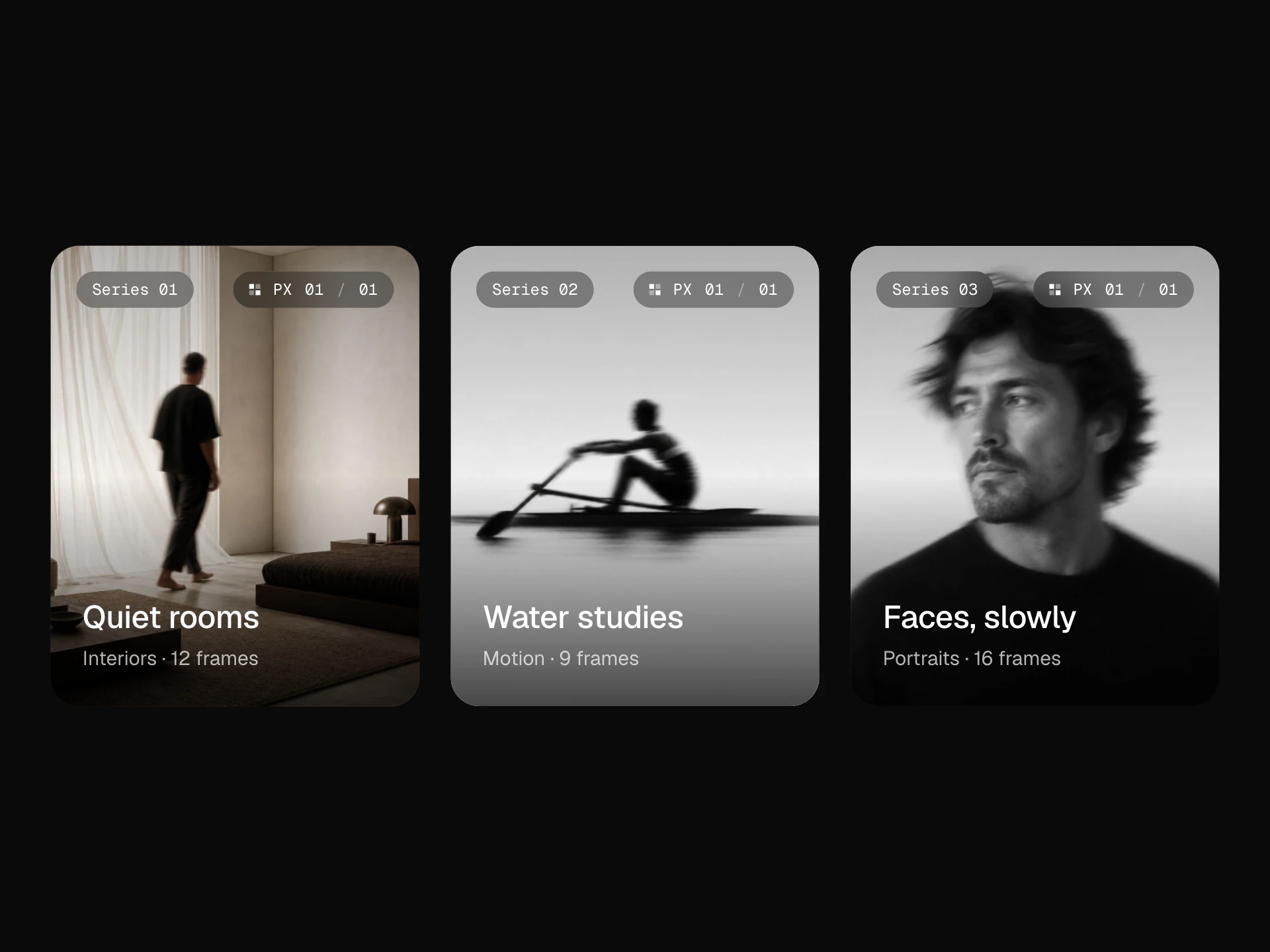
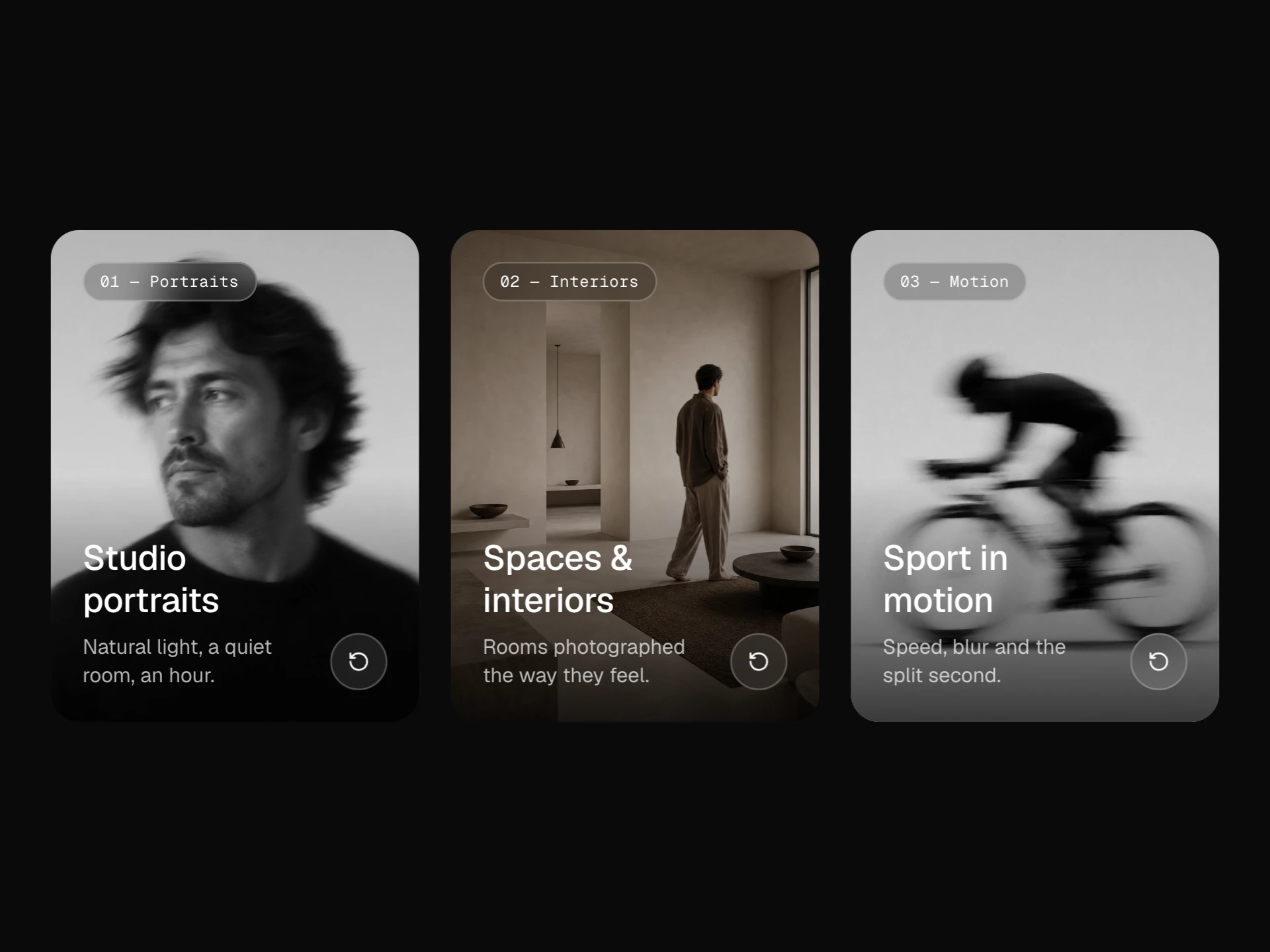
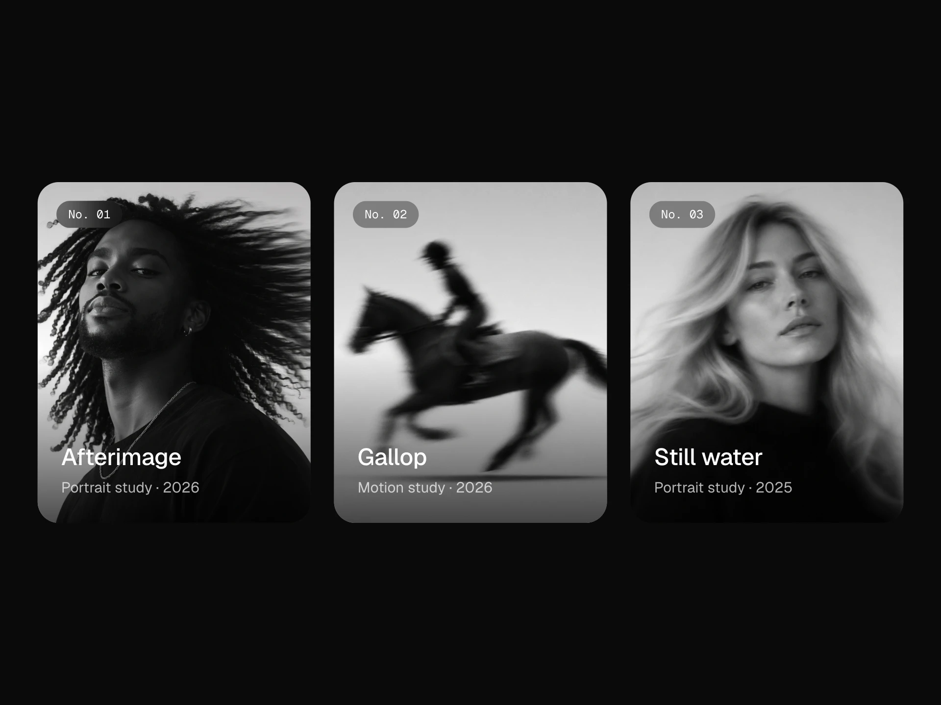
An image box for stories, projects and services in three layouts (stacked, overlay, split), with an image that drifts toward the pointer, a drawn title underline, a sliding arrow, a description that opens on hover in the overlay layout and the whole card as one accessible link.
About the Image Box component
Image Box is the card you reach for when a picture and a few lines of text lead somewhere: a blog post, a project, a service. It comes in three layouts — stacked (image on top), overlay (text on the image) and split (side by side) — that share the same props, so you can switch between them without rewriting anything.
The details are quiet: the image drifts slightly toward the pointer and zooms in, the title draws an underline, the arrow slides, and in the overlay layout the description opens up on hover. The whole card is clickable, yet a screen reader hears it as one link named after the title.
When to use it
Use it for blog and journal listings, case-study grids, service overviews and 'related posts' rows.
Use overlay when the photo is the point and the text is short; use stacked or split when the description matters, since overlay hides it until hover on desktop.
Installation
Add the Image Box component to your project with the shadcn CLI. It lands in components/image-box.tsx as plain React + Tailwind CSS source you own and can edit.
npx shadcn@latest add @reactframe/image-boxOr copy the source by hand and install its dependencies:
npm install lucide-react clsx tailwind-mergeProps
<ImageBox /> accepts 14 props, all optional. It also accepts the usual <article> attributes, like className, style, id and aria-*, and passes them to its root element.
| Prop | Type | Default |
|---|---|---|
| image | string | "/demo/19.webp" |
| imageAlt | string | "" |
| tag Small tag shown above the title, e.g. a category. | string | "Interiors" |
| meta Mono detail on the right of the tag row, e.g. "6 min read". | string | "6 min read" |
| title | string | "Notes on daylight" |
| description | string | "How we plan an interior shoot around the sun: which rooms to start in, when to wait, and… |
| href | string | "#" |
| linkLabel | string | "Read story" |
| layout | "stacked" | "overlay" | "split" | "stacked" |
| imageRatio Image width / height. Ignored by the overlay layout, which uses the card's own ratio. | number | 4 / 3 |
| overlayRatio Card width / height for the overlay layout. | number | 3 / 4 |
| parallax How far the image drifts toward the pointer, in px. 0 turns it off. | number | 8 |
- imagestringDefault: "/demo/19.webp"
- imageAltstringDefault: ""
- tag
Small tag shown above the title, e.g. a category.
stringDefault: "Interiors" - meta
Mono detail on the right of the tag row, e.g. "6 min read".
stringDefault: "6 min read" - titlestringDefault: "Notes on daylight"
- descriptionstringDefault: "How we plan an interior shoot around the sun: which rooms to start in, when to wait, and…
- hrefstringDefault: "#"
- linkLabelstringDefault: "Read story"
- layout"stacked" | "overlay" | "split"Default: "stacked"
- imageRatio
Image width / height. Ignored by the overlay layout, which uses the card's own ratio.
numberDefault: 4 / 3 - overlayRatio
Card width / height for the overlay layout.
numberDefault: 3 / 4 - parallax
How far the image drifts toward the pointer, in px. 0 turns it off.
numberDefault: 8
Show all 14 propsShow fewer
| radius | number | 18 |
| theme | "dark" | "light" | "dark" |
- radiusnumberDefault: 18
- theme"dark" | "light"Default: "dark"
npm dependencies
Installed for you by the shadcn CLI.
Image Box FAQ
- Is the whole card clickable?
- Yes. The title's link stretches over the whole card, so clicking anywhere opens href, while assistive tech hears a single link named after the title instead of a block of text.
- Does the overlay hide the description on phones?
- No. On touch screens the description is always open, since there is no hover to reveal it.
- Can I turn off the image drift?
- Set parallax={0}. The hover zoom stays; reduced-motion settings remove the transition.
- How do I change the image shape?
- imageRatio sets the image's width / height in the stacked and split layouts (4/3 by default). overlayRatio sets the overlay card's shape (3/4 by default).