Burger Menu React component
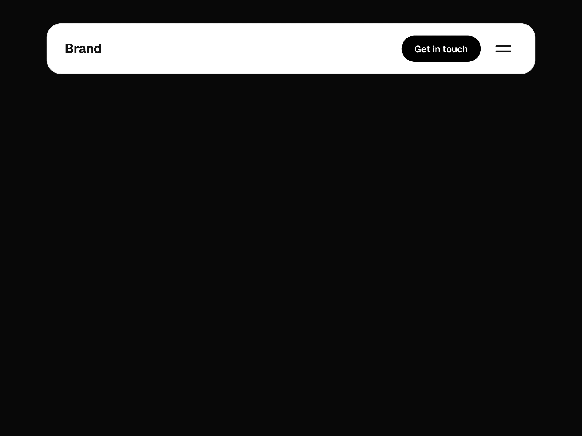
A header whose round burger folds into a cross (or a back arrow) and drops a soft panel of numbered serif links, with a gliding highlight, a second level that slides in, keyboard arrows and a footer CTA.
About the Burger Menu component
Burger Menu is a compact site header: a logo and a round burger button. Pressing the button folds its three lines into a cross and drops a soft panel from the corner with numbered serif links, each with a short description, while a highlight glides between rows as you move over them.
Links with children open a second level: the panel slides over to show the sub-pages with a back button, and its height eases to fit. A footer note and a filled call-to-action pill sit under the list.
When to use it
Use it on studio, portfolio and small business sites, or anywhere the header should stay quiet, with up to a dozen links across two levels.
For one-level menus that should feel bigger and more theatrical, the Fullscreen Overlay Menu takes over the whole screen instead.
Installation
Add the Burger Menu component to your project with the shadcn CLI. It lands in components/burger-menu.tsx as plain React + Tailwind CSS source you own and can edit.
npx shadcn@latest add @reactframe/burger-menuOr copy the source by hand and install its dependencies:
npm install motion lucide-react clsx tailwind-mergeProps
<BurgerMenu /> accepts 13 props, all optional. It also accepts the usual <nav> attributes, like className, style, id and aria-*, and passes them to its root element.
| Prop | Type | Default |
|---|---|---|
| theme | "dark" | "light" | "dark" |
| logo | React.ReactNode | "Forme." |
| logoHref | string | "/" |
| items | { id: string; label: string; href: string; description?: string; badge?: string; children?: Omit<BurgerMenuLink, "children">[] }[] | DEFAULT_LINKS |
| open | boolean | — |
| defaultOpen | boolean | false |
| onOpenChange | (open: boolean) => void | — |
| variant How the burger folds when open. | "cross" | "arrow" | "cross" |
| showNumbers | boolean | true |
| ctaLabel | string | "Let's talk" |
| ctaHref | string | "/contact" |
| footnote | string | "Good things start with a hello." |
- theme"dark" | "light"Default: "dark"
- logoReact.ReactNodeDefault: "Forme."
- logoHrefstringDefault: "/"
- items{ id: string; label: string; href: string; description?: string; badge?: string; children?: Omit<BurgerMenuLink, "children">[] }[]Default: DEFAULT_LINKS
- openboolean
- defaultOpenbooleanDefault: false
- onOpenChange(open: boolean) => void
- variant
How the burger folds when open.
"cross" | "arrow"Default: "cross" - showNumbersbooleanDefault: true
- ctaLabelstringDefault: "Let's talk"
- ctaHrefstringDefault: "/contact"
- footnotestringDefault: "Good things start with a hello."
Show all 13 propsShow fewer
| onNavigate | (item: Omit<BurgerMenuLink, "children">, event: React.MouseEvent<HTMLAnchorElement>) => void | — |
- onNavigate(item: Omit<BurgerMenuLink, "children">, event: React.MouseEvent<HTMLAnchorElement>) => void
npm dependencies
Installed for you by the shadcn CLI.
Burger Menu FAQ
- How do I add a second level?
- Give an item a children array. Its row shows a chevron and opens the sub-level instead of navigating; ArrowRight opens it from the keyboard and ArrowLeft or the back button returns.
- Can the burger turn into an arrow instead of a cross?
- Yes, variant="arrow" folds the lines into a back arrow.
- Is it keyboard friendly?
- Yes. Focus moves into the panel when it opens, ArrowUp and ArrowDown move between rows, Escape or a click outside closes it, and focus returns to the burger button.
- Can I control whether it is open?
- Pass open and onOpenChange, or defaultOpen to start it open.