Fullscreen Overlay Menu React component
A full-screen menu that grows out of its Menu button in a circle: large serif links rise into a hairline framed grid, the hovered link dims the rest and fills a preview panel, with contact and social cells, focus trap and Escape to close.
About the Fullscreen Overlay Menu component
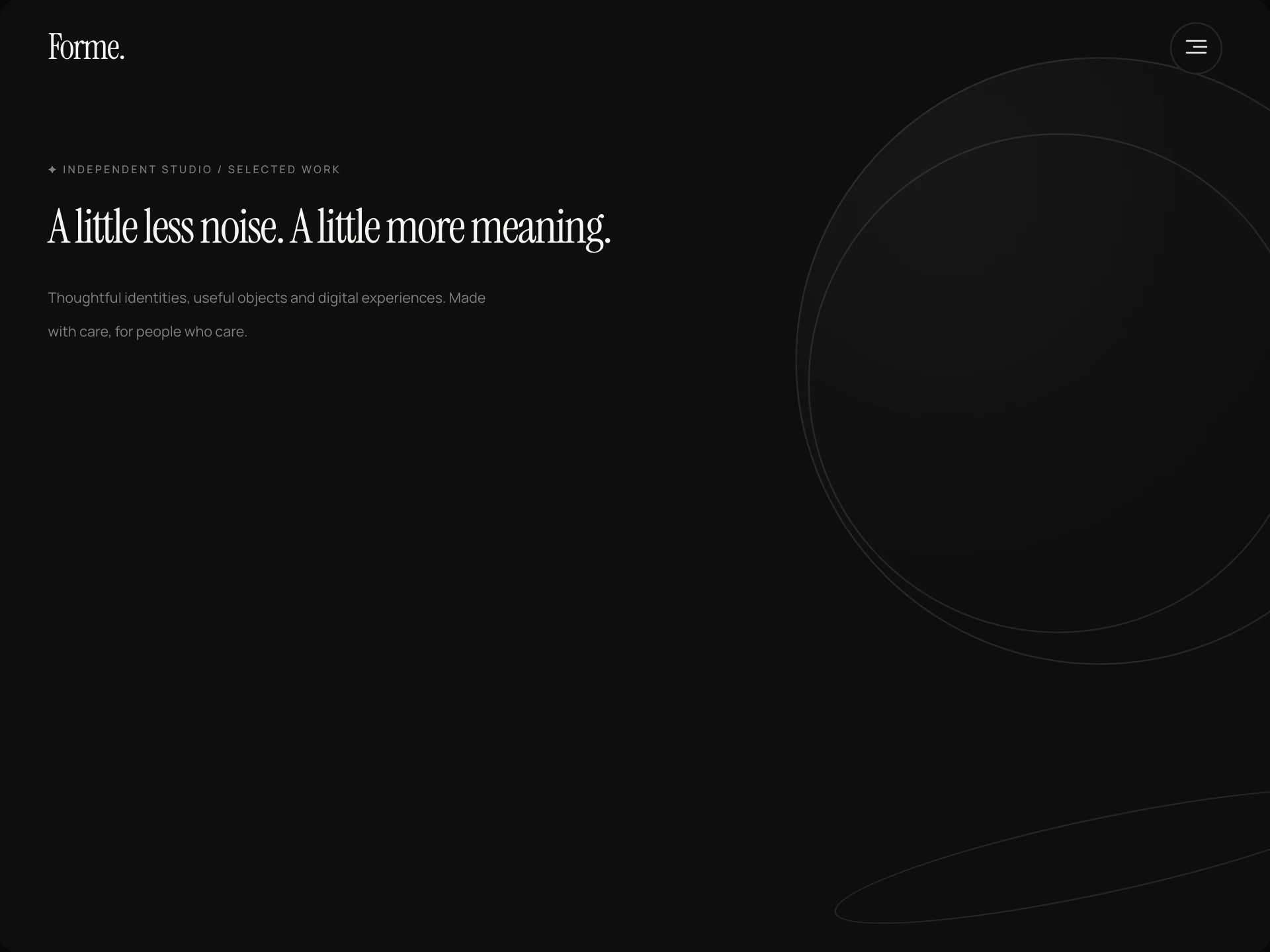
Fullscreen Overlay Menu is a site header whose Menu button opens the whole screen as a menu. The page is covered by a circle that grows out of the button, and the links rise into place as large serif words inside a thin framed grid.
Pointing at a link mutes the others and shows its description in a preview panel beside the list, with the studio's email and social links underneath. The button's label rolls to Close and its lines become a cross; Escape, the button or any link closes it again.
When to use it
Use it for studio, agency, portfolio and editorial sites with a handful of top-level pages, where the menu itself is part of the brand moment.
For sites with many sections or deep navigation, a mega menu or sidebar keeps more within reach.
Installation
Add the Fullscreen Overlay Menu component to your project with the shadcn CLI. It lands in components/fullscreen-overlay-menu.tsx as plain React + Tailwind CSS source you own and can edit.
npx shadcn@latest add @reactframe/fullscreen-overlay-menuOr copy the source by hand and install its dependencies:
npm install motion lucide-react clsx tailwind-mergeProps
<FullscreenOverlayMenu /> accepts 16 props, all optional. It also accepts the usual <div> attributes, like className, style, id and aria-*, and passes them to its root element.
| Prop | Type | Default |
|---|---|---|
| theme | "dark" | "light" | "dark" |
| logo | React.ReactNode | "Forme." |
| logoHref | string | "/" |
| items | { id: string; label: string; href: string; description?: string; badge?: string }[] | DEFAULT_LINKS |
| open | boolean | — |
| defaultOpen | boolean | false |
| onOpenChange | (open: boolean) => void | — |
| contained Cover the nearest positioned ancestor instead of the whole window (for previews and embedded layouts). | boolean | false |
| string | "hello@forme.studio" | |
| socials | { label: string; href: string }[] | DEFAULT_SOCIALS |
| address | string | "Studio 4, 12 Rua das Flores, Lisbon" |
| tagline | string | "Independent minds. Considered work." |
- theme"dark" | "light"Default: "dark"
- logoReact.ReactNodeDefault: "Forme."
- logoHrefstringDefault: "/"
- items{ id: string; label: string; href: string; description?: string; badge?: string }[]Default: DEFAULT_LINKS
- openboolean
- defaultOpenbooleanDefault: false
- onOpenChange(open: boolean) => void
- contained
Cover the nearest positioned ancestor instead of the whole window (for previews and embedded layouts).
booleanDefault: false - emailstringDefault: "hello@forme.studio"
- socials{ label: string; href: string }[]Default: DEFAULT_SOCIALS
- addressstringDefault: "Studio 4, 12 Rua das Flores, Lisbon"
- taglinestringDefault: "Independent minds. Considered work."
Show all 16 propsShow fewer
| ctaLabel | string | "Let's talk" |
| ctaHref | string | "/contact" |
| showNumbers | boolean | true |
| onNavigate | (item: OverlayMenuLink, event: React.MouseEvent<HTMLAnchorElement>) => void | — |
- ctaLabelstringDefault: "Let's talk"
- ctaHrefstringDefault: "/contact"
- showNumbersbooleanDefault: true
- onNavigate(item: OverlayMenuLink, event: React.MouseEvent<HTMLAnchorElement>) => void
npm dependencies
Installed for you by the shadcn CLI.
Fullscreen Overlay Menu FAQ
- Can I open and close it myself?
- Yes. Pass open and onOpenChange to control it, or defaultOpen to start it open.
- Can it cover just a section instead of the whole window?
- Pass contained and it covers the nearest positioned ancestor (give that parent position: relative). Otherwise it covers the window and stops the page from scrolling while open.
- Is it accessible?
- The button reports its state with aria-expanded, the overlay is a modal dialog, focus moves to the first link when it opens and back to the button when it closes, Tab stays inside, and Escape closes it. Reduced-motion settings turn the animations off.
- Which fonts does it use?
- Headings use the --navbar-serif CSS variable, falling back to Instrument Serif and then Georgia; set that variable to use your own display face.