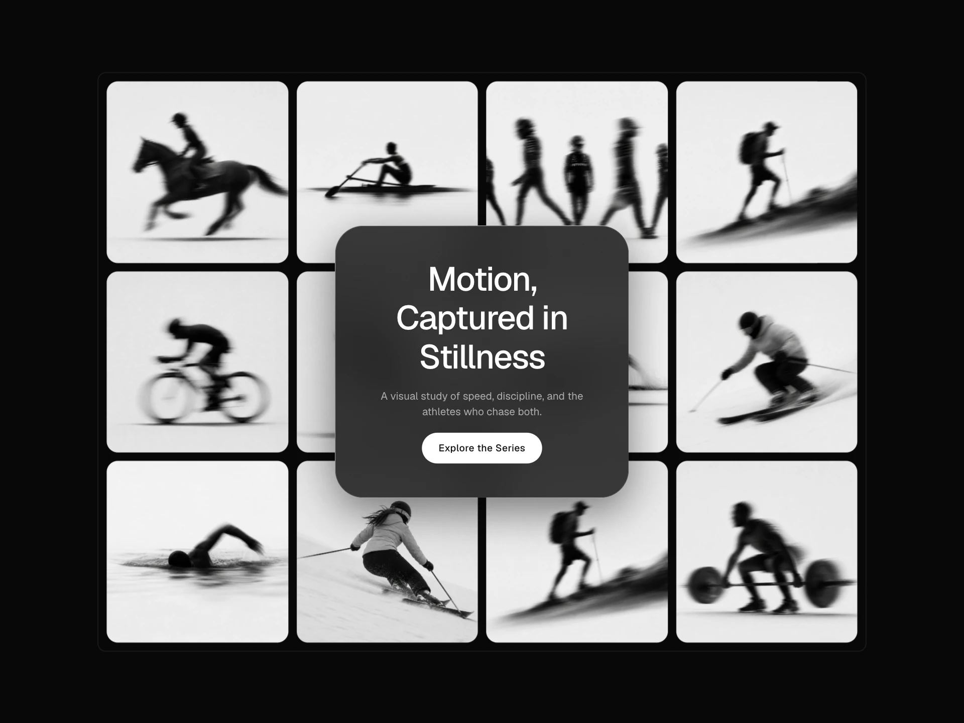
Cinematic Stacked Gallery React component
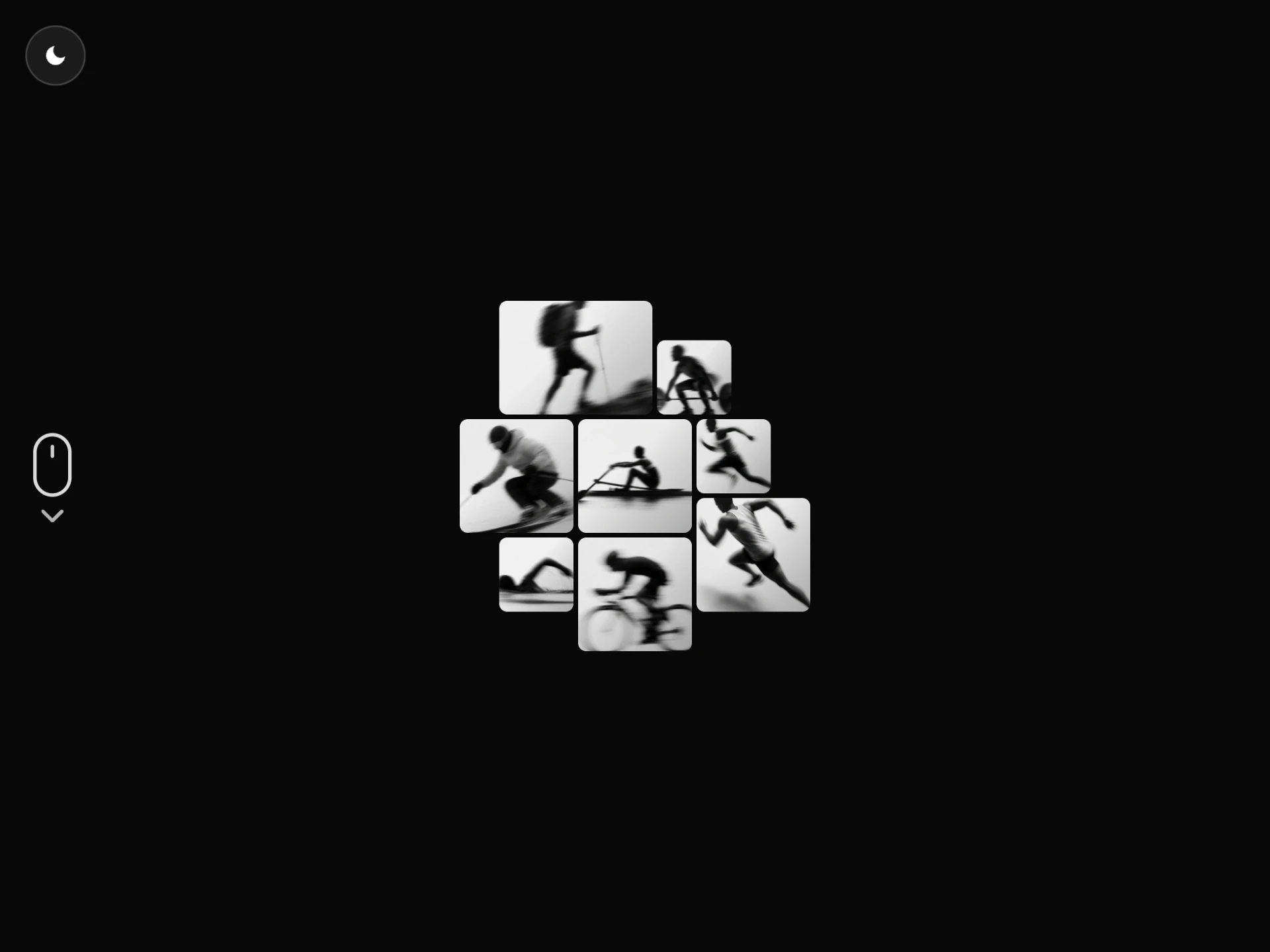
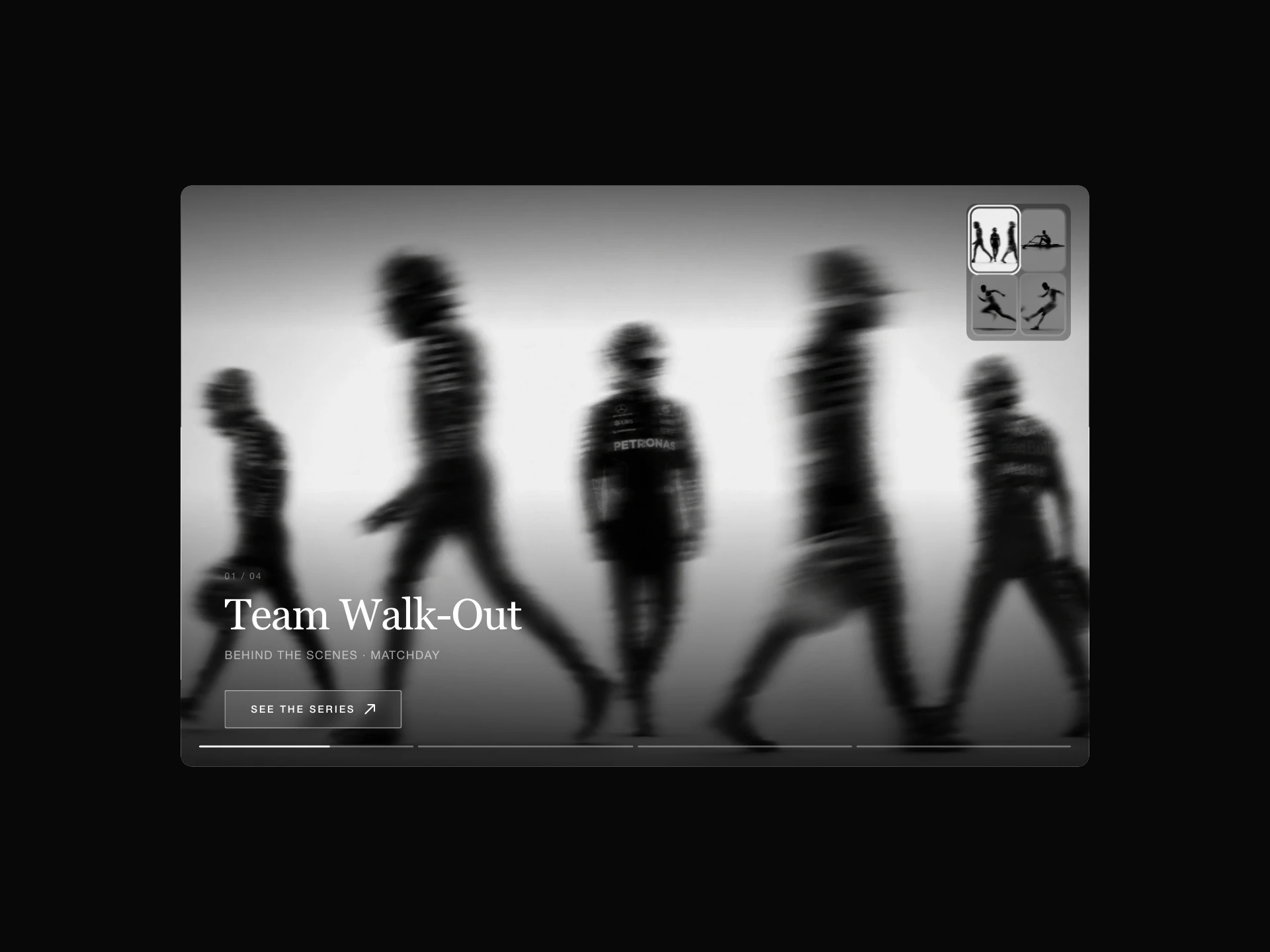
A fullscreen hero gallery where inactive slides collapse into a stacked deck of thumbnails; clicking one crossfades it to full size with Ken Burns zoom, cursor parallax, and a title/description rail with CTA and prev/next controls.
About the Cinematic Stacked Gallery component
Cinematic Stacked Gallery is a free fullscreen hero gallery: the active image fills the frame with a slow Ken Burns zoom and cursor parallax, while the other slides collapse into a stacked deck of thumbnails. Picking one crossfades it to full size, and a rail shows its title, description, a CTA and previous/next controls.
Arrow keys navigate and slide changes are announced; Ken Burns, parallax, depth blur, fonts and the CTA are props, and motion is reduced for visitors who ask for it.
When to use it
Use it as the hero of a hotel, real estate, travel, architecture or fashion site, where a few strong images introduce the brand.
Installation
Add the Cinematic Stacked Gallery component to your project with the shadcn CLI. It lands in components/cinematic-stacked-gallery.tsx as plain React + Tailwind CSS source you own and can edit.
npx shadcn@latest add @reactframe/cinematic-stacked-galleryOr copy the source by hand and install its dependencies:
npm install clsx tailwind-mergeProps
<CinematicStackedGallery /> accepts 14 props, all optional. It also accepts the usual <div> attributes, like className, style, id and aria-*, and passes them to its root element.
| Prop | Type | Default |
|---|---|---|
| items | { image: string; title: string; description: string; alt?: string }[] | DEFAULT_ITEMS |
| kenBurns | boolean | true |
| kenBurnsDuration | number | 18 |
| kenBurnsScale | number | 1.08 |
| parallax | boolean | true |
| parallaxStrength | number | 18 |
| depthBlur | boolean | true |
| kickerFontFamily | string | "system-ui, -apple-system, sans-serif" |
| titleFontFamily | string | "system-ui, -apple-system, sans-serif" |
| descriptionFontFamily | string | "system-ui, -apple-system, sans-serif" |
| showCta | boolean | true |
| ctaLabel | string | "Explore" |
- items{ image: string; title: string; description: string; alt?: string }[]Default: DEFAULT_ITEMS
- kenBurnsbooleanDefault: true
- kenBurnsDurationnumberDefault: 18
- kenBurnsScalenumberDefault: 1.08
- parallaxbooleanDefault: true
- parallaxStrengthnumberDefault: 18
- depthBlurbooleanDefault: true
- kickerFontFamilystringDefault: "system-ui, -apple-system, sans-serif"
- titleFontFamilystringDefault: "system-ui, -apple-system, sans-serif"
- descriptionFontFamilystringDefault: "system-ui, -apple-system, sans-serif"
- showCtabooleanDefault: true
- ctaLabelstringDefault: "Explore"
Show all 14 propsShow fewer
| ctaLink | string | "#" |
| ctaNewTab | boolean | false |
- ctaLinkstringDefault: "#"
- ctaNewTabbooleanDefault: false
Collections
Use-case pages that compare Cinematic Stacked Gallery with the other components that do a similar job.
npm dependencies
Installed for you by the shadcn CLI.
Cinematic Stacked Gallery FAQ
- What does each slide need?
- image, title and description, plus optional alt text.
- Can I turn off the slow zoom?
- Yes, kenBurns={false}; kenBurnsDuration and kenBurnsScale tune it.
- Can the CTA open in a new tab?
- Yes, set ctaNewTab; ctaLabel and ctaLink set the button.
- Is it keyboard accessible?
- Yes, left and right arrow keys change slides and each change is announced.