Motion Gallery Grid React component
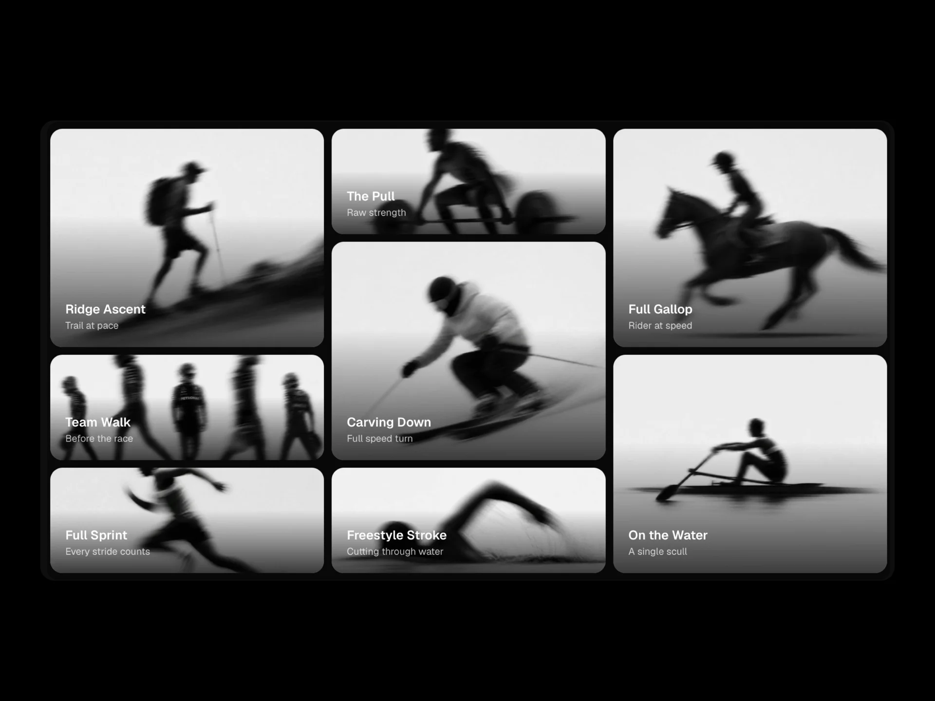
A perfectly aligned image grid with a centered glassmorphism overlay card, heading, subtitle and CTA button, with a staggered blur/slide/fade/scale entrance triggered on scroll into view.
About the Motion Gallery Grid component
Motion Gallery Grid is a free, evenly aligned image grid with a glassmorphism card in the centre holding a heading, subtitle and button. As it scrolls into view the images come in one after another with a blur, slide, fade or scale.
Columns, the entrance animation, dark or light theme and the overlay card are props.
When to use it
Use it as a gallery section with a clear call to action: a photo series, a product range, a portfolio teaser or an event recap.
Installation
Add the Motion Gallery Grid component to your project with the shadcn CLI. It lands in components/motion-gallery-grid.tsx as plain React + Tailwind CSS source you own and can edit.
npx shadcn@latest add @reactframe/motion-gallery-gridOr copy the source by hand and install its dependencies:
npm install motion clsx tailwind-mergeProps
<MotionGalleryGrid /> accepts 9 props, all optional. It also accepts the usual <section> attributes, like className, style, id and aria-*, and passes them to its root element.
| Prop | Type | Default |
|---|---|---|
| items | { image: string; caption?: string }[] | DEFAULT_ITEMS |
| title | string | "Motion,\nCaptured in Stillness" |
| subtitle | string | "A visual study of speed, discipline, and the athletes who chase both." |
| buttonText | string | "Explore the Series" |
| buttonLink | string | "#" |
| theme | "dark" | "light" | "dark" |
| animationType | "blur" | "slide" | "fade" | "scale" | "fade" |
| columns | number | 4 |
| showOverlay | boolean | true |
- items{ image: string; caption?: string }[]Default: DEFAULT_ITEMS
- titlestringDefault: "Motion,\nCaptured in Stillness"
- subtitlestringDefault: "A visual study of speed, discipline, and the athletes who chase both."
- buttonTextstringDefault: "Explore the Series"
- buttonLinkstringDefault: "#"
- theme"dark" | "light"Default: "dark"
- animationType"blur" | "slide" | "fade" | "scale"Default: "fade"
- columnsnumberDefault: 4
- showOverlaybooleanDefault: true
Collections
Use-case pages that compare Motion Gallery Grid with the other components that do a similar job.
npm dependencies
Installed for you by the shadcn CLI.
Motion Gallery Grid FAQ
- Can I turn off the centre card?
- Yes, showOverlay={false} leaves just the grid.
- Which entrance animations are there?
- blur, slide, fade (default) and scale, set with animationType.
- What does each image need?
- image, and an optional caption.