Diagonal Carousel React component
Square cards fan out diagonally into a stacked deck, each inactive card rotates and offsets away from the active one, with paper/glass themes.
About the Diagonal Carousel component
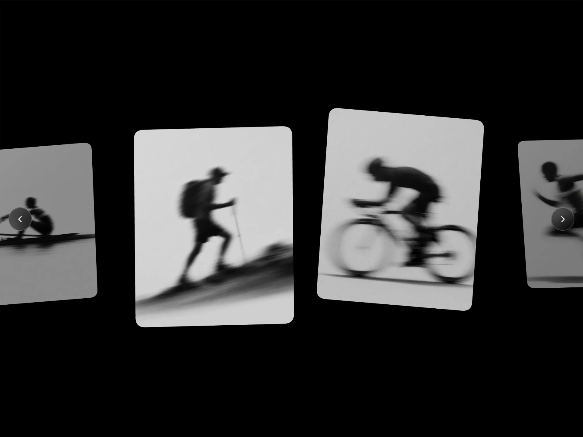
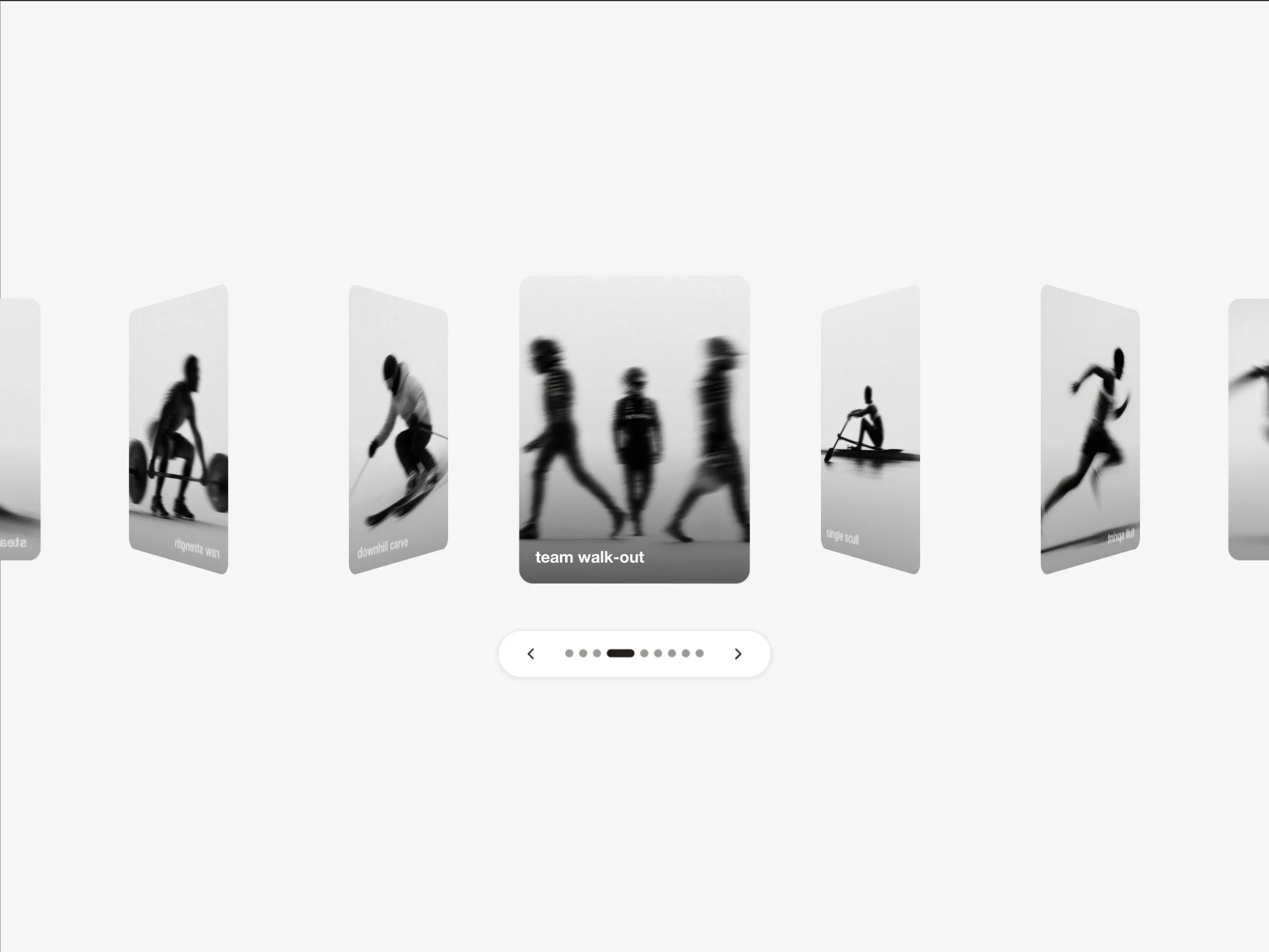
Diagonal Carousel is a free carousel of square cards that fan out diagonally into a stacked deck: each card away from the active one rotates, shifts down and shrinks. Clicking a card or pressing the arrow keys brings it to the front.
It has paper and glass themes, three title positions, and props for card size, radius, rotation angle, vertical offset, inactive scale and the starting card.
When to use it
Use it for a playful set of images: album art, product shots, team photos, travel snaps or project thumbnails, where a fanned deck feels more personal than a grid.
Installation
Add the Diagonal Carousel component to your project with the shadcn CLI. It lands in components/diagonal-carousel.tsx as plain React + Tailwind CSS source you own and can edit.
npx shadcn@latest add @reactframe/diagonal-carouselOr copy the source by hand and install its dependencies:
npm install motion clsx tailwind-mergeProps
<DiagonalCarousel /> accepts 10 props, all optional. It also accepts the usual <div> attributes, like className, style, id and aria-*, and passes them to its root element.
| Prop | Type | Default |
|---|---|---|
| slides | { src: string; title: string }[] | DEFAULT_SLIDES |
| cardSize | number | 280 |
| cardBorderRadius | number | 20 |
| rotateAngle | number | 30 |
| yOffset | number | 50 |
| inactiveScale | number | 0.6 |
| theme | "paper" | "glass" | "paper" |
| titleAlign | "bottom-left" | "bottom-center" | "center" | "bottom-left" |
| titleSize | number | 14 |
| initialIndex | number | 3 |
- slides{ src: string; title: string }[]Default: DEFAULT_SLIDES
- cardSizenumberDefault: 280
- cardBorderRadiusnumberDefault: 20
- rotateAnglenumberDefault: 30
- yOffsetnumberDefault: 50
- inactiveScalenumberDefault: 0.6
- theme"paper" | "glass"Default: "paper"
- titleAlign"bottom-left" | "bottom-center" | "center"Default: "bottom-left"
- titleSizenumberDefault: 14
- initialIndexnumberDefault: 3
Kits
Sets of components designed to be used together on one site, Diagonal Carousel included.
Collections
Use-case pages that compare Diagonal Carousel with the other components that do a similar job.
npm dependencies
Installed for you by the shadcn CLI.
Diagonal Carousel FAQ
- How do I make the fan tighter or wider?
- rotateAngle sets how far each card rotates (30° by default), yOffset how far it drops, and inactiveScale how small the cards behind get.
- Is it keyboard accessible?
- Yes, left and right arrow keys move between cards and the active one is marked aria-current.
- Where does the title go?
- titleAlign places it bottom-left, bottom-center or center on each card.
- What images work best?
- Square images, since the cards are square (cardSize is 280px by default).