Glide Carousel React component
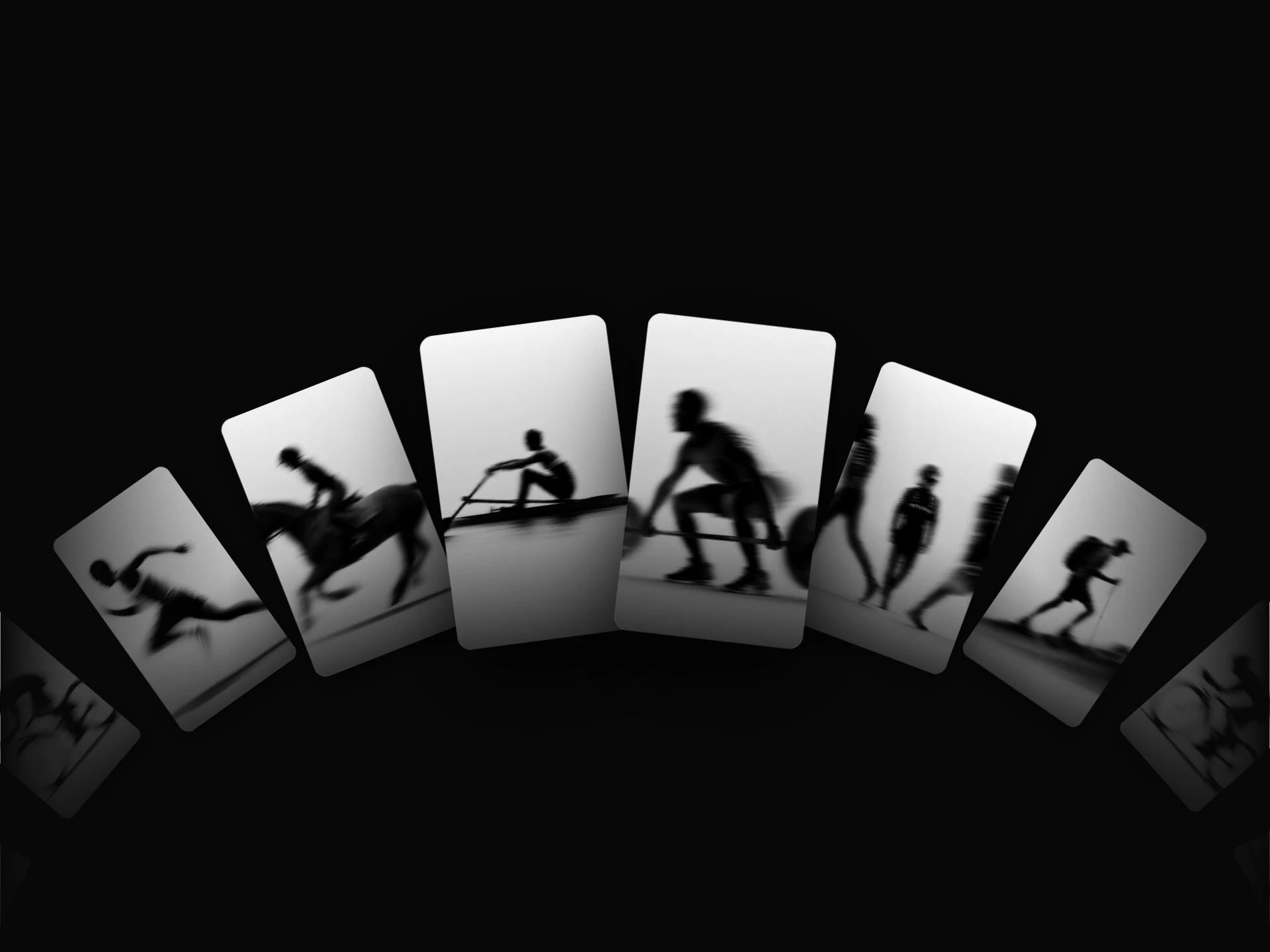
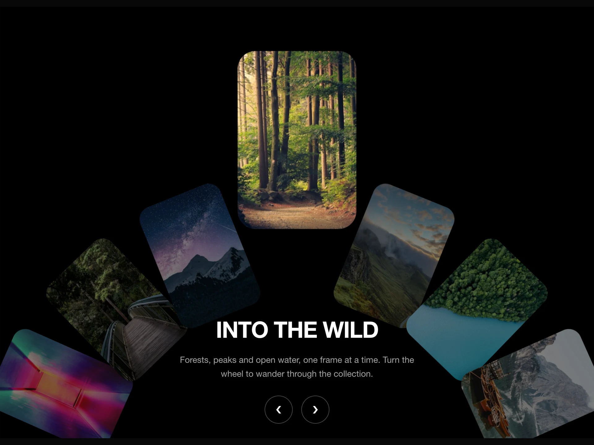
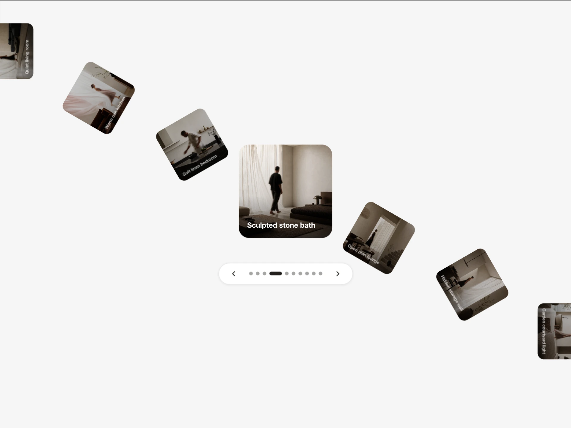
A canvas-rendered, drag-to-scroll carousel with a curved wave layout and ambient wind/drift/magnetic card sway, click-to-open lightbox modal, autoplay, and image/video support.
About the Glide Carousel component
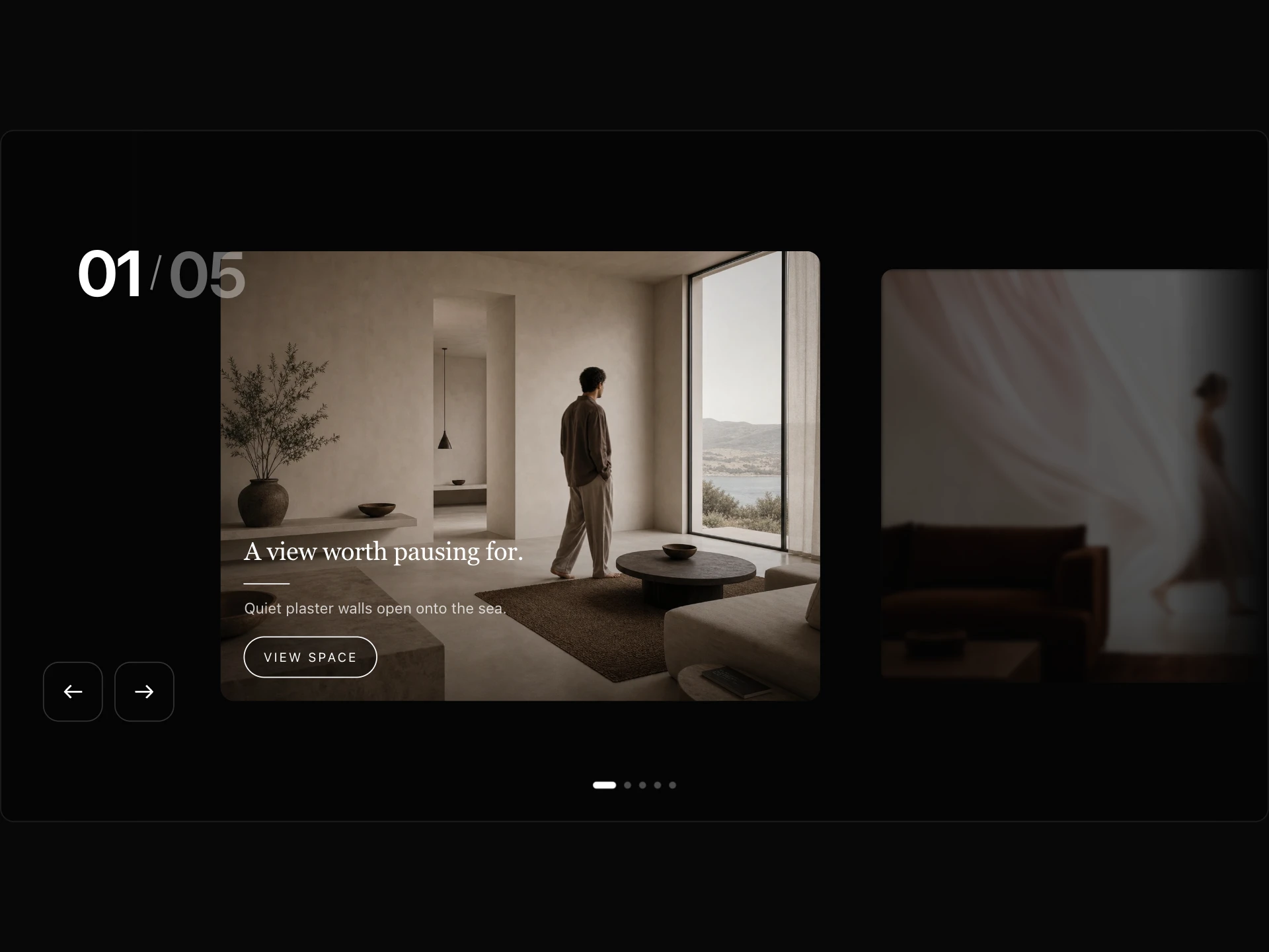
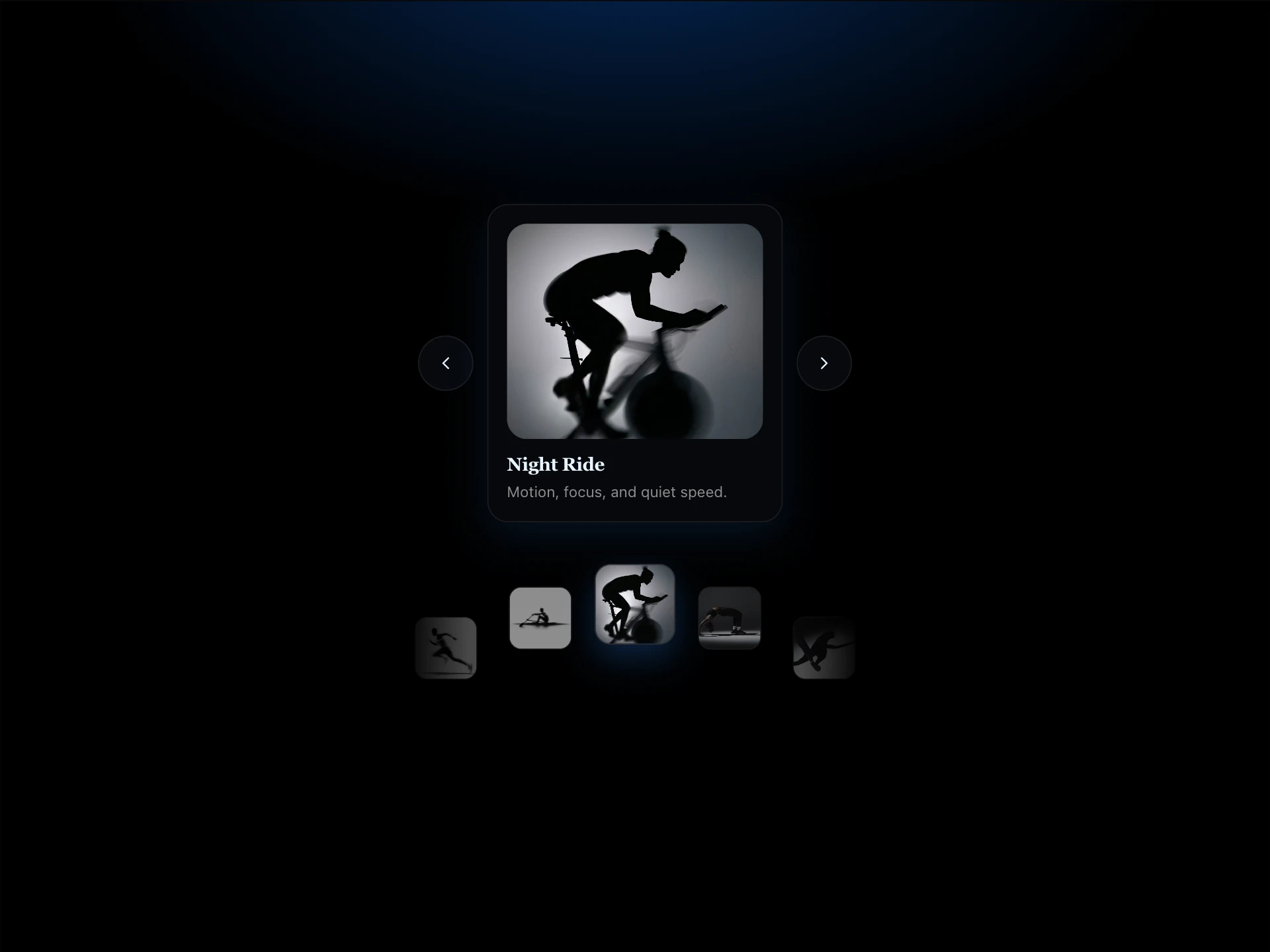
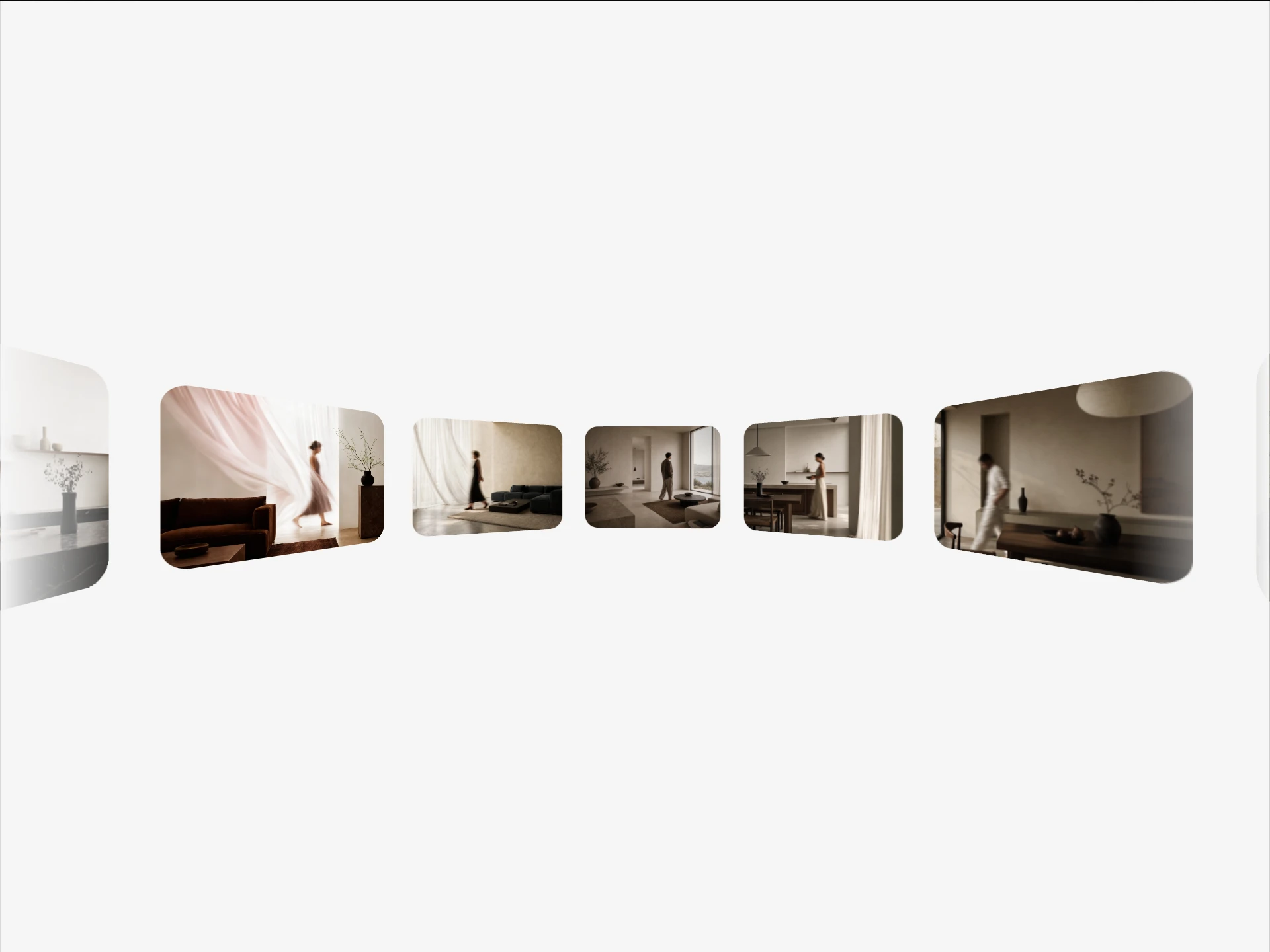
Glide Carousel is a free, canvas-rendered carousel that you drag to scroll, with the cards laid out along a gentle wave and swaying in an ambient wind, drift or magnetic motion. Clicking a card opens it in a lightbox modal, which Escape closes.
It supports images and videos, autoplays in either direction, and takes card size, radius, wave strength, wind mode and strength, gap and inner parallax as props.
When to use it
Use it for immersive galleries on creative, travel and product sites where the motion of the strip is part of the experience.
Because it draws to a canvas, pair it with real text content on the page; for a gallery whose images should be indexed as images, prefer an HTML-based carousel.
Installation
Add the Glide Carousel component to your project with the shadcn CLI. It lands in components/glide-carousel.tsx as plain React + Tailwind CSS source you own and can edit.
npx shadcn@latest add @reactframe/glide-carouselOr copy the source by hand and install its dependencies:
npm install clsx tailwind-mergeProps
<GlideCarousel /> accepts 14 props, all optional. It also accepts the usual <div> attributes, like className, style, id and aria-*, and passes them to its root element.
| Prop | Type | Default |
|---|---|---|
| items | { src: string; type?: "image" | "video"; title?: string; description?: string }[] | DEFAULT_ITEMS |
| cardWidth | number | 320 |
| cardHeight | number | 420 |
| cardRadius | number | 20 |
| waveStrength | number | 18 |
| bgColor | string | "#000000" |
| autoPlay | boolean | true |
| autoPlaySpeed | number | 1 |
| autoPlayDirection | "right" | "left" | "right" |
| showArrows | boolean | true |
| gap | number | 32 |
| windStrength | number | 1.0 |
- items{ src: string; type?: "image" | "video"; title?: string; description?: string }[]Default: DEFAULT_ITEMS
- cardWidthnumberDefault: 320
- cardHeightnumberDefault: 420
- cardRadiusnumberDefault: 20
- waveStrengthnumberDefault: 18
- bgColorstringDefault: "#000000"
- autoPlaybooleanDefault: true
- autoPlaySpeednumberDefault: 1
- autoPlayDirection"right" | "left"Default: "right"
- showArrowsbooleanDefault: true
- gapnumberDefault: 32
- windStrengthnumberDefault: 1.0
Show all 14 propsShow fewer
| windMode | "wind" | "drift" | "magnetic" | "none" | "wind" |
| parallaxInner | boolean | true |
- windMode"wind" | "drift" | "magnetic" | "none"Default: "wind"
- parallaxInnerbooleanDefault: true
Collections
Use-case pages that compare Glide Carousel with the other components that do a similar job.
npm dependencies
Installed for you by the shadcn CLI.
Glide Carousel FAQ
- Can it show videos?
- Yes, set type: "video" on an item; items default to images.
- How do I turn off the sway?
- Set windMode="none", or lower windStrength.
- Can it autoplay to the left?
- Yes, autoPlayDirection="left"; autoPlaySpeed sets the speed.
- What happens when a card is clicked?
- It opens in a lightbox dialog; Escape or the close button returns to the carousel.