Flip Price Cards React component
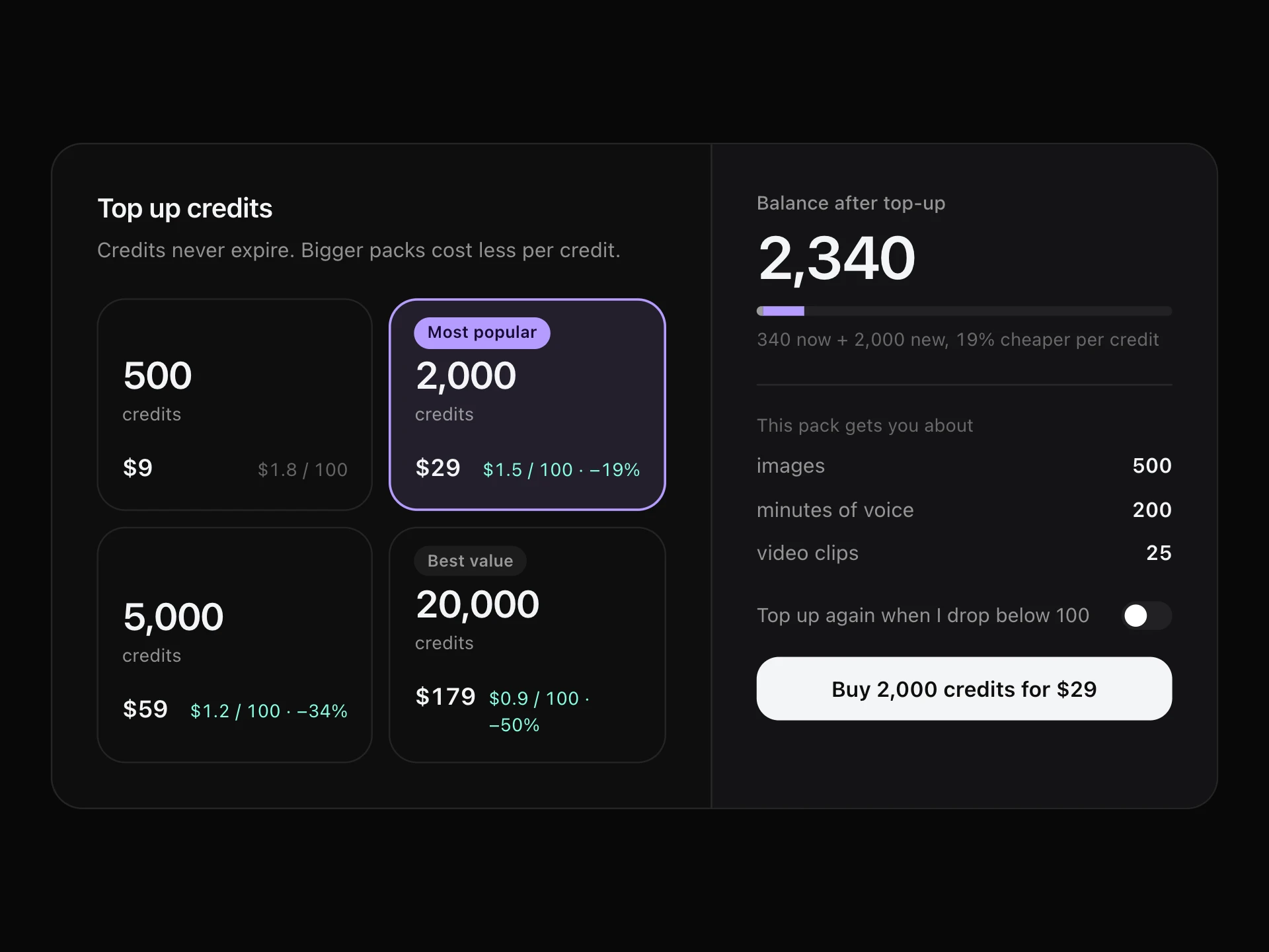
Pricing cards that keep the front clean: a big price on one side, and a springy 3D flip on hover or tap to reveal what's included and the call to action.
About the Flip Price Cards component
Flip Price Cards keep the first look simple: just the plan and a big price. Hover or tap and the card flips with a springy 3D turn to show what's included and the button to buy.
Hiding the feature lists until they're wanted makes the row easy to compare by price, which suits products with few plans and short lists.
When to use it
Use it for landing pages, product launches and playful brands with two to four plans.
For detailed plan comparison, use a pricing table so every feature is visible at once.
Installation
Add the Flip Price Cards component to your project with the shadcn CLI. It lands in components/flip-price-cards.tsx as plain React + Tailwind CSS source you own and can edit.
npx shadcn@latest add @reactframe/flip-price-cardsOr copy the source by hand and install its dependencies:
npm install clsx tailwind-mergeProps
<FlipPriceCards /> accepts 7 props, all optional. It also accepts the usual <div> attributes, like className, style, id and aria-*, and passes them to its root element.
| Prop | Type | Default |
|---|---|---|
| theme | "dark" | "light" | "dark" |
| title | string | "Simple plans, nothing hidden" |
| plans | { name: string; tagline: string; monthly: number; yearly: number; features: string[]; cta?: string; featured?: boolean }[] | DEFAULT_PLANS |
| currency | string | "$" |
| cardHeight Height of each card, in px. | number | 340 |
| flipOnHover Flip on hover with a mouse; a click or tap always flips. | boolean | true |
| onSelect | (plan: FlipPlan, yearly: boolean) => void | — |
- theme"dark" | "light"Default: "dark"
- titlestringDefault: "Simple plans, nothing hidden"
- plans{ name: string; tagline: string; monthly: number; yearly: number; features: string[]; cta?: string; featured?: boolean }[]Default: DEFAULT_PLANS
- currencystringDefault: "$"
- cardHeight
Height of each card, in px.
numberDefault: 340 - flipOnHover
Flip on hover with a mouse; a click or tap always flips.
booleanDefault: true - onSelect(plan: FlipPlan, yearly: boolean) => void
npm dependencies
Installed for you by the shadcn CLI.
Flip Price Cards FAQ
- How do people flip a card on a phone?
- Tap What's included; the button on the back flips it again. Hover flipping only applies to a mouse.
- Can I turn off hover?
- Yes, flipOnHover={false} makes it flip only with the button.
- Is the hidden side reachable by keyboard?
- No, the hidden face is inert, so Tab only reaches the visible buttons.
- What about reduced motion?
- The card switches sides instantly without the 3D turn.