Pricing Spotlight Carousel React component
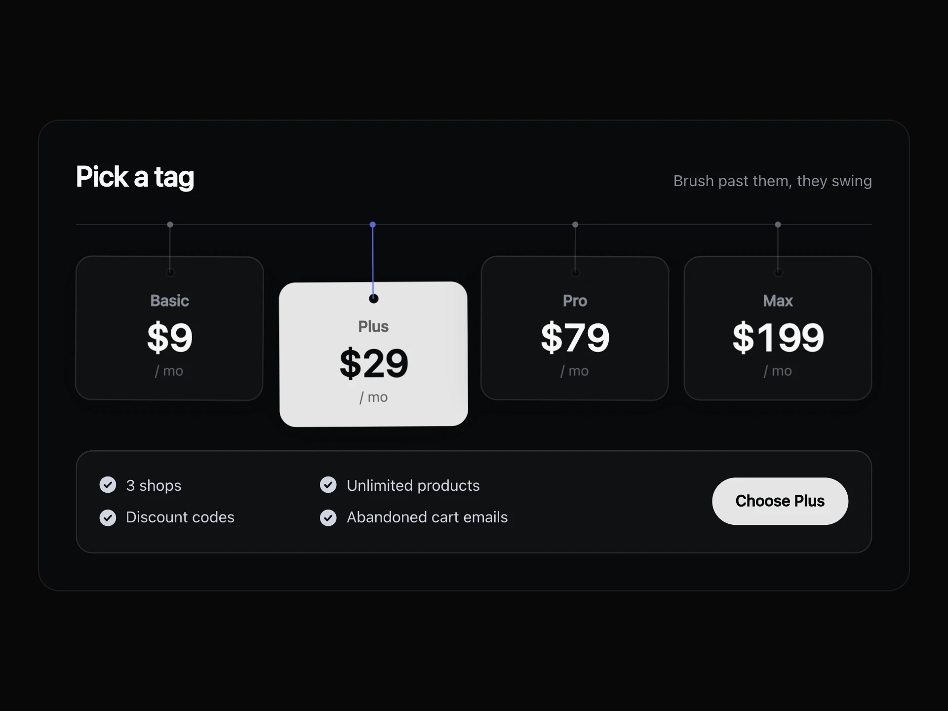
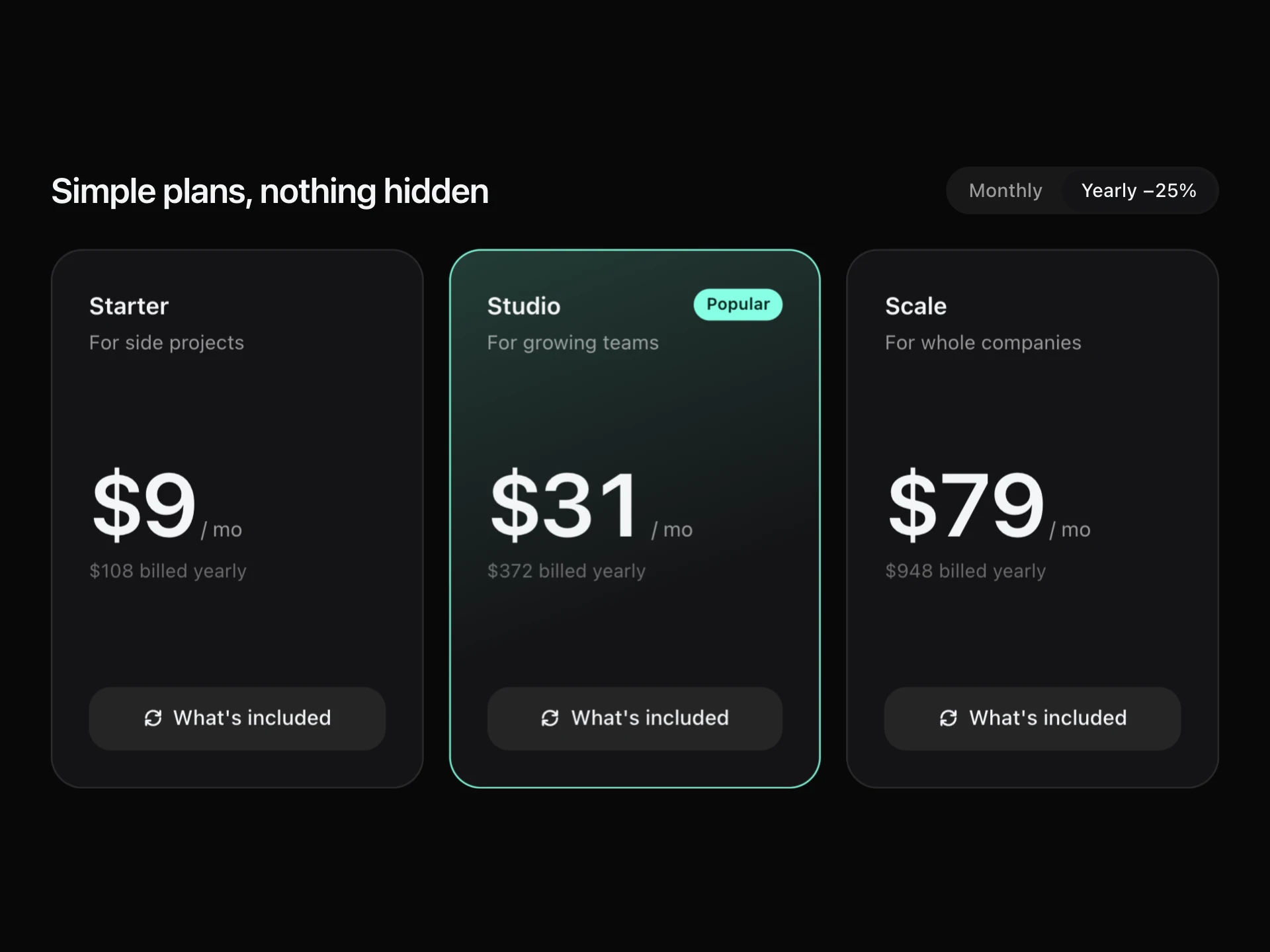
A looping plan carousel with one card in the spotlight: neighbours recede and blur, the active card glows in its own colour with a light that follows the pointer, and you can swipe, click or use the arrow keys.
About the Pricing Spotlight Carousel component
Pricing Spotlight Carousel shows one plan at a time without hiding the others: the active card stands in the spotlight with a glow in its own colour, while its neighbours recede, shrink and blur on either side.
Swipe, click a neighbour, use the arrows or dots or press the arrow keys, and it loops in both directions. A soft light follows the pointer across the active card.
When to use it
Use it on mobile-first pricing pages, product launches and when you have four or more plans that won't fit side by side.
When people need to compare plans at a glance, show them in a table.
Installation
Add the Pricing Spotlight Carousel component to your project with the shadcn CLI. It lands in components/pricing-spotlight-carousel.tsx as plain React + Tailwind CSS source you own and can edit.
npx shadcn@latest add @reactframe/pricing-spotlight-carouselOr copy the source by hand and install its dependencies:
npm install clsx tailwind-mergeProps
<PricingSpotlightCarousel /> accepts 7 props, all optional. It also accepts the usual <div> attributes, like className, style, id and aria-*, and passes them to its root element.
| Prop | Type | Default |
|---|---|---|
| theme | "dark" | "light" | "dark" |
| title | string | "Find your fit" |
| plans | { name: string; description: string; monthly: number; yearly: number; features: string[]; color?: string; cta?: string }[] | DEFAULT_PLANS |
| defaultIndex Index of the plan in the spotlight first. | number | 1 |
| currency | string | "$" |
| height Height of the stage, in px. | number | 430 |
| onSelect | (plan: SpotlightPlan, yearly: boolean) => void | — |
- theme"dark" | "light"Default: "dark"
- titlestringDefault: "Find your fit"
- plans{ name: string; description: string; monthly: number; yearly: number; features: string[]; color?: string; cta?: string }[]Default: DEFAULT_PLANS
- defaultIndex
Index of the plan in the spotlight first.
numberDefault: 1 - currencystringDefault: "$"
- height
Height of the stage, in px.
numberDefault: 430 - onSelect(plan: SpotlightPlan, yearly: boolean) => void
npm dependencies
Installed for you by the shadcn CLI.
Pricing Spotlight Carousel FAQ
- How do I colour each plan?
- Set color on a plan; it drives the name, ticks, glow, dot and pointer light. Without it, the theme's colours are used in turn.
- Does it loop?
- Yes, each card takes the shortest way around, so it wraps in both directions.
- Does it work on phones?
- Yes, swipe sideways to change plans; vertical scrolling still scrolls the page.
- Is it accessible?
- It's marked up as a carousel, cards out of the spotlight are hidden and inert, and the left and right keys work when the stage has focus.