Floating Label Input React component
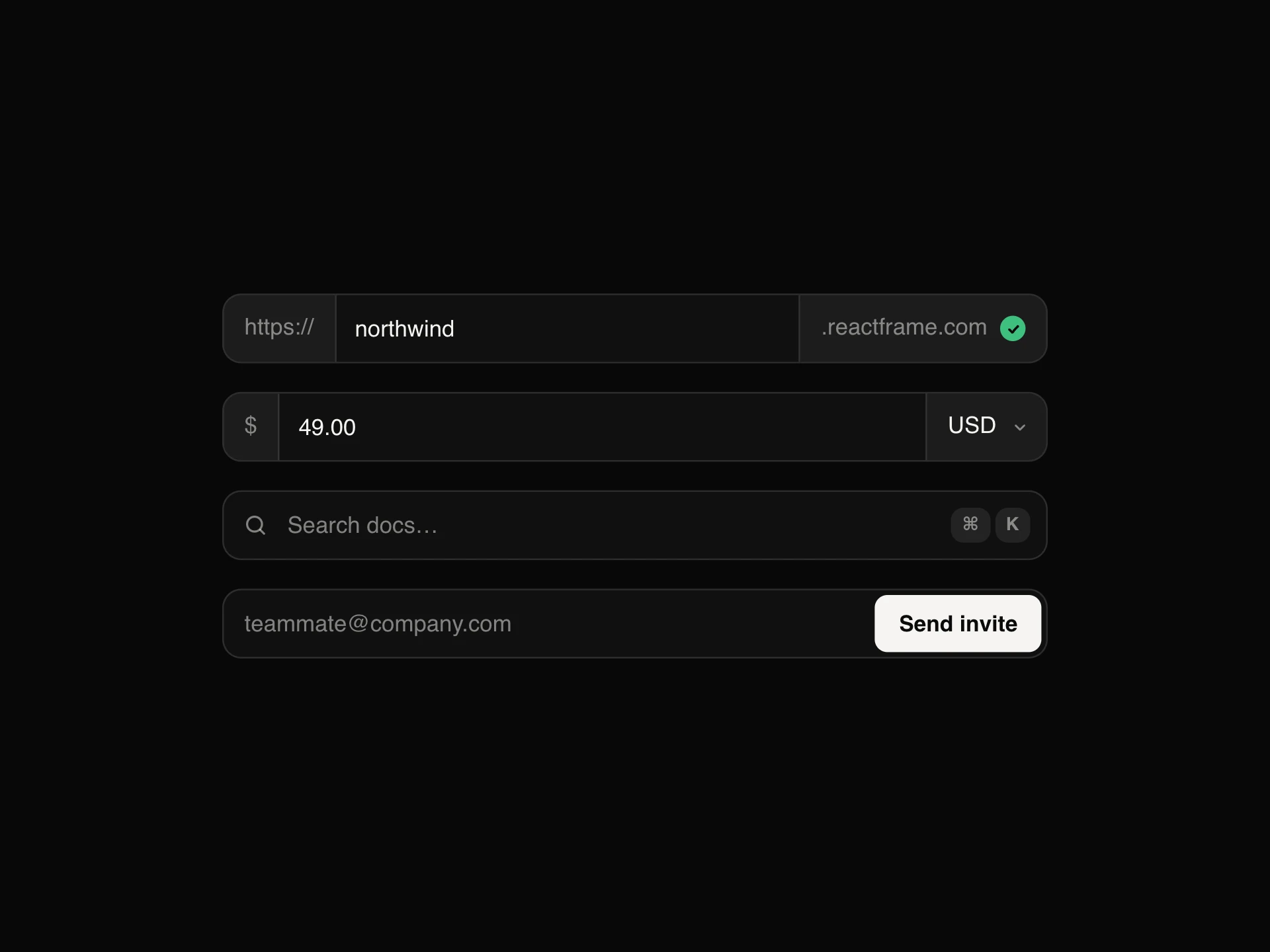
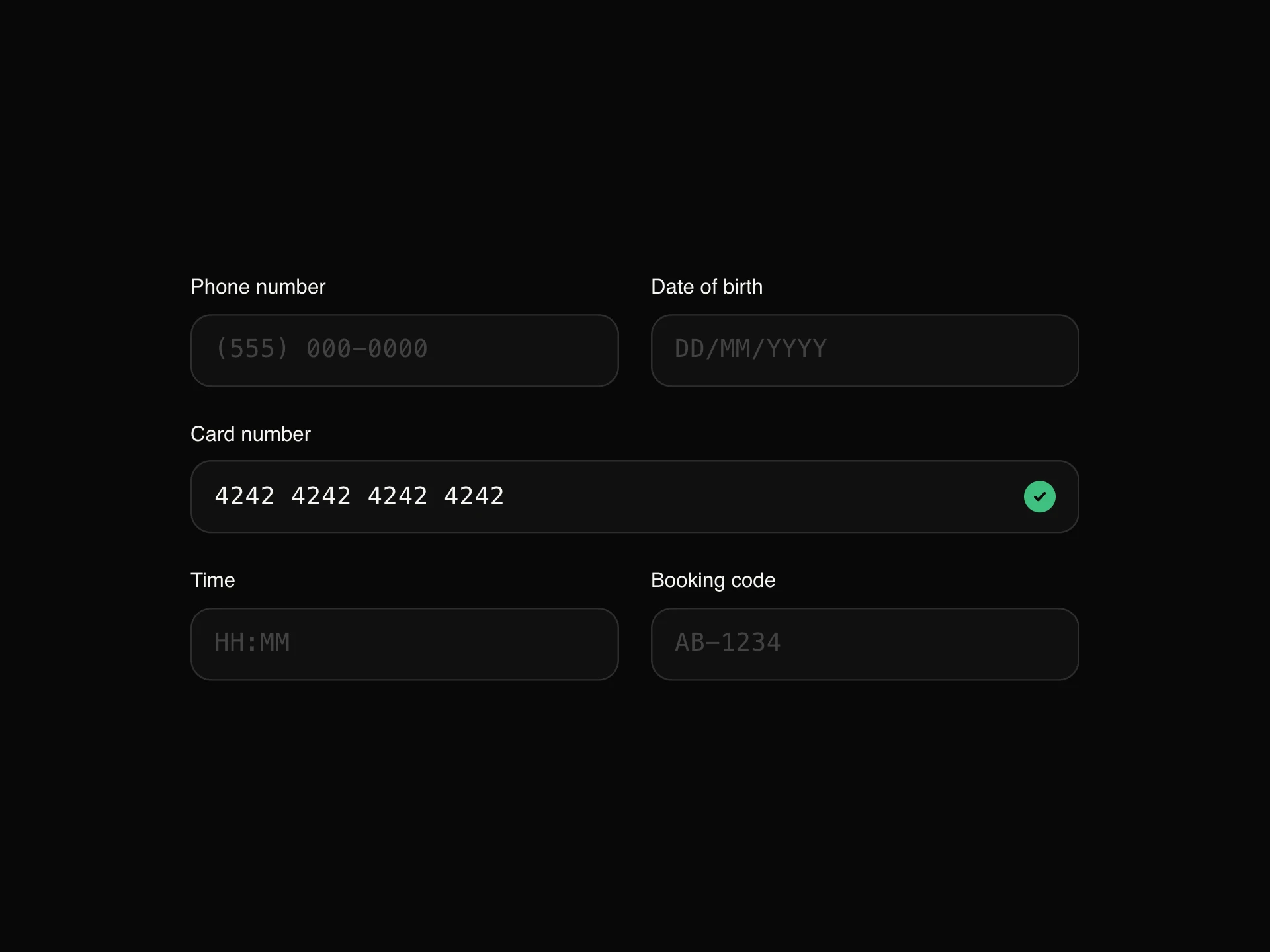
A text field whose label sits inside it and floats up on focus or once filled, in outlined (label in a notch in the border), filled or underline styles, with an optional icon, clear button, validity tick, character count, helper text and a shake on error.
When to use the Floating Label Input component
Use Floating Label Input in compact forms (sign-up, checkout, settings) where a label above every field takes too much room but a placeholder alone would disappear once people type.
Set surface to the background behind outlined fields so the label's notch blends in.
Installation
Add the Floating Label Input component to your project with the shadcn CLI. It lands in components/floating-label-input.tsx as plain React + Tailwind CSS source you own and can edit.
npx shadcn@latest add https://reactframe.com/r/floating-label-input.jsonOr copy the source by hand and install its dependencies:
npm install motion clsx tailwind-mergeProps
<FloatingLabelInput /> accepts 15 props (required ones are marked *).
| Prop | Type | Default |
|---|---|---|
| label* | string | — |
| value | string | — |
| defaultValue | string | "" |
| onValueChange | (value: string) => void | — |
| variant outlined: label sits in a notch in the border. filled: shaded field. underline: a line that grows on focus. | "outlined" | "filled" | "underline" | "outlined" |
| helperText | string | — |
| error | string | — |
| valid Shows a green tick (e.g. after validation passes). | boolean | false |
| icon | React.ReactNode | — |
| clearable | boolean | false |
| showCount Show "12 / 40" when maxLength is set. | boolean | false |
| size | "sm" | "md" | "lg" | "md" |
- label*string
- valuestring
- defaultValuestringDefault: ""
- onValueChange(value: string) => void
- variant
outlined: label sits in a notch in the border. filled: shaded field. underline: a line that grows on focus.
"outlined" | "filled" | "underline"Default: "outlined" - helperTextstring
- errorstring
- valid
Shows a green tick (e.g. after validation passes).
booleanDefault: false - iconReact.ReactNode
- clearablebooleanDefault: false
- showCount
Show "12 / 40" when maxLength is set.
booleanDefault: false - size"sm" | "md" | "lg"Default: "md"
Show all 15 propsShow fewer
| surface Background behind the field, used to cut the outlined notch. | string | — |
| theme | "dark" | "light" | "dark" |
| className | string | — |
- surface
Background behind the field, used to cut the outlined notch.
string - theme"dark" | "light"Default: "dark"
- classNamestring
FAQ
- Is the label still a real label?
- Yes. It's a <label> tied to the input, so clicking it focuses the field and screen readers announce it; it only moves visually.
- What's the surface prop for?
- In the outlined style the floating label cuts the border with a background patch; surface is that colour, and should match what's behind the field.
- How are errors shown?
- The border and label turn coral, the field shakes once and the message replaces the helper text, linked to the input for assistive tech.