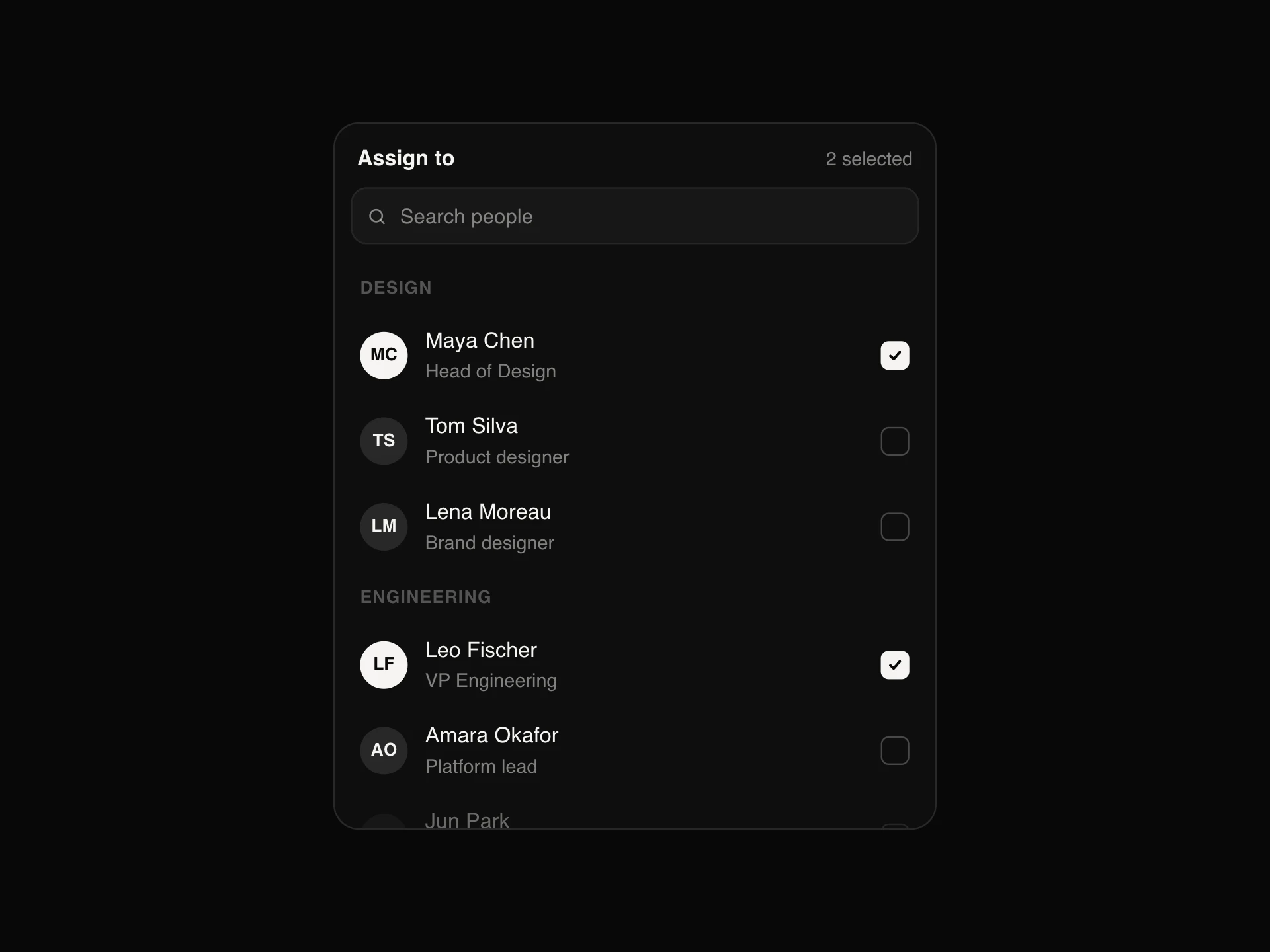
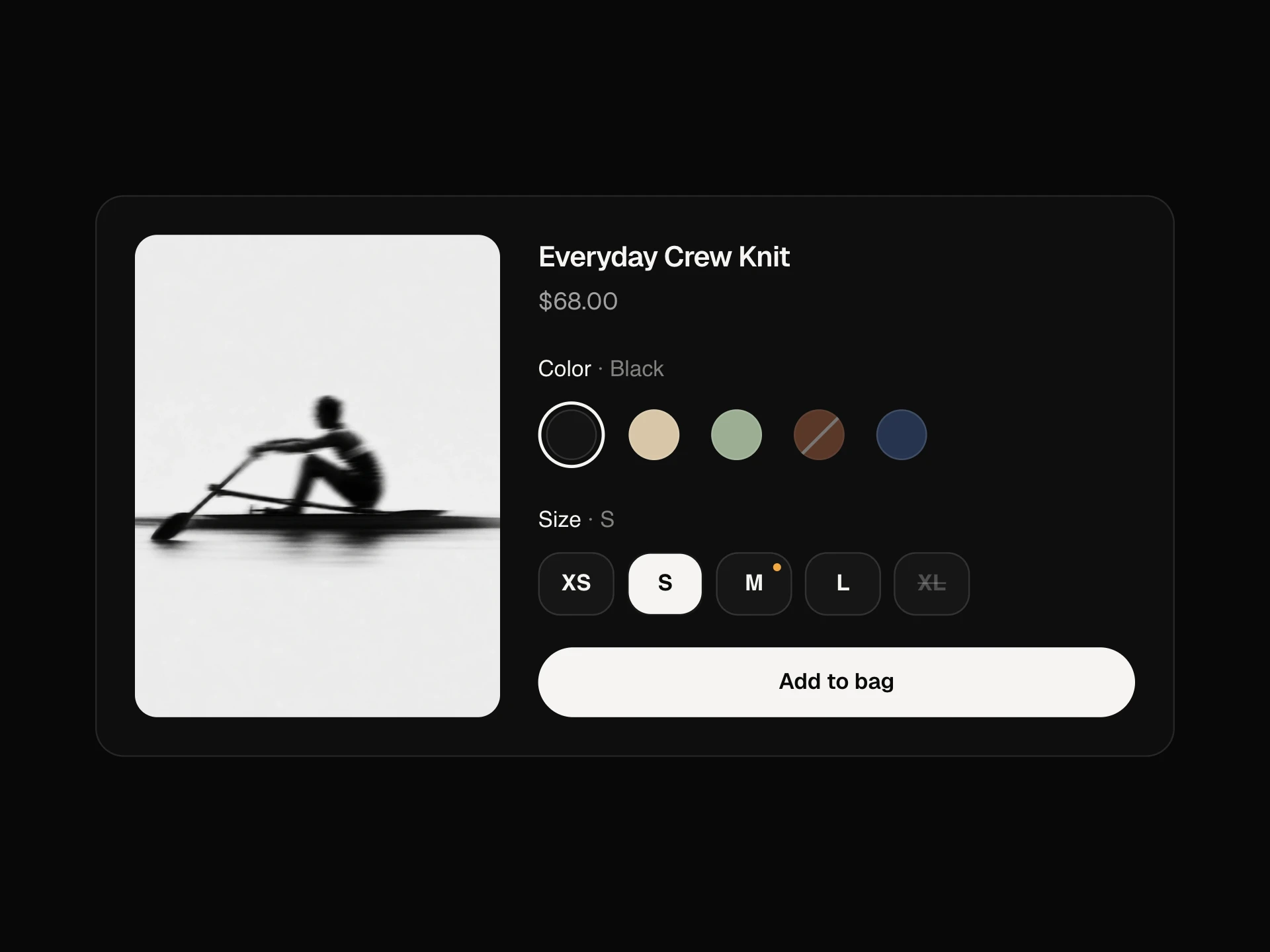
Input Group React component
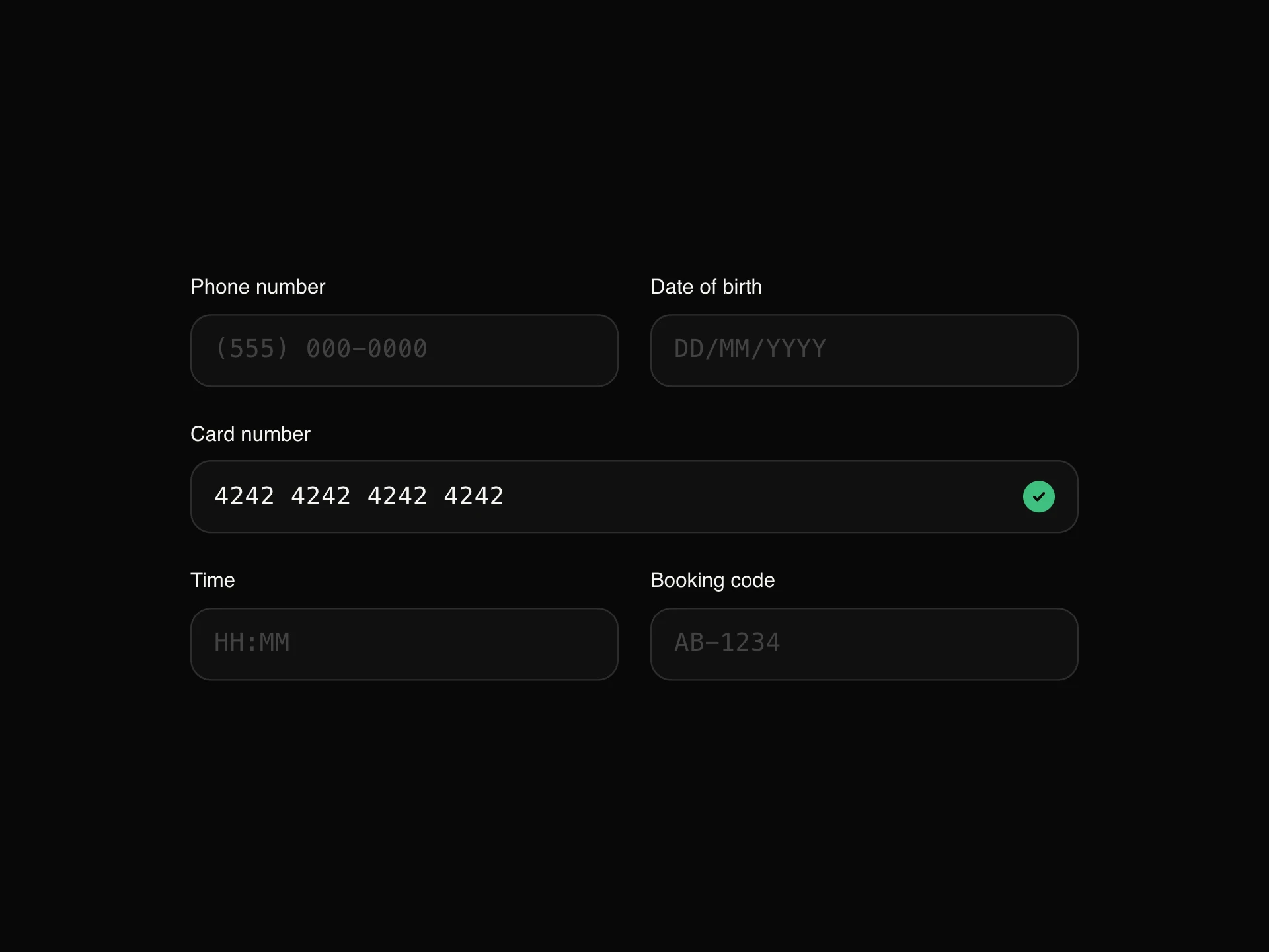
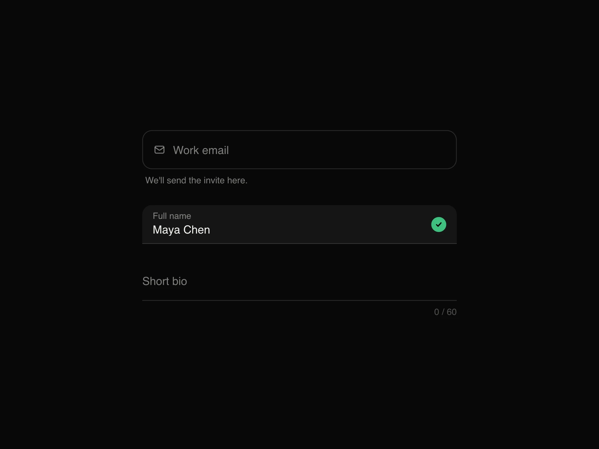
Joins an input with text addons, icons, a select or a button into one field with one border and one focus ring: https:// and .com around a subdomain with a live availability tick, a price with a currency picker, a search with a shortcut, an invite with a send button.
When to use the Input Group component
Use Input Group when an input needs context or an action attached to it: URL and domain fields, prices with currency, units (kg, px, %), search with a shortcut, newsletter and invite fields with their button.
Keep addons short; labels still belong outside the group (or as aria-label on the input).
Installation
Add the Input Group component to your project with the shadcn CLI. It lands in components/input-group.tsx as plain React + Tailwind CSS source you own and can edit.
npx shadcn@latest add https://reactframe.com/r/input-group.jsonOr copy the source by hand and install its dependencies:
npm install motion clsx tailwind-mergeProps
<InputGroup /> accepts 5 props, all optional.
| Prop | Type | Default |
|---|---|---|
| children | React.ReactNode | — |
| size | "sm" | "md" | "lg" | "md" |
| error Error message; turns the frame coral and shows under it. | string | — |
| theme | "dark" | "light" | "dark" |
| className | string | — |
- childrenReact.ReactNode
- size"sm" | "md" | "lg"Default: "md"
- error
Error message; turns the frame coral and shows under it.
string - theme"dark" | "light"Default: "dark"
- classNamestring
FAQ
- Why one focus ring for the whole group?
- The addons and button are part of the same field, so the frame lights up as one piece when anything inside has focus, instead of just the text box.
- Can I mix several addons?
- Yes. Put addons, inputs, a select and a button in any order; dividers and borders line up automatically.
- How do I show an error?
- Pass error to InputGroup: the frame turns coral and the message appears underneath, linked to the group.