Glare Card React component
A 3D tilt card that reacts to the cursor with animated conic-gradient reflections, diamond, holographic or aurora reflex styles.
About the Glare Card component
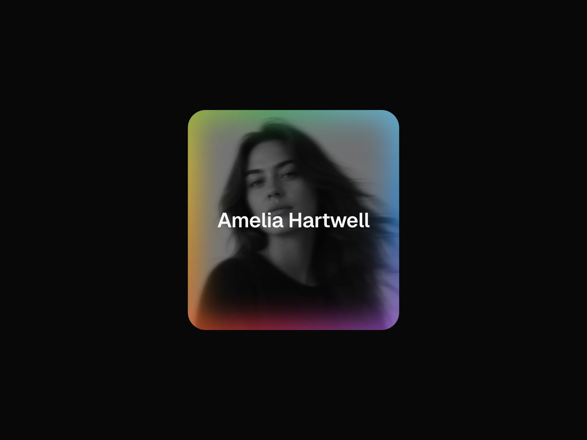
Glare Card is a free 3D tilt card: as the cursor moves over it, the card rotates toward the pointer on a spring, scales up slightly, shifts its shadow, and layers conic-gradient reflections, a soft spotlight and a linear glare over the image. On mouse leave everything settles back flat.
reflexMode picks the reflection style: "diamond" (thin white facet lines plus a star burst), "holographic" (rainbow hues that rotate with the cursor angle) or "aurora" (purple, teal and green bands). tiltIntensity, reflexIntensity, spotRadius and borderRadius tune the effect, and title and subtitle sit on a dark bottom gradient that showText={false} removes. It is built on motion and fills its parent, so give the wrapper a size.
When to use it
Use it for collectible or trading-card style visuals, featured product shots, pricing tier highlights and portfolio covers where a tactile hover adds something. The effect is driven by mouse events only, so on touch screens it shows as a static card.
Installation
Add the Glare Card component to your project with the shadcn CLI. It lands in components/glare-card.tsx as plain React + Tailwind CSS source you own and can edit.
npx shadcn@latest add @reactframe/glare-cardOr copy the source by hand and install its dependencies:
npm install motion clsx tailwind-mergeProps
<GlareCard /> accepts 9 props, all optional. It also accepts the usual <div> attributes, like className, style, id and aria-*, and passes them to its root element.
| Prop | Type | Default |
|---|---|---|
| title | string | "Glare Card" |
| subtitle | string | "Dynamic tilt motion with animated conic gradient overlays and cinematic reflections." |
| image | string | — |
| tiltIntensity | number | 18 |
| reflexMode | "diamond" | "holographic" | "aurora" | "diamond" |
| reflexIntensity | number | 0.75 |
| spotRadius | number | 140 |
| showText | boolean | true |
| borderRadius | number | 20 |
- titlestringDefault: "Glare Card"
- subtitlestringDefault: "Dynamic tilt motion with animated conic gradient overlays and cinematic reflections."
- imagestring
- tiltIntensitynumberDefault: 18
- reflexMode"diamond" | "holographic" | "aurora"Default: "diamond"
- reflexIntensitynumberDefault: 0.75
- spotRadiusnumberDefault: 140
- showTextbooleanDefault: true
- borderRadiusnumberDefault: 20
npm dependencies
Installed for you by the shadcn CLI.
Glare Card FAQ
- How do I change the reflection style?
- Set reflexMode to "diamond" (the default), "holographic" or "aurora".
- How do I make the tilt stronger or subtler?
- tiltIntensity sets the maximum rotation in degrees (default 18); vertical tilt is scaled to 78% of it. reflexIntensity (default 0.75) controls how bright the reflections get.
- What shows when I don't pass an image?
- A dark blue to purple gradient. The image prop is applied as a CSS background with background-size: cover, so it has no alt text; put any meaningful text in title and subtitle.
- Why is the card not visible?
- Its root is h-full w-full, so it takes the size of its parent. Wrap it in an element with a fixed width and height or an aspect ratio.