Dot Screen Reveal React component
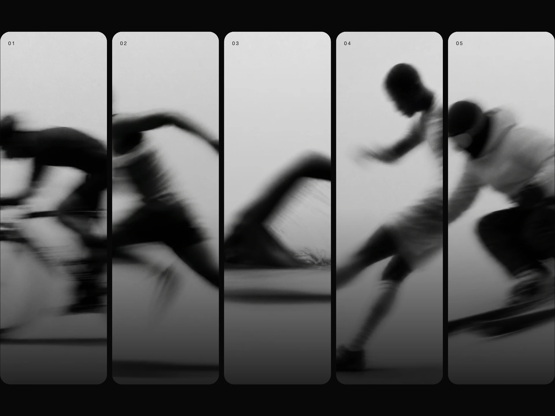
A photo printed as a halftone dot screen that develops into the real image under your pointer: dots swell into each other and melt away in a soft window that follows the cursor, then the screen slowly grows back behind it.
About the Dot Screen Reveal component
Dot Screen Reveal shows a photo printed as a halftone, the dot pattern of newspapers and screen prints, with every dot sized by the tone underneath and coloured from the photo itself.
Under the pointer the dots swell into each other and melt away in a soft round window, so the real photo seems to develop out of the screen. When the pointer moves on, the dots grow back slowly, leaving a fading trail where you've been.
When to use it
Use it for editorial and magazine sites, photographers and agencies, album and poster pages, or a product reveal that rewards a bit of exploring.
Pick a photo with a clear subject and strong contrast; halftone flattens fine detail.
Installation
Add the Dot Screen Reveal component to your project with the shadcn CLI. It lands in components/dot-screen-reveal.tsx as plain React + Tailwind CSS source you own and can edit.
npx shadcn@latest add @reactframe/dot-screen-revealOr copy the source by hand and install its dependencies:
npm install clsx tailwind-mergeProps
<DotScreenReveal /> accepts 9 props (required ones are marked *). It also accepts the usual <div> attributes, like className, style, id and aria-*, and passes them to its root element.
| Prop | Type | Default |
|---|---|---|
| src* The image under the dot screen. Cross-origin images need CORS headers for colour dots. | string | — |
| alt | string | "" |
| spacing Distance between dots, in px. | number | 10 |
| radius Radius of the window the pointer opens, in px. | number | 150 |
| variant "color" dots take the image's colours; "mono" dots are all one ink colour. | "color" | "mono" | "color" |
| paper Colour of the paper behind the dots. | string | "#0b0b0d" |
| ink Colour of the dots in the mono variant. | string | "#f2efe6" |
| heal How long the screen takes to grow back over a revealed area, in ms (0 = right away). | number | 1600 |
| children | React.ReactNode | — |
- src*
The image under the dot screen. Cross-origin images need CORS headers for colour dots.
string - altstringDefault: ""
- spacing
Distance between dots, in px.
numberDefault: 10 - radius
Radius of the window the pointer opens, in px.
numberDefault: 150 - variant
"color" dots take the image's colours; "mono" dots are all one ink colour.
"color" | "mono"Default: "color" - paper
Colour of the paper behind the dots.
stringDefault: "#0b0b0d" - ink
Colour of the dots in the mono variant.
stringDefault: "#f2efe6" - heal
How long the screen takes to grow back over a revealed area, in ms (0 = right away).
numberDefault: 1600 - childrenReact.ReactNode
npm dependencies
Installed for you by the shadcn CLI.
Dot Screen Reveal FAQ
- Can I use any image?
- Yes. Images on your own site work as they are. Images from another domain need CORS headers for colour dots; without them the screen falls back to even ink dots, and the reveal still shows the real photo.
- Can I change the look?
- spacing sets the gap between dots, variant picks colour dots or one-colour 'mono' dots, ink is the mono colour and paper the colour behind. On dark paper bright areas get big dots, on light paper dark areas do, like real print.
- How long does the trail last?
- heal is how long, in milliseconds, the screen takes to grow back over a revealed spot. Set it to 0 for a window that only shows what's under the pointer, and radius sets the window's size.
- What about phones and reduced motion?
- A tap or drag reveals under your finger (add touch-none if you want dragging not to scroll the page). With reduced motion turned on the window opens and closes without easing or a trail.