Tilt Text React component
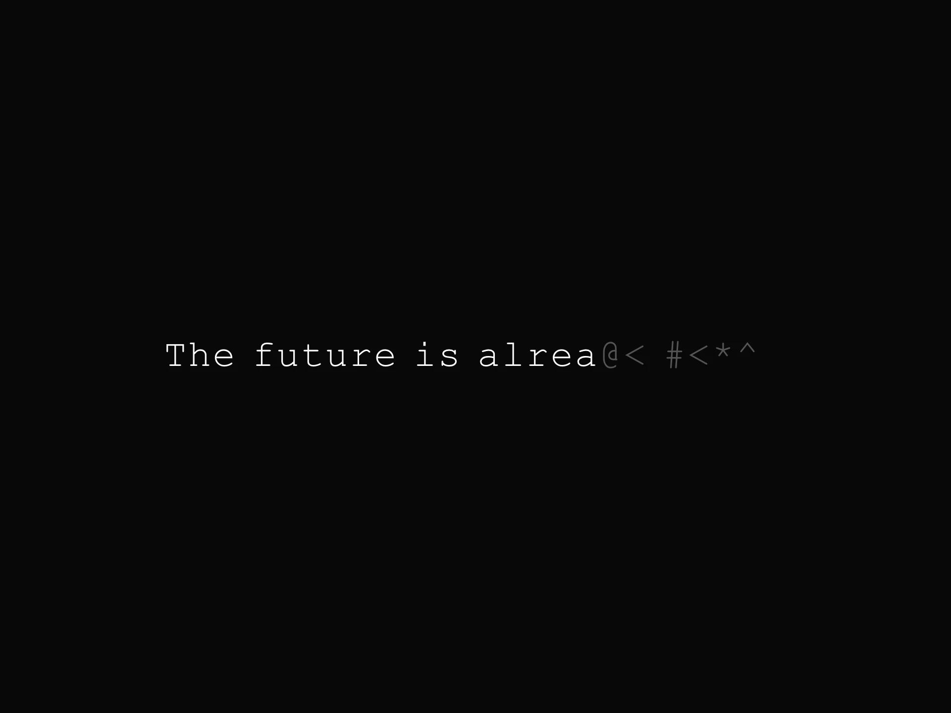
Large display text that tilts and scales in 3D toward the cursor, with smoothed spring-like motion and optional gradient fill.
About the Tilt Text component
Tilt Text is a free display-type effect: a large line of text rotates in 3D toward the pointer and scales up slightly while hovered, then eases back flat when the pointer leaves. It is real DOM text, so screen readers and search engines read it like any other text, and the motion is written directly to the transform each frame without re-rendering React.
text supports line breaks with \n, and fontSize, fontWeight, fontFamily, letterSpacing, lineHeight and textColor style it. autoFit sizes it to the container instead, leaving fitPadding percent on each side. tiltStrength is the maximum rotation in degrees, perspectiveDepth the CSS perspective and smoothing how quickly the tilt follows, and scaleOnHover with scaleAmount sets the zoom. useGradient fills the letters with a horizontal, vertical, diagonal or radial gradient toward gradientColorTo.
When to use it
Use it for a hero headline, a 404 or 'coming soon' message, or a big closing statement on a landing page, where one short phrase should feel tactile.
For a wobbly, melting look use Liquid Text. For text made of particles, use Particle Text.
Installation
Add the Tilt Text component to your project with the shadcn CLI. It lands in components/tilt-text.tsx as plain React + Tailwind CSS source you own and can edit.
npx shadcn@latest add @reactframe/tilt-textOr copy the source by hand and install its dependencies:
npm install clsx tailwind-mergeProps
<TiltText /> accepts 18 props, all optional. It also accepts the usual <div> attributes, like className, style, id and aria-*, and passes them to its root element.
| Prop | Type | Default |
|---|---|---|
| text | string | "WOAH THERE" |
| fontSize | number | 140 |
| autoFit | boolean | false |
| fitPadding | number | 8 |
| fontWeight | string | "700" |
| fontFamily | string | "Inter, sans-serif" |
| letterSpacing | number | -3 |
| lineHeight | number | 1.1 |
| textColor | string | "#ffffff" |
| backgroundColor | string | "#0a0a0a" |
| useGradient | boolean | false |
| gradientColorTo | string | "#ff55ee" |
- textstringDefault: "WOAH THERE"
- fontSizenumberDefault: 140
- autoFitbooleanDefault: false
- fitPaddingnumberDefault: 8
- fontWeightstringDefault: "700"
- fontFamilystringDefault: "Inter, sans-serif"
- letterSpacingnumberDefault: -3
- lineHeightnumberDefault: 1.1
- textColorstringDefault: "#ffffff"
- backgroundColorstringDefault: "#0a0a0a"
- useGradientbooleanDefault: false
- gradientColorTostringDefault: "#ff55ee"
Show all 18 propsShow fewer
| gradientDirection | "horizontal" | "vertical" | "diagonal" | "radial" | "horizontal" |
| perspectiveDepth | number | 900 |
| tiltStrength | number | 60 |
| smoothing | number | 0.08 |
| scaleOnHover | boolean | true |
| scaleAmount | number | 1.05 |
- gradientDirection"horizontal" | "vertical" | "diagonal" | "radial"Default: "horizontal"
- perspectiveDepthnumberDefault: 900
- tiltStrengthnumberDefault: 60
- smoothingnumberDefault: 0.08
- scaleOnHoverbooleanDefault: true
- scaleAmountnumberDefault: 1.05
Collections
Use-case pages that compare Tilt Text with the other components that do a similar job.
npm dependencies
Installed for you by the shadcn CLI.
Tilt Text FAQ
- How strong is the default tilt?
- tiltStrength is 60, so with the pointer at the element's edge the text rotates up to 60 degrees on each axis. Values around 10 to 20 feel subtler.
- Can I use more than one line?
- Yes. The text uses white-space: pre-line, so a \n in text starts a new line, and lineHeight (default 1.1) sets the spacing.
- What does autoFit do?
- It measures the text on a hidden canvas and picks the largest font size that fits the container width minus fitPadding percent on each side, capped at 85% of the height. It measures again on resize.
- Does it respect reduced motion?
- The source has no reduced-motion check. It only moves while the pointer is over it. Set tiltStrength={0} and scaleOnHover={false} to keep it still.