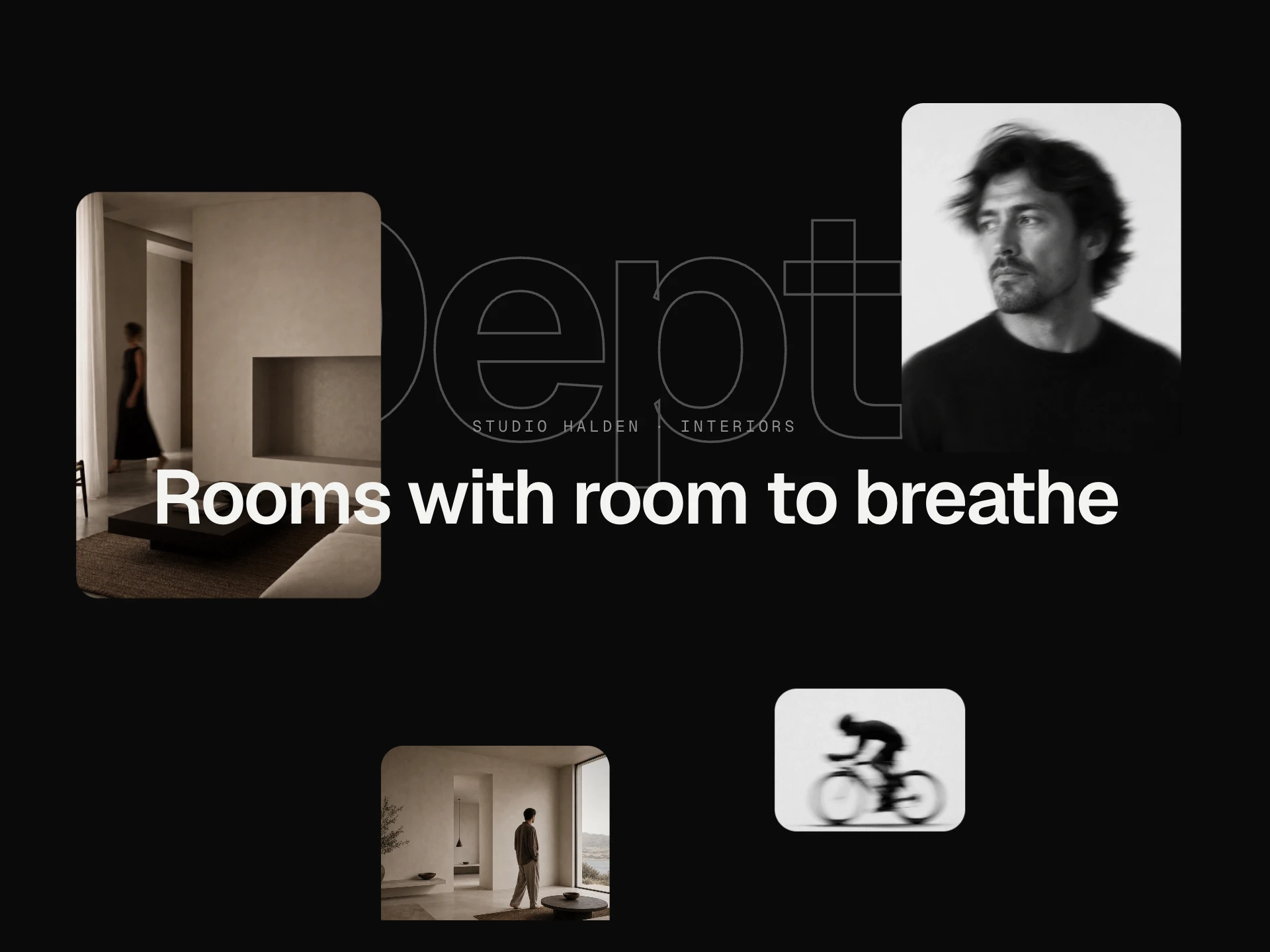
Image Mask Reveal React component
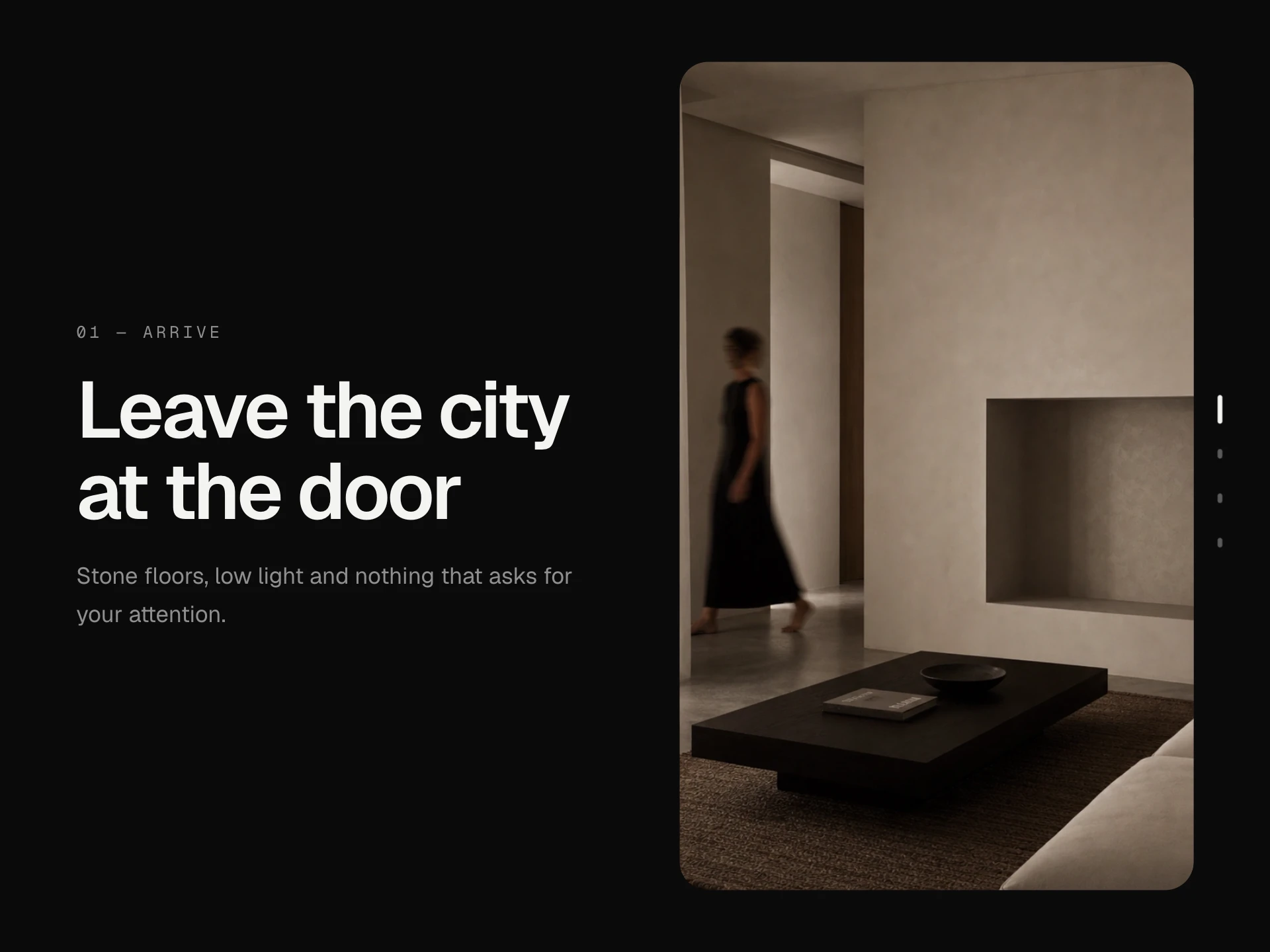
An image that unveils itself through a moving mask — a circle opening from where the pointer came in, falling blinds, a cascade of tiles, a diagonal wipe or a parting curtain — on hover or as it scrolls into view, settling from a slight zoom.
About the Image Mask Reveal component
Image Mask Reveal holds an image back behind a solid cover and lets it out through a moving shape: a circle that opens from exactly where your pointer came in, blinds falling away one strip at a time, a cascade of tiles, a diagonal wipe or a curtain parting from the middle. As it opens, the photo eases back from a slight zoom.
It can play once as it scrolls into view, or on hover, closing again toward wherever the pointer leaves. Keyboard focus opens it too, and on phones a tap reveals it.
When to use it
Use it for portfolio and case-study grids, editorial images, team photos or product shots where the moment of reveal adds to the story.
Pick one variant per grid for a calm page, or mix them, as in the demo, for a playful index.
Installation
Add the Image Mask Reveal component to your project with the shadcn CLI. It lands in components/image-mask-reveal.tsx as plain React + Tailwind CSS source you own and can edit.
npx shadcn@latest add @reactframe/image-mask-revealOr copy the source by hand and install its dependencies:
npm install clsx tailwind-mergeProps
<ImageMaskReveal /> accepts 11 props (required ones are marked *). It also accepts the usual <div> attributes, like className, style, id and aria-*, and passes them to its root element.
| Prop | Type | Default |
|---|---|---|
| src* | string | — |
| alt | string | "" |
| variant | "circle" | "blinds" | "tiles" | "diagonal" | "curtain" | "circle" |
| trigger "view" reveals once when it scrolls into sight; "hover" reveals while the pointer (or focus) is on it. | "view" | "hover" | "view" |
| cover Colour of the cover the image is revealed from. | string | "#161616" |
| title Optional caption shown over the cover and slid away as the image appears. | string | — |
| meta | string | — |
| duration | number | 1000 |
| aspectRatio Width / height. | number | 4 / 5 |
| radius | number | 16 |
| href | string | — |
- src*string
- altstringDefault: ""
- variant"circle" | "blinds" | "tiles" | "diagonal" | "curtain"Default: "circle"
- trigger
"view" reveals once when it scrolls into sight; "hover" reveals while the pointer (or focus) is on it.
"view" | "hover"Default: "view" - cover
Colour of the cover the image is revealed from.
stringDefault: "#161616" - title
Optional caption shown over the cover and slid away as the image appears.
string - metastring
- durationnumberDefault: 1000
- aspectRatio
Width / height.
numberDefault: 4 / 5 - radiusnumberDefault: 16
- hrefstring
npm dependencies
Installed for you by the shadcn CLI.
Image Mask Reveal FAQ
- Which reveal styles are there?
- circle, blinds, tiles, diagonal and curtain. circle follows the pointer on hover; the others always open the same way.
- Can it reveal on scroll instead of hover?
- Yes. trigger="view" reveals once when about a third of the image is visible; trigger="hover" reveals while the pointer or keyboard focus is on it.
- What colour is behind the image?
- Set cover to any CSS colour; it's what the image is revealed from and what it hides behind again.
- Does it work on phones?
- Yes. With trigger="hover", a tap reveals the image and it stays revealed; with trigger="view" it plays as you scroll.