LinkedIn Post Mockup React component
A realistic LinkedIn post with a headline, media image, a reaction summary, and interactive like/repost actions with live counts.
About the LinkedIn Post Mockup component
LinkedIn Post Mockup is a free LinkedIn feed post. It shows the avatar, name, headline, posting time with a globe icon, the post text and an optional image. Below that is a reactions summary with comment and repost counts, and the Like, Comment, Repost and Send action bar.
Pass username, headline, userAvatar, timePosted, postText, mediaImage, likesCount, commentsCount and repostsCount. theme is "light" (the default) or "dark", and borderRadius defaults to 8. Like and Repost toggle and add one to their counts; allowLike and allowRepost can turn them off. showCounts={false} hides the summary row, which also disappears when every count is zero.
When to use it
Use it for B2B testimonials, hiring and employer branding pages, and case studies about LinkedIn content or ghostwriting.
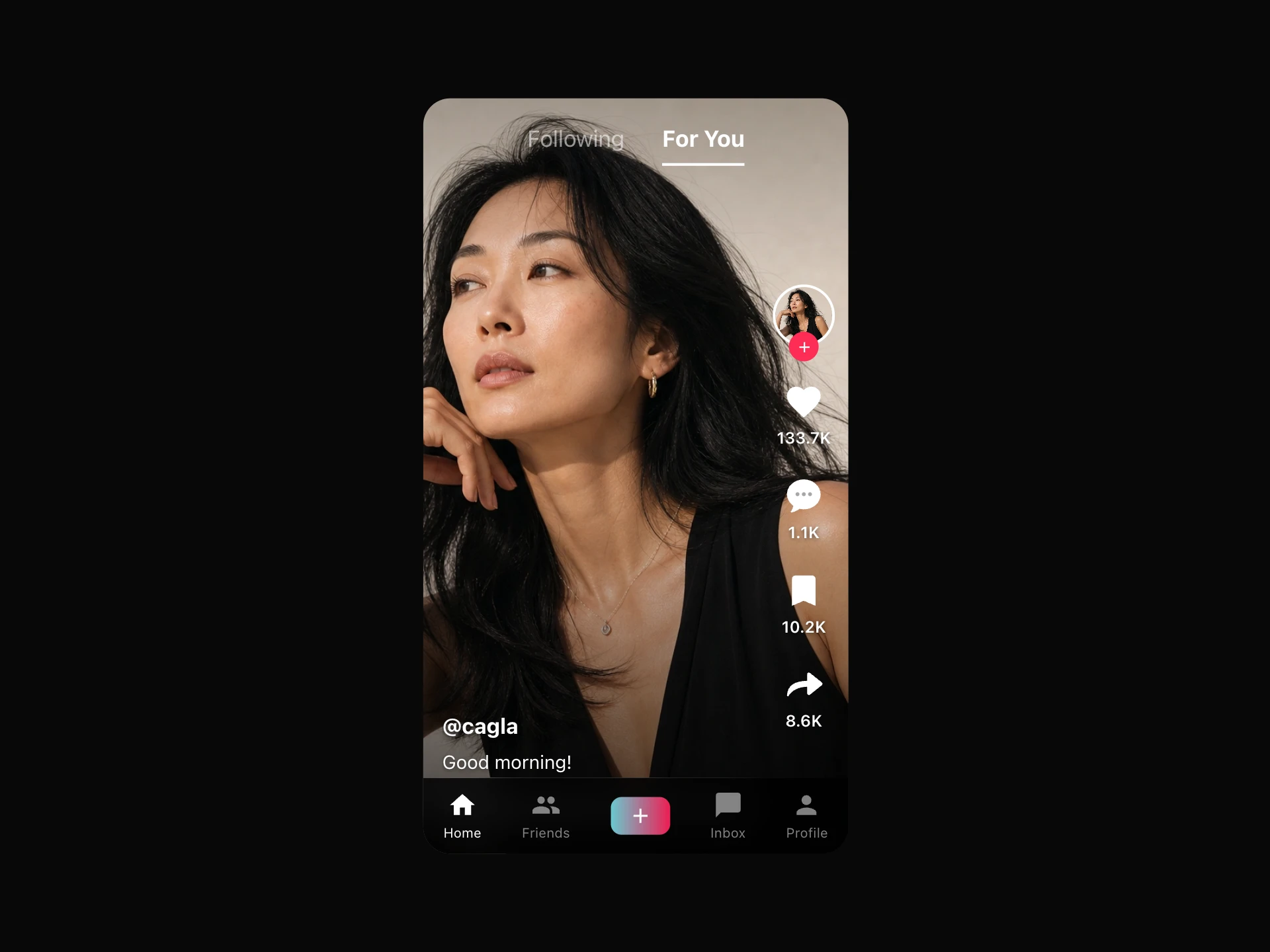
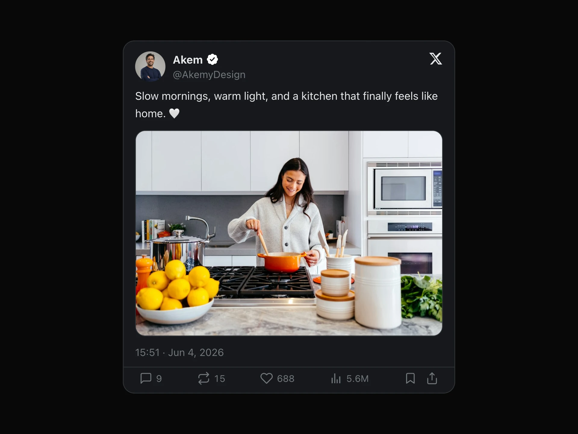
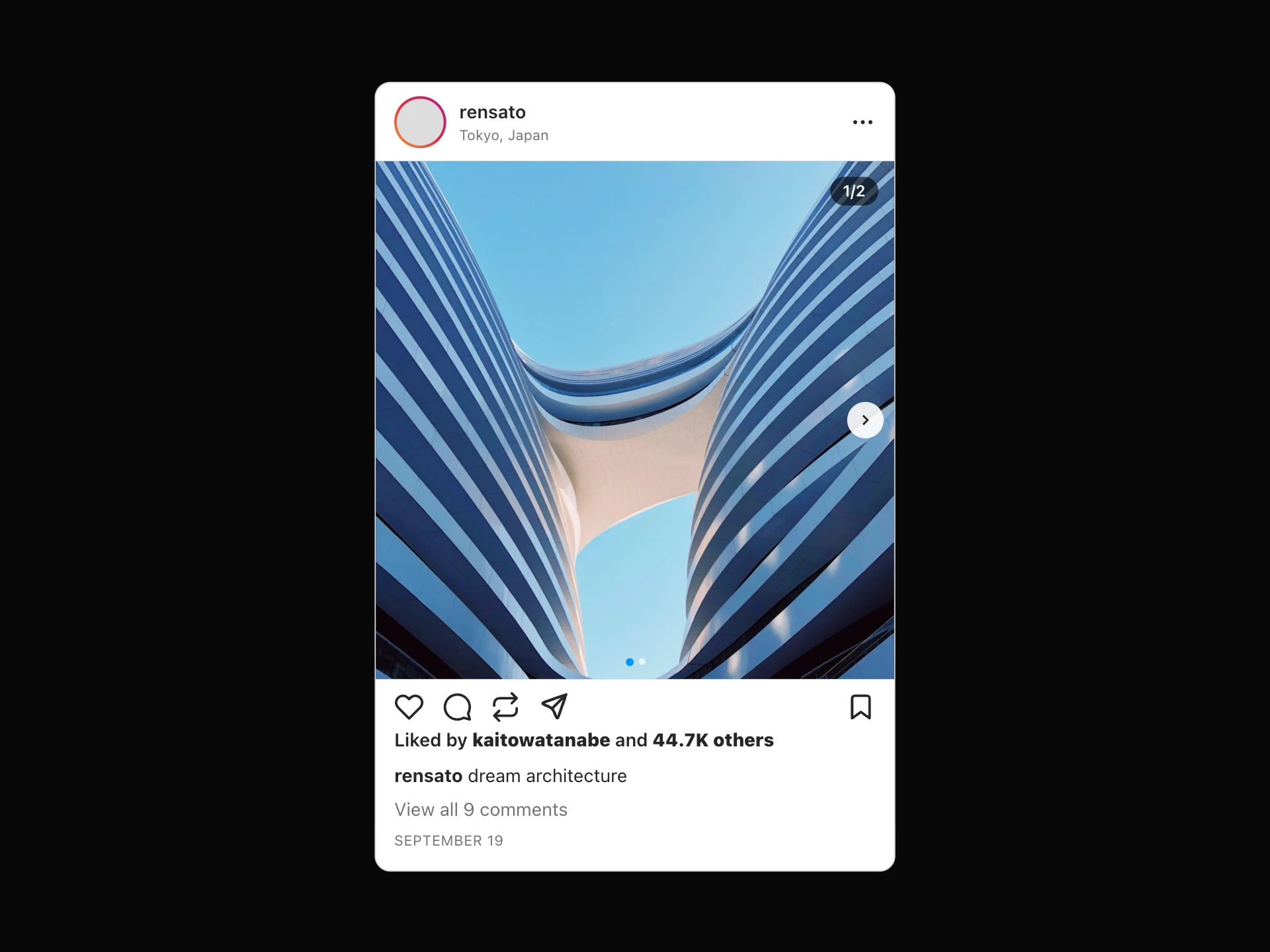
For a consumer-facing post, X Post Mockup or Instagram Post Mockup fit better.
Installation
Add the LinkedIn Post Mockup component to your project with the shadcn CLI. It lands in components/linkedin-post-mockup.tsx as plain React + Tailwind CSS source you own and can edit.
npx shadcn@latest add @reactframe/linkedin-post-mockupOr copy the source by hand and install its dependencies:
npm install clsx tailwind-mergeProps
<LinkedInPostMockup /> accepts 14 props, all optional. It also accepts the usual <div> attributes, like className, style, id and aria-*, and passes them to its root element.
| Prop | Type | Default |
|---|---|---|
| theme | "light" | "dark" | "light" |
| borderRadius | number | 8 |
| username | string | "Joshua Json" |
| headline | string | "Product Designer at Framer" |
| userAvatar | string | — |
| timePosted | string | "2h" |
| postText | string | "Excited to share that we just launched our new product 🚀 Big thanks to the team for the… |
| mediaImage | string | — |
| likesCount | number | 482 |
| commentsCount | number | 36 |
| repostsCount | number | 8 |
| showCounts | boolean | true |
- theme"light" | "dark"Default: "light"
- borderRadiusnumberDefault: 8
- usernamestringDefault: "Joshua Json"
- headlinestringDefault: "Product Designer at Framer"
- userAvatarstring
- timePostedstringDefault: "2h"
- postTextstringDefault: "Excited to share that we just launched our new product 🚀 Big thanks to the team for the…
- mediaImagestring
- likesCountnumberDefault: 482
- commentsCountnumberDefault: 36
- repostsCountnumberDefault: 8
- showCountsbooleanDefault: true
Show all 14 propsShow fewer
| allowLike | boolean | true |
| allowRepost | boolean | true |
- allowLikebooleanDefault: true
- allowRepostbooleanDefault: true
Kits
Sets of components designed to be used together on one site, LinkedIn Post Mockup included.
Collections
Use-case pages that compare LinkedIn Post Mockup with the other components that do a similar job.
npm dependencies
Installed for you by the shadcn CLI.
LinkedIn Post Mockup FAQ
- Is the post loaded from LinkedIn?
- No. There is no LinkedIn embed or API call. Everything is passed as props.
- How are large numbers shown?
- Counts of 1,000 or more are shortened, so 1200 becomes 1.2K.
- Do Comment and Send do anything?
- No, they are static. Only Like and Repost respond to clicks.
- Are line breaks in postText kept?
- Yes. postText uses white-space: pre-wrap, so line breaks in the string stay.