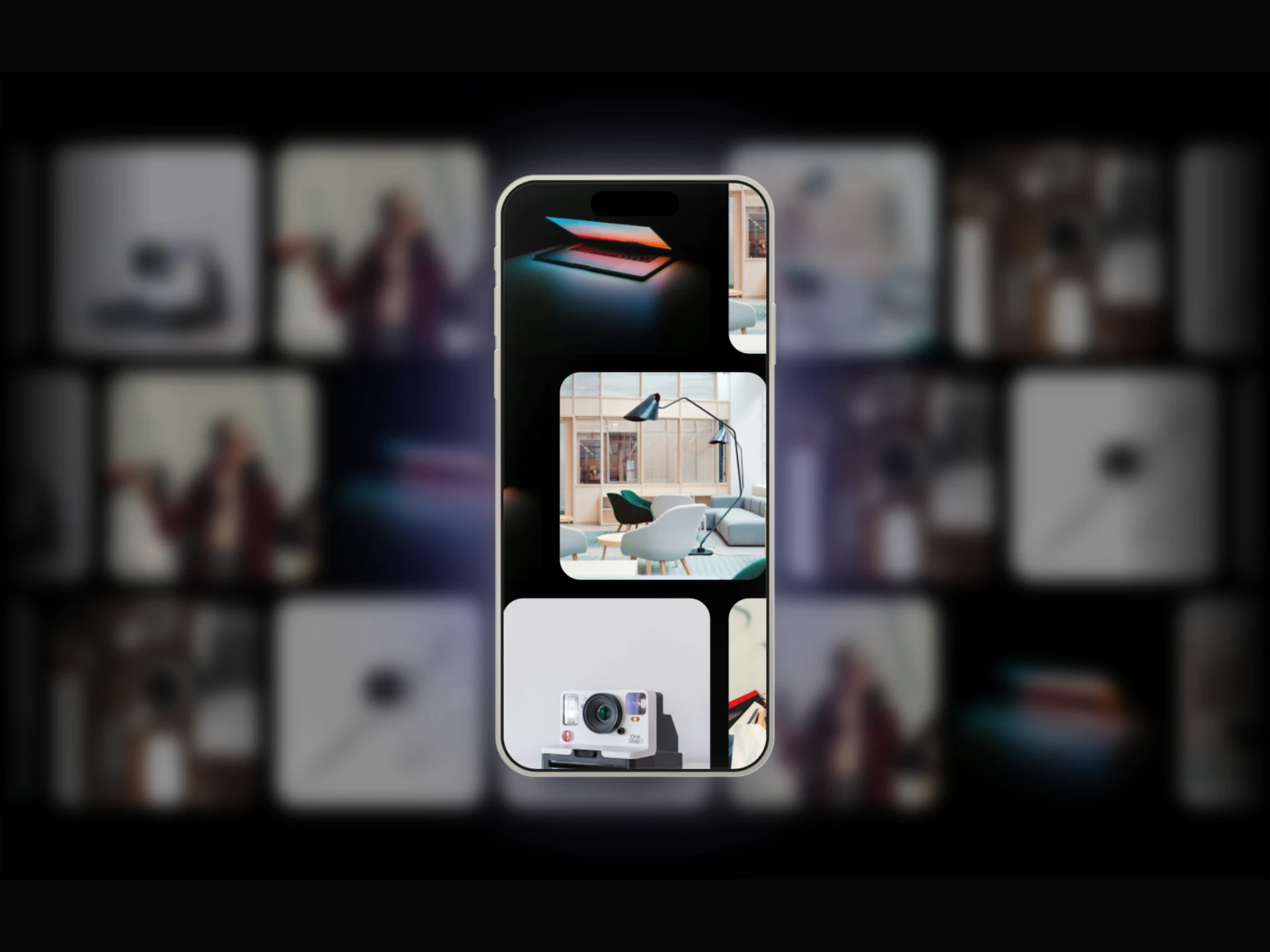
Instagram Post Mockup React component
A realistic Instagram post with a swipeable multi-photo carousel, double-tap-to-like heart burst, and like/comment/repost/share/save actions.
About the Instagram Post Mockup component
Instagram Post Mockup is a free recreation of an Instagram feed post. It shows an avatar with the story ring, the username, an optional verified badge and location, and a square photo carousel you can swipe. Below the photo are like, comment, repost, share and save icons, the likes line, the caption, the comment count and the date. Double-clicking the photo likes it with a heart burst.
Everything comes from props: media (an array of image URLs, capped by maxMedia, default 8), username, userAvatar, postDescription, location, timePosted, likesCount and commentsCount. theme can be light or dark, and borderRadius rounds the card. Counts of 1,000 or more are shortened to K and M. Each photo gets alt text like "rensato post photo 1 of 3", and like and save are toggle buttons with aria-pressed.
When to use it
Use it on social media marketing pages, influencer and agency portfolios, case studies and UGC sections, where a post in its native look is clearer than a plain image.
For X, TikTok or LinkedIn posts, use X Post Mockup, TikTok Post Mockup or LinkedIn Post Mockup.
Installation
Add the Instagram Post Mockup component to your project with the shadcn CLI. It lands in components/instagram-post-mockup.tsx as plain React + Tailwind CSS source you own and can edit.
npx shadcn@latest add @reactframe/instagram-post-mockupOr copy the source by hand and install its dependencies:
npm install clsx tailwind-mergeProps
<InstagramPostMockup /> accepts 25 props, all optional. It also accepts the usual <div> attributes, like className, style, id and aria-*, and passes them to its root element.
| Prop | Type | Default |
|---|---|---|
| theme | "light" | "dark" | "light" |
| borderRadius | number | 12 |
| username | string | "rensato" |
| userAvatar | string | — |
| showVerified | boolean | false |
| location | string | "Tokyo, Japan" |
| showLocation | boolean | true |
| postDescription | string | "dream architecture" |
| timePosted | string | "September 19" |
| media | string[] | [] |
| maxMedia | number | 8 |
| likesCount | number | 44686 |
- theme"light" | "dark"Default: "light"
- borderRadiusnumberDefault: 12
- usernamestringDefault: "rensato"
- userAvatarstring
- showVerifiedbooleanDefault: false
- locationstringDefault: "Tokyo, Japan"
- showLocationbooleanDefault: true
- postDescriptionstringDefault: "dream architecture"
- timePostedstringDefault: "September 19"
- mediastring[]Default: []
- maxMedianumberDefault: 8
- likesCountnumberDefault: 44686
Show all 25 propsShow fewer
| showLikes | boolean | true |
| likedByUsername | string | "kaitowatanabe" |
| showLikedBy | boolean | true |
| showLikeCount | boolean | true |
| commentsCount | number | 9 |
| showComments | boolean | true |
| showCounter | boolean | true |
| allowLike | boolean | true |
| doubleTapLike | boolean | true |
| allowBookmark | boolean | true |
| showCommentIcon | boolean | true |
| showRepost | boolean | true |
| showShare | boolean | true |
- showLikesbooleanDefault: true
- likedByUsernamestringDefault: "kaitowatanabe"
- showLikedBybooleanDefault: true
- showLikeCountbooleanDefault: true
- commentsCountnumberDefault: 9
- showCommentsbooleanDefault: true
- showCounterbooleanDefault: true
- allowLikebooleanDefault: true
- doubleTapLikebooleanDefault: true
- allowBookmarkbooleanDefault: true
- showCommentIconbooleanDefault: true
- showRepostbooleanDefault: true
- showSharebooleanDefault: true
Kits
Sets of components designed to be used together on one site, Instagram Post Mockup included.
Collections
Use-case pages that compare Instagram Post Mockup with the other components that do a similar job.
npm dependencies
Installed for you by the shadcn CLI.
Instagram Post Mockup FAQ
- Does it load posts from Instagram?
- No. It makes no requests to Instagram. You pass the images, text and counts as props.
- How do people move through the photos?
- They can drag or swipe sideways past 18% of the width, use the previous and next arrows, or click a dot. showCounter={false} hides the 1/3 counter.
- What happens when someone clicks like?
- The heart fills and the count goes up by one, and a second click undoes it. This is local state only. allowLike={false} disables liking, and doubleTapLike={false} turns off double-click to like.
- Can I hide parts of the post?
- Yes. showLocation, showVerified, showLikes, showLikedBy, showLikeCount, showComments, showCommentIcon, showRepost and showShare each control one element.