Phone Mockup React component
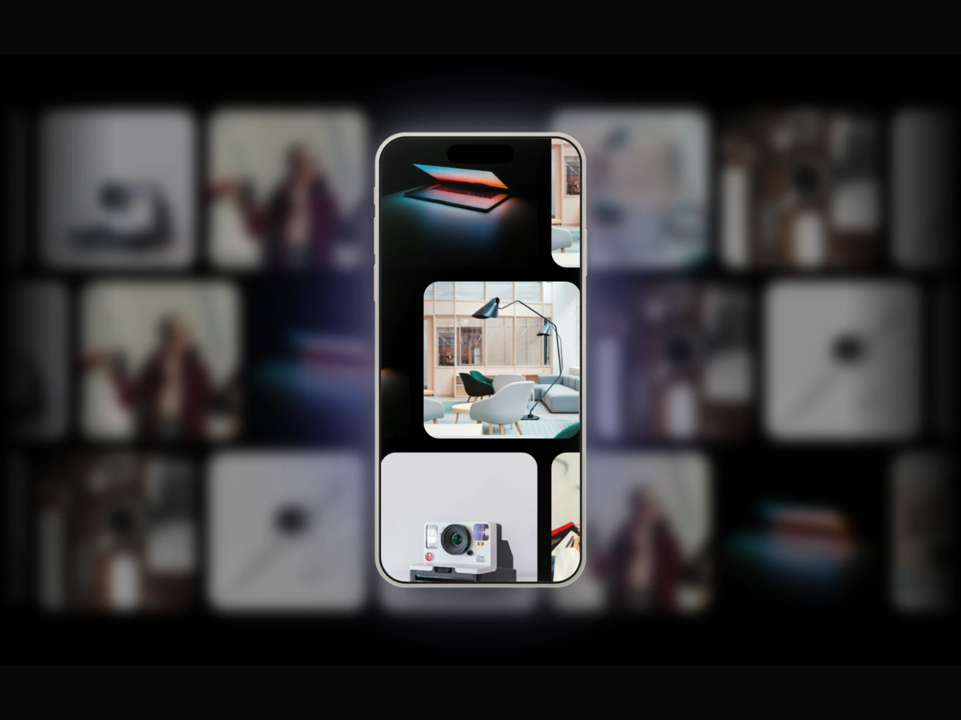
A realistic iPhone frame with 3D cursor tilt, a tilt-tracking screen glare, ambient glow, and a story-style video/image player with swipe navigation.
About the Phone Mockup component
Phone Mockup is a free, hand-built iPhone frame with a story-style media player inside. It plays a list of videos and images one after another, with a progress bar, a vertical dot indicator and a slide or fade transition. The phone tilts toward the cursor, a glare on the screen follows the tilt, and a colored glow sits behind it.
Pass media as an array of { type: "video" | "image", src }. Each image stays for imageDuration seconds (default 3), and with loop={false} each video moves on when it ends. phoneWidth (default 280), frameColor ("titanium" or "black"), tiltStrength (default 18), glowColor, glowIntensity, progressBar, videoTransition and background are props. Videos are muted and play inline, so they autoplay on phones.
When to use it
Use it to show an app, a reel or a short product demo on a landing page, in a portfolio or in an App Store style section.
To add floating stat cards around the phone, use Phone Analytics Mockup. For a tablet or desktop screen, use iPad Mockup Carousel or Desktop Mockup Carousel.
Installation
Add the Phone Mockup component to your project with the shadcn CLI. It lands in components/phone-mockup.tsx as plain React + Tailwind CSS source you own and can edit.
npx shadcn@latest add @reactframe/phone-mockupOr copy the source by hand and install its dependencies:
npm install motion clsx tailwind-mergeProps
<PhoneMockup /> accepts 14 props, all optional. It also accepts the usual <div> attributes, like className, style, id and aria-*, and passes them to its root element.
| Prop | Type | Default |
|---|---|---|
| media | { type: "video" | "image"; src: string }[] | DEFAULT_MEDIA |
| imageDuration | number | 3 |
| autoplay | boolean | true |
| loop | boolean | true |
| phoneWidth | number | 280 |
| frameColor | "titanium" | "black" | "titanium" |
| tilt | boolean | true |
| tiltStrength | number | 18 |
| ambientGlow | boolean | true |
| glowColor | string | "#6060FF" |
| glowIntensity | number | 50 |
| progressBar | boolean | true |
- media{ type: "video" | "image"; src: string }[]Default: DEFAULT_MEDIA
- imageDurationnumberDefault: 3
- autoplaybooleanDefault: true
- loopbooleanDefault: true
- phoneWidthnumberDefault: 280
- frameColor"titanium" | "black"Default: "titanium"
- tiltbooleanDefault: true
- tiltStrengthnumberDefault: 18
- ambientGlowbooleanDefault: true
- glowColorstringDefault: "#6060FF"
- glowIntensitynumberDefault: 50
- progressBarbooleanDefault: true
Show all 14 propsShow fewer
| videoTransition | "slide" | "fade" | "slide" |
| background | string | "transparent" |
- videoTransition"slide" | "fade"Default: "slide"
- backgroundstringDefault: "transparent"
Kits
Sets of components designed to be used together on one site, Phone Mockup included.
Collections
Use-case pages that compare Phone Mockup with the other components that do a similar job.
npm dependencies
Installed for you by the shadcn CLI.
Phone Mockup FAQ
- How do people move between clips?
- Clicking the right half of the screen goes to the next item and the left half to the previous one. Swiping or dragging up or down by more than 50px also works. With a single item, a click pauses and resumes it.
- Why does a video repeat instead of moving on?
- loop is true by default, so each video loops in place. Set loop={false} to go to the next item when a video ends.
- Can I change the transition?
- videoTransition="slide" (the default) slides items vertically, and "fade" crossfades them.
- Do images get alt text?
- No. Media is rendered with empty alt text as decoration, so describe what the clip shows in the text around it.