Morphing Pill Nav React component
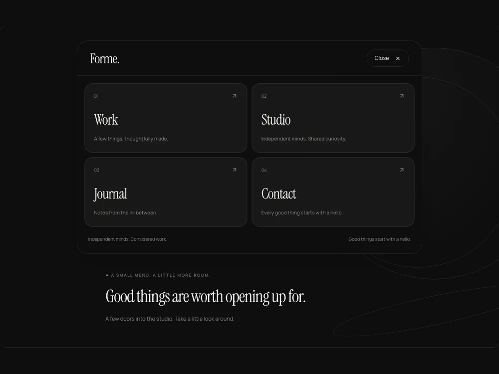
A responsive pill navigation with a spring-driven indicator that moves and changes width between links, optional hover following, icons and controlled active state.
About the Morphing Pill Nav component
A responsive pill navigation with a spring-driven indicator that moves and changes width between links, optional hover following, icons and controlled active state.
Installation
Add the Morphing Pill Nav component to your project with the shadcn CLI. It lands in components/morphing-pill-nav.tsx as plain React + Tailwind CSS source you own and can edit.
npx shadcn@latest add @reactframe/morphing-pill-navOr copy the source by hand and install its dependencies:
npm install motion lucide-react clsx tailwind-mergeProps
<MorphingPillNav /> accepts 8 props, all optional. It also accepts the usual <nav> attributes, like className, style, id and aria-*, and passes them to its root element.
| Prop | Type | Default |
|---|---|---|
| theme | "dark" | "light" | "dark" |
| items | { id: string; label: string; href: string; description?: string; badge?: string; icon?: React.ReactNode }[] | DEFAULT_LINKS |
| activeId | string | — |
| defaultActiveId | string | "work" |
| onActiveChange | (id:string)=>void | — |
| followHover | boolean | true |
| showIcons | boolean | true |
| onNavigate | (item:NavbarLink,event:React.MouseEvent<HTMLAnchorElement>)=>void | — |
- theme"dark" | "light"Default: "dark"
- items{ id: string; label: string; href: string; description?: string; badge?: string; icon?: React.ReactNode }[]Default: DEFAULT_LINKS
- activeIdstring
- defaultActiveIdstringDefault: "work"
- onActiveChange(id:string)=>void
- followHoverbooleanDefault: true
- showIconsbooleanDefault: true
- onNavigate(item:NavbarLink,event:React.MouseEvent<HTMLAnchorElement>)=>void
npm dependencies
Installed for you by the shadcn CLI.