Back to components
ComponentNavbarFree
Gooey Tab Bar React component
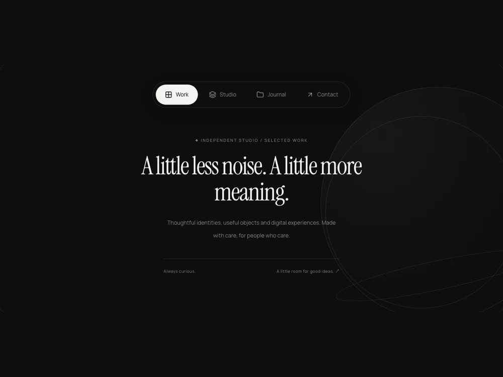
An accessible tab bar with a filtered liquid indicator and trailing blob, automatic active-tab measurement, roving keyboard focus and reduced-motion support.
About the Gooey Tab Bar component
An accessible tab bar with a filtered liquid indicator and trailing blob, automatic active-tab measurement, roving keyboard focus and reduced-motion support.
Installation
Add the Gooey Tab Bar component to your project with the shadcn CLI. It lands in components/gooey-tab-bar.tsx as plain React + Tailwind CSS source you own and can edit.
Install
Copied!
npx shadcn@latest add @reactframe/gooey-tab-barOr copy the source by hand and install its dependencies:
Install
Copied!
npm install motion lucide-react clsx tailwind-mergeProps
<GooeyTabBar /> accepts 7 props, all optional. It also accepts the usual <div> attributes, like className, style, id and aria-*, and passes them to its root element.
| Prop | Type | Default |
|---|---|---|
| theme | "dark" | "light" | "dark" |
| items | { id: string; label: string; icon?: React.ReactNode; panelId?: string }[] | DEFAULT_TABS |
| value | string | — |
| defaultValue | string | "home" |
| onValueChange | (value:string)=>void | — |
| showLabels | boolean | true |
| gooey | boolean | true |
- theme"dark" | "light"Default: "dark"
- items{ id: string; label: string; icon?: React.ReactNode; panelId?: string }[]Default: DEFAULT_TABS
- valuestring
- defaultValuestringDefault: "home"
- onValueChange(value:string)=>void
- showLabelsbooleanDefault: true
- gooeybooleanDefault: true
npm dependencies
Installed for you by the shadcn CLI.