Back to components
ComponentNavbarFree
Expanding Card Navbar React component
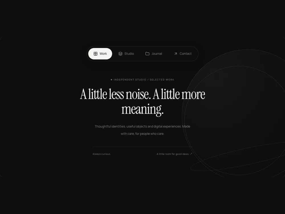
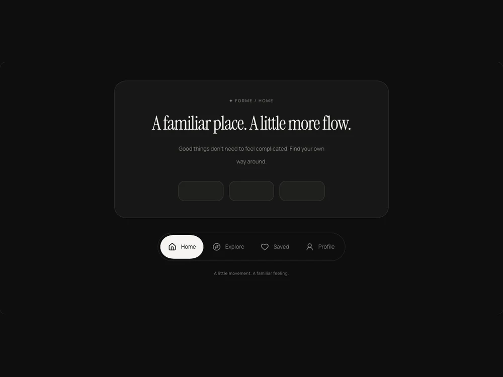
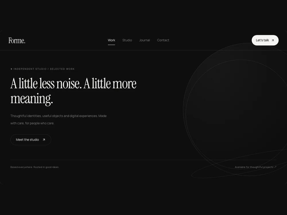
A compact navigation card that expands into an editorial grid of links, with controlled or internal open state, numbering and reduced-motion support.
About the Expanding Card Navbar component
A compact navigation card that expands into an editorial grid of links, with controlled or internal open state, numbering and reduced-motion support.
Installation
Add the Expanding Card Navbar component to your project with the shadcn CLI. It lands in components/expanding-card-navbar.tsx as plain React + Tailwind CSS source you own and can edit.
Install
Copied!
npx shadcn@latest add @reactframe/expanding-card-navbarOr copy the source by hand and install its dependencies:
Install
Copied!
npm install motion lucide-react clsx tailwind-mergeProps
<ExpandingCardNavbar /> accepts 11 props, all optional. It also accepts the usual <nav> attributes, like className, style, id and aria-*, and passes them to its root element.
| Prop | Type | Default |
|---|---|---|
| theme | "dark" | "light" | "dark" |
| logo | React.ReactNode | "Forme." |
| logoHref | string | "/" |
| items | { id: string; label: string; href: string; description?: string; badge?: string; icon?: React.ReactNode }[] | DEFAULT_LINKS |
| tagline | string | "Independent minds. Considered work." |
| open | boolean | — |
| defaultOpen | boolean | false |
| onOpenChange | (open:boolean)=>void | — |
| showNumbers | boolean | true |
| columns | 1 | 2 | 2 |
| onNavigate | (item:NavbarLink,event:React.MouseEvent<HTMLAnchorElement>)=>void | — |
- theme"dark" | "light"Default: "dark"
- logoReact.ReactNodeDefault: "Forme."
- logoHrefstringDefault: "/"
- items{ id: string; label: string; href: string; description?: string; badge?: string; icon?: React.ReactNode }[]Default: DEFAULT_LINKS
- taglinestringDefault: "Independent minds. Considered work."
- openboolean
- defaultOpenbooleanDefault: false
- onOpenChange(open:boolean)=>void
- showNumbersbooleanDefault: true
- columns1 | 2Default: 2
- onNavigate(item:NavbarLink,event:React.MouseEvent<HTMLAnchorElement>)=>void
npm dependencies
Installed for you by the shadcn CLI.