Profile Flip Card React component
A profile card that flips from a photo front to a bio back on click or hover, with flip Y, flip X, spring, or fade transitions.
About the Profile Flip Card component
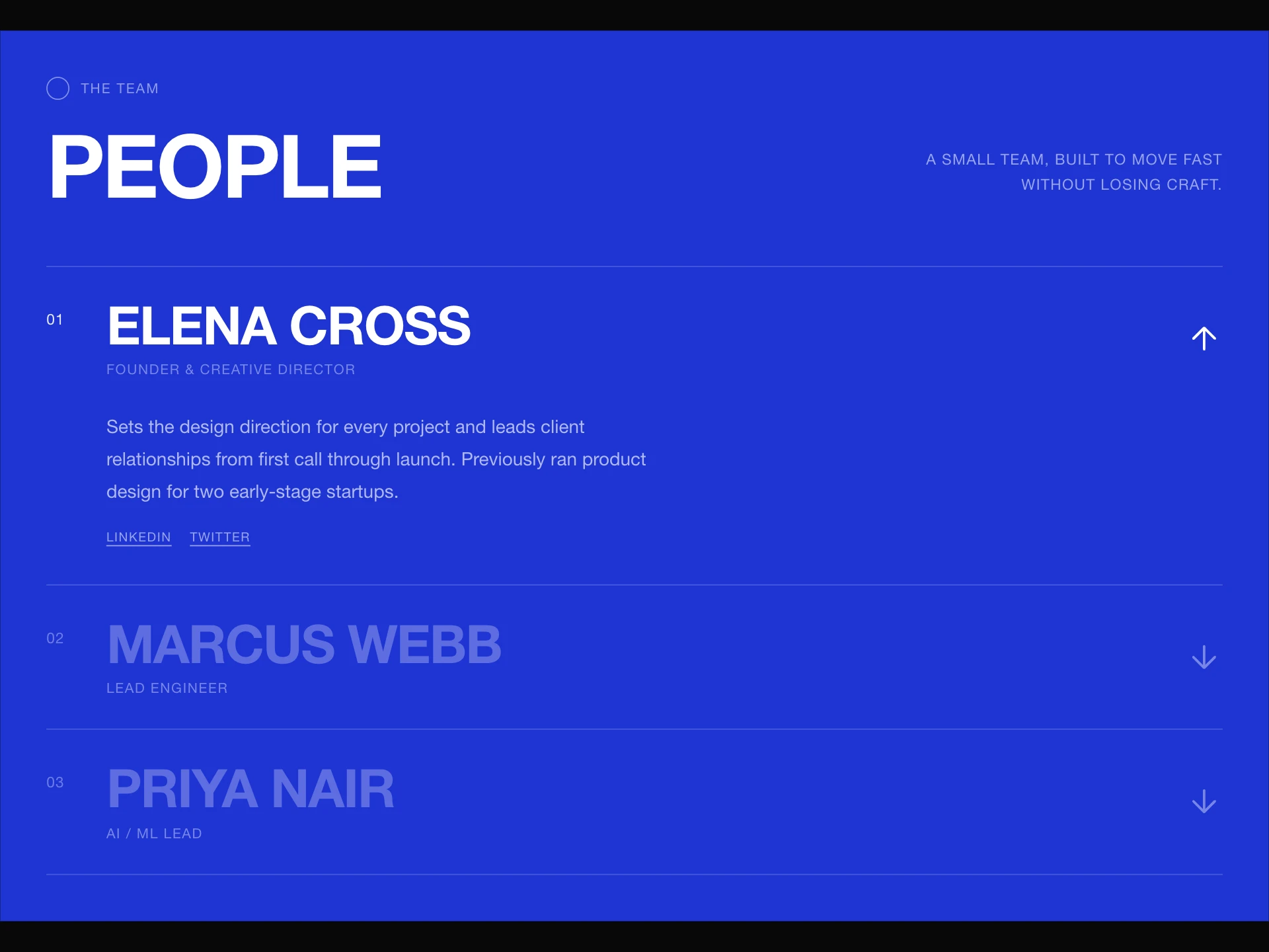
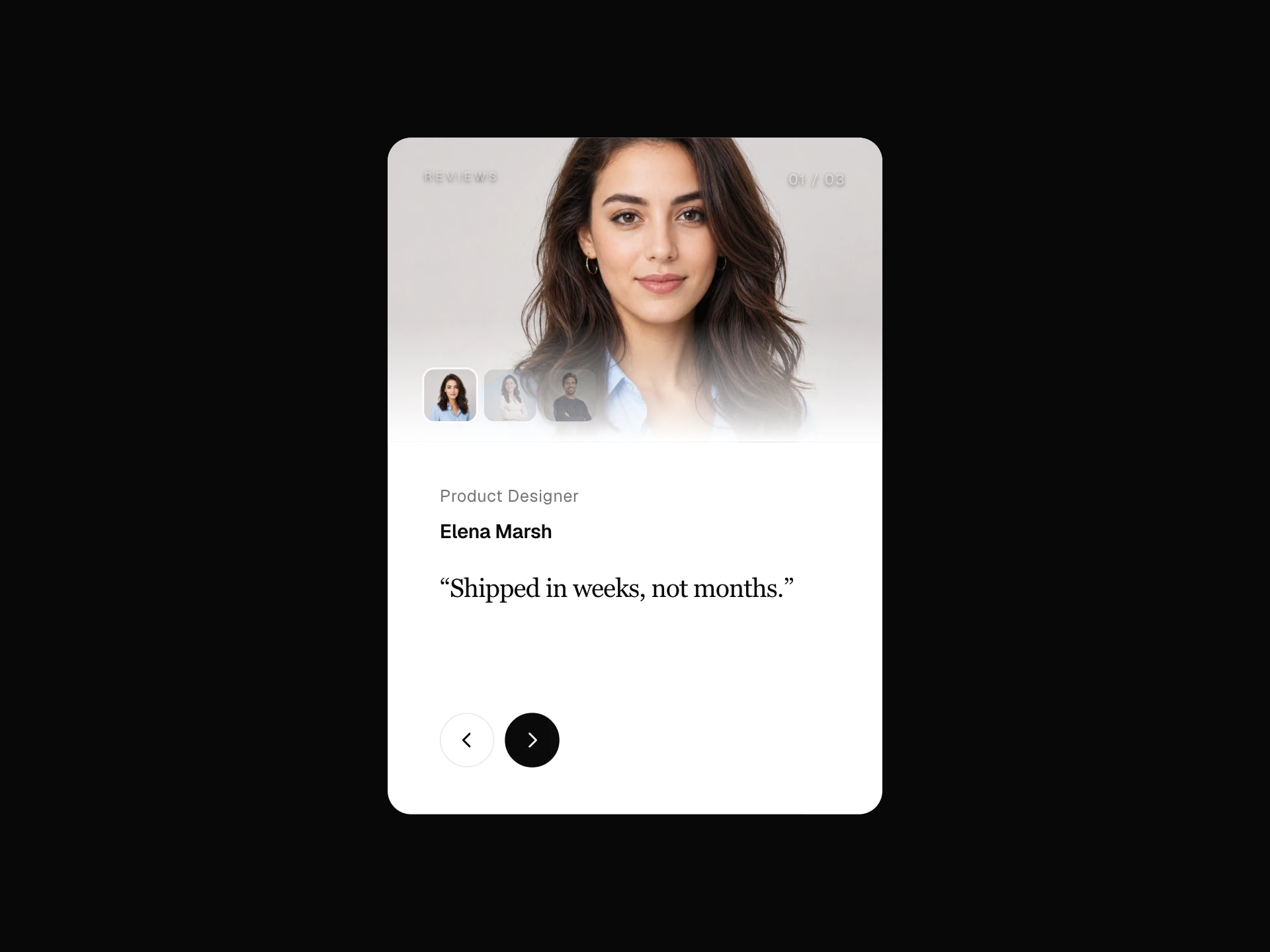
Profile Flip Card is a free profile card with two faces: the front is a full-bleed photo with the name, role and an optional tag, and the back splits into a tinted panel with the name and a bio column with a quote mark. It flips with a mouse click, with a tap or sideways swipe on touch screens, or on hover when flipOnHover is set, and a back arrow or Escape turns it back.
flipTransition picks the motion ("flipY", "flipX", "spring" or "fade") and animationSpeed its length in seconds (0.7); accentColor, bgBack, the front and back name and role colors, bioColor, borderRadius and borderColor style the two faces, and tag, tagColor and tagBg add a pill badge. Below 480px of width the back stacks vertically and the bio clamps to four lines. Once the name differs from the placeholder, it outputs Person JSON-LD with name, jobTitle, description and image.
When to use it
Use it for founder and speaker profiles, team grids and portfolio about sections where the photo should come first and the bio second.
For a whole team in one component, use Team Drawer or Team Carousel.
Installation
Add the Profile Flip Card component to your project with the shadcn CLI. It lands in components/profile-flip-card.tsx as plain React + Tailwind CSS source you own and can edit.
npx shadcn@latest add @reactframe/profile-flip-cardOr copy the source by hand and install its dependencies:
npm install clsx tailwind-mergeProps
<ProfileFlipCard /> accepts 19 props, all optional. It also accepts the usual <div> attributes, like className, style, id and aria-*, and passes them to its root element.
| Prop | Type | Default |
|---|---|---|
| src | string | — |
| name | string | "Takahashi Aya" |
| role | string | "CEO, Pentaclay" |
| bio | string | "I'm focused on growing my brand, improving my products, and finding smarter ways to mark… |
| accentColor | string | "#cccccc" |
| bgBack | string | "#ffffff" |
| nameColorFront | string | "#ffffff" |
| nameColorBack | string | "#0a0a0a" |
| roleColorFront | string | "#ffffff" |
| roleColorBack | string | "#0a0a0a" |
| bioColor | string | "#333333" |
| animationSpeed | number | 0.7 |
- srcstring
- namestringDefault: "Takahashi Aya"
- rolestringDefault: "CEO, Pentaclay"
- biostringDefault: "I'm focused on growing my brand, improving my products, and finding smarter ways to mark…
- accentColorstringDefault: "#cccccc"
- bgBackstringDefault: "#ffffff"
- nameColorFrontstringDefault: "#ffffff"
- nameColorBackstringDefault: "#0a0a0a"
- roleColorFrontstringDefault: "#ffffff"
- roleColorBackstringDefault: "#0a0a0a"
- bioColorstringDefault: "#333333"
- animationSpeednumberDefault: 0.7
Show all 19 propsShow fewer
| tag | string | "" |
| tagColor | string | "#0a0a0a" |
| tagBg | string | "#ffffff" |
| borderRadius | number | 20 |
| borderColor | string | "rgba(0,0,0,0.08)" |
| flipOnHover | boolean | false |
| flipTransition | "flipY" | "flipX" | "spring" | "fade" | "flipY" |
- tagstringDefault: ""
- tagColorstringDefault: "#0a0a0a"
- tagBgstringDefault: "#ffffff"
- borderRadiusnumberDefault: 20
- borderColorstringDefault: "rgba(0,0,0,0.08)"
- flipOnHoverbooleanDefault: false
- flipTransition"flipY" | "flipX" | "spring" | "fade"Default: "flipY"
Collections
Use-case pages that compare Profile Flip Card with the other components that do a similar job.
npm dependencies
Installed for you by the shadcn CLI.
Profile Flip Card FAQ
- Can it flip on hover instead of click?
- Yes, set flipOnHover. Hover only applies on devices with a fine pointer; touch screens still flip on tap.
- Does the card need a set size?
- Yes, it fills its parent, so wrap it in an element with a width and height, for example 320 by 440 pixels.
- Can keyboard users flip it?
- The card is focusable and Escape flips it back, but no key flips it forward, so keep essential bio text available elsewhere if keyboard access matters.
- Is it free?
- Yes, Profile Flip Card is free.