Spreadsheet Grid React component
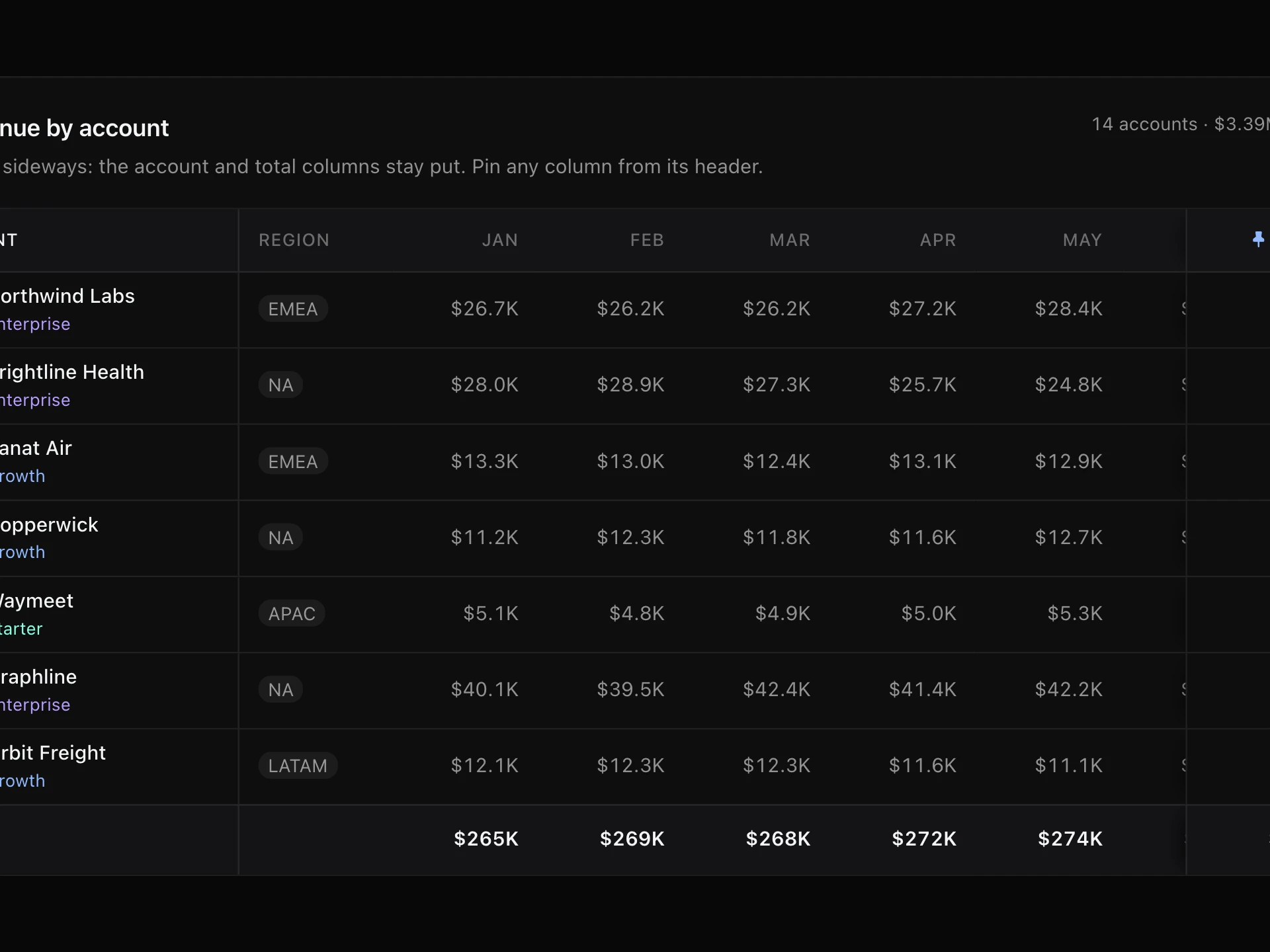
A small spreadsheet in a card: lettered columns and numbered rows, click, drag or shift-select ranges, type to edit, a formula bar, a formula engine with SUM, AVERAGE, MIN, MAX and cell maths, colour-coded reference outlines, live sum / average / count, copy-paste and undo.
About the Spreadsheet Grid component
Spreadsheet Grid is a small, real spreadsheet you can drop into a page: lettered columns, numbered rows, a formula bar and formulas that recalculate as you type. It handles SUM, AVERAGE, MIN, MAX, COUNT, ROUND and ABS, cell maths with + − × ÷ ^, and shows errors like #DIV/0! the way spreadsheet users expect.
Select with a click, a drag or shift + arrows, and the footer shows the sum, average and count. Type to edit, paste from Excel or Google Sheets, copy back out, and undo. When a formula is selected, the cells it uses are outlined in colour.
When to use it
Use it for budget and pricing calculators, editable data in admin tools, onboarding imports, quote builders and anywhere people expect to type numbers into a grid.
It's built for small sheets (dozens of rows); for thousands of rows of read-only data, use a virtualized table.
Installation
Add the Spreadsheet Grid component to your project with the shadcn CLI. It lands in components/spreadsheet-grid.tsx as plain React + Tailwind CSS source you own and can edit.
npx shadcn@latest add @reactframe/spreadsheet-gridOr copy the source by hand and install its dependencies:
npm install clsx tailwind-mergeProps
<SpreadsheetGrid /> accepts 10 props, all optional. It also accepts the usual <div> attributes, like className, style, id and aria-*, and passes them to its root element.
| Prop | Type | Default |
|---|---|---|
| theme | "dark" | "light" | "dark" |
| title | string | "Q1 budget" |
| columns Number of columns (A, B, C…). | number | 7 |
| rows | number | 14 |
| initialCells Starting contents by address, e.g. { A1: "Item", B2: "4200", E2: "=SUM(B2:D2)" }. | Record<string, string> | DEFAULT_CELLS |
| columnFormats Display format per column letter, e.g. { B: "currency", F: "percent" }. | Record<string, SpreadsheetFormat> | DEFAULT_FORMATS |
| columnWidths Width per column letter, in px; others use 104. | Record<string, number> | { A: 140 } |
| headerRow Treat the first row as a header (bold). | boolean | true |
| readOnly | boolean | false |
| onChange Called with every cell's raw content after each change. | (cells: Record<string, string>) => void | — |
- theme"dark" | "light"Default: "dark"
- titlestringDefault: "Q1 budget"
- columns
Number of columns (A, B, C…).
numberDefault: 7 - rowsnumberDefault: 14
- initialCells
Starting contents by address, e.g. { A1: "Item", B2: "4200", E2: "=SUM(B2:D2)" }.
Record<string, string>Default: DEFAULT_CELLS - columnFormats
Display format per column letter, e.g. { B: "currency", F: "percent" }.
Record<string, SpreadsheetFormat>Default: DEFAULT_FORMATS - columnWidths
Width per column letter, in px; others use 104.
Record<string, number>Default: { A: 140 } - headerRow
Treat the first row as a header (bold).
booleanDefault: true - readOnlybooleanDefault: false
- onChange
Called with every cell's raw content after each change.
(cells: Record<string, string>) => void
npm dependencies
Installed for you by the shadcn CLI.
Spreadsheet Grid FAQ
- Which formulas work?
- Cell references (with or without $), + − × ÷ ^, parentheses, percentages like 15%, and the functions SUM, AVERAGE (or AVG), MIN, MAX, COUNT, ROUND and ABS, with ranges like B2:D7. Circular references show #CYCLE!.
- How do I load and save data?
- Pass initialCells as { A1: "Item", B2: "4200", E2: "=SUM(B2:D2)" } and listen to onChange, which receives every cell's raw content after each edit.
- Can people paste from Excel?
- Yes. Copied cells arrive as tab-separated text and fill the grid from the selected cell. Copying a selection out works the same way.
- What about the keyboard and screen readers?
- Arrows, Shift + arrows, Tab, Enter, F2, Delete, Cmd/Ctrl+Z and Cmd/Ctrl+A all work. The grid uses grid roles with an active-descendant, and each cell is announced with its address and value.