AI Chat Bubble Launcher React component
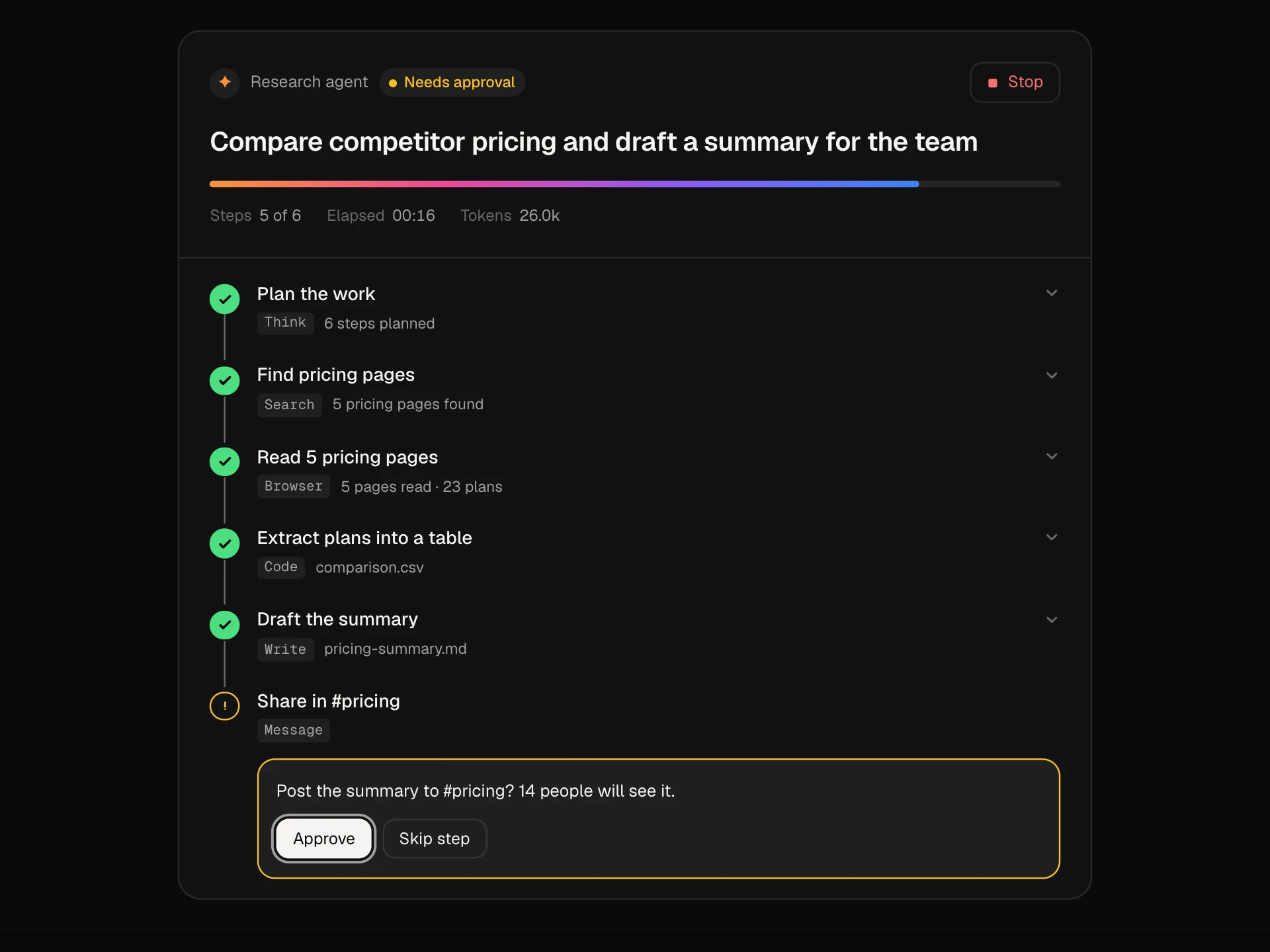
A floating support launcher for any page: a gradient-ringed bubble with an unread badge, a proactive teaser with quick-reply chips, and a panel with Home, Messages and Help tabs, streamed AI answers, a hand-off to a person and searchable help articles.
About the AI Chat Bubble Launcher component
AI Chat Bubble Launcher is the small round button in the corner of a site that opens a support chat. A few seconds after the page loads it can show a short message with quick replies, and an orange badge tells people when they have unread answers.
Open it and there are three tabs. Home has a greeting, a question box and common questions. Messages keeps past conversations, streams the assistant's answers and lets people ask for a person at any point. Help is a searchable list of articles, and if an article doesn't help, one tap turns it into a question for the assistant.
When to use it
Use it on marketing sites, pricing pages, help centres and inside SaaS apps where people need quick answers without leaving the page.
Keep the teaser short and give it two or three chips that match what people on that page usually ask. Turn it off with teaser={null} on pages where it would get in the way.
Installation
Add the AI Chat Bubble Launcher component to your project with the shadcn CLI. It lands in components/ai-chat-bubble-launcher.tsx as plain React + Tailwind CSS source you own and can edit.
npx shadcn@latest add @reactframe/ai-chat-bubble-launcherOr copy the source by hand and install its dependencies:
npm install motion clsx tailwind-mergeProps
<AIChatBubbleLauncher /> accepts 11 props, all optional.
| Prop | Type | Default |
|---|---|---|
| assistantName Name shown in the panel header. | string | "Atlas" |
| greeting | string | "Hi there. How can we help?" |
| teaser Proactive message above the bubble. Set to null to turn it off. | { text: string; chips: string[]; delay?: number } | null | DEFAULT_TEASER |
| suggestions | string[] | DEFAULT_SUGGESTIONS |
| threads | { id: string; title: string; preview: string; time: string; unread?: number; messages: LauncherMessage[] }[] | — |
| articles | { id: string; title: string; collection: string; body: string }[] | DEFAULT_ARTICLES |
| getReply Return the assistant's reply. Defaults to built-in demo answers. | (text: string) => string | Promise<string> | demoReply |
| onHandoff | (threadId: string) => void | — |
| defaultOpen | boolean | false |
| theme | "dark" | "light" | "dark" |
| className | string | — |
- assistantName
Name shown in the panel header.
stringDefault: "Atlas" - greetingstringDefault: "Hi there. How can we help?"
- teaser
Proactive message above the bubble. Set to null to turn it off.
{ text: string; chips: string[]; delay?: number } | nullDefault: DEFAULT_TEASER - suggestionsstring[]Default: DEFAULT_SUGGESTIONS
- threads{ id: string; title: string; preview: string; time: string; unread?: number; messages: LauncherMessage[] }[]
- articles{ id: string; title: string; collection: string; body: string }[]Default: DEFAULT_ARTICLES
- getReply
Return the assistant's reply. Defaults to built-in demo answers.
(text: string) => string | Promise<string>Default: demoReply - onHandoff(threadId: string) => void
- defaultOpenbooleanDefault: false
- theme"dark" | "light"Default: "dark"
- classNamestring
npm dependencies
Installed for you by the shadcn CLI.
AI Chat Bubble Launcher FAQ
- How do I connect it to my AI or support tool?
- Pass getReply. It receives the message text and can return a string or a promise, so you can call your own API. Without it, the block uses a few built-in demo answers.
- What happens when someone asks for a person?
- Messages like 'Talk to a person' call onHandoff with the conversation id, post a 'Connecting you to the team' note and show a reply from the support agent. Wire onHandoff to your inbox or ticketing tool.
- Where does the unread badge come from?
- It adds up unread on every thread. Opening a thread clears its count, and the badge on the launcher and the Messages tab updates with it.
- Can I use it as a real floating widget?
- Yes. The block fills its parent, so put it in a fixed full-screen wrapper with pointer-events turned off on the wrapper and back on for the block, as in the usage example.
- Is it accessible?
- The launcher says whether it is open and how many messages are unread, the panel is a labelled dialog, the tabs are a real tablist, new messages are announced politely and Escape closes the panel and returns focus to the launcher. Motion is turned off for people who prefer reduced motion.