Footer Premium React component
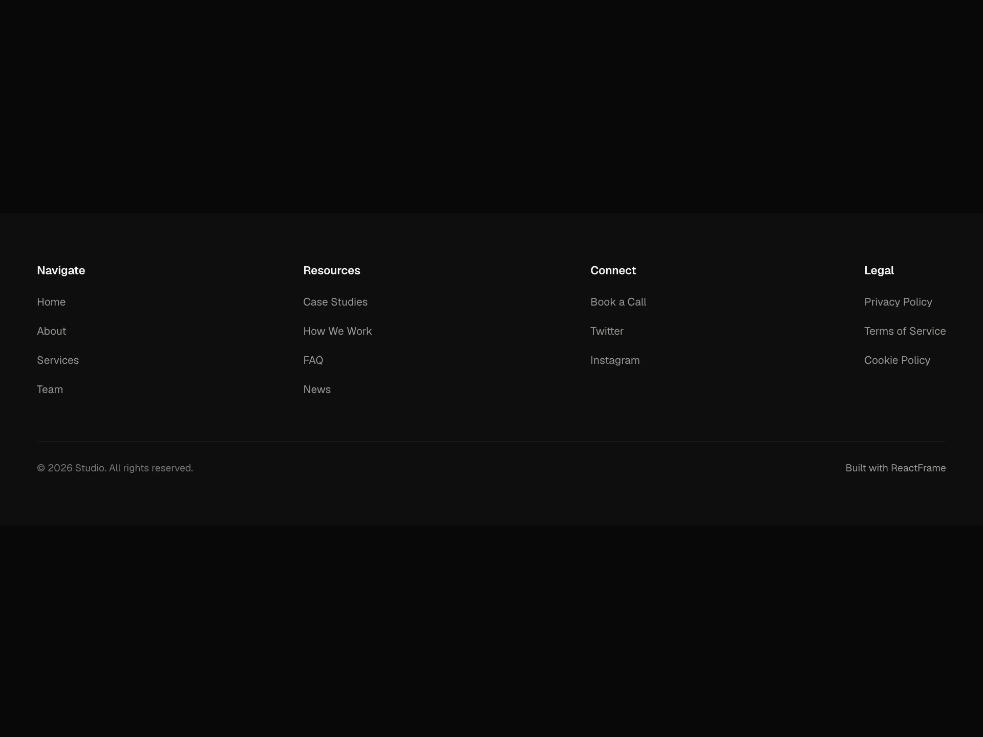
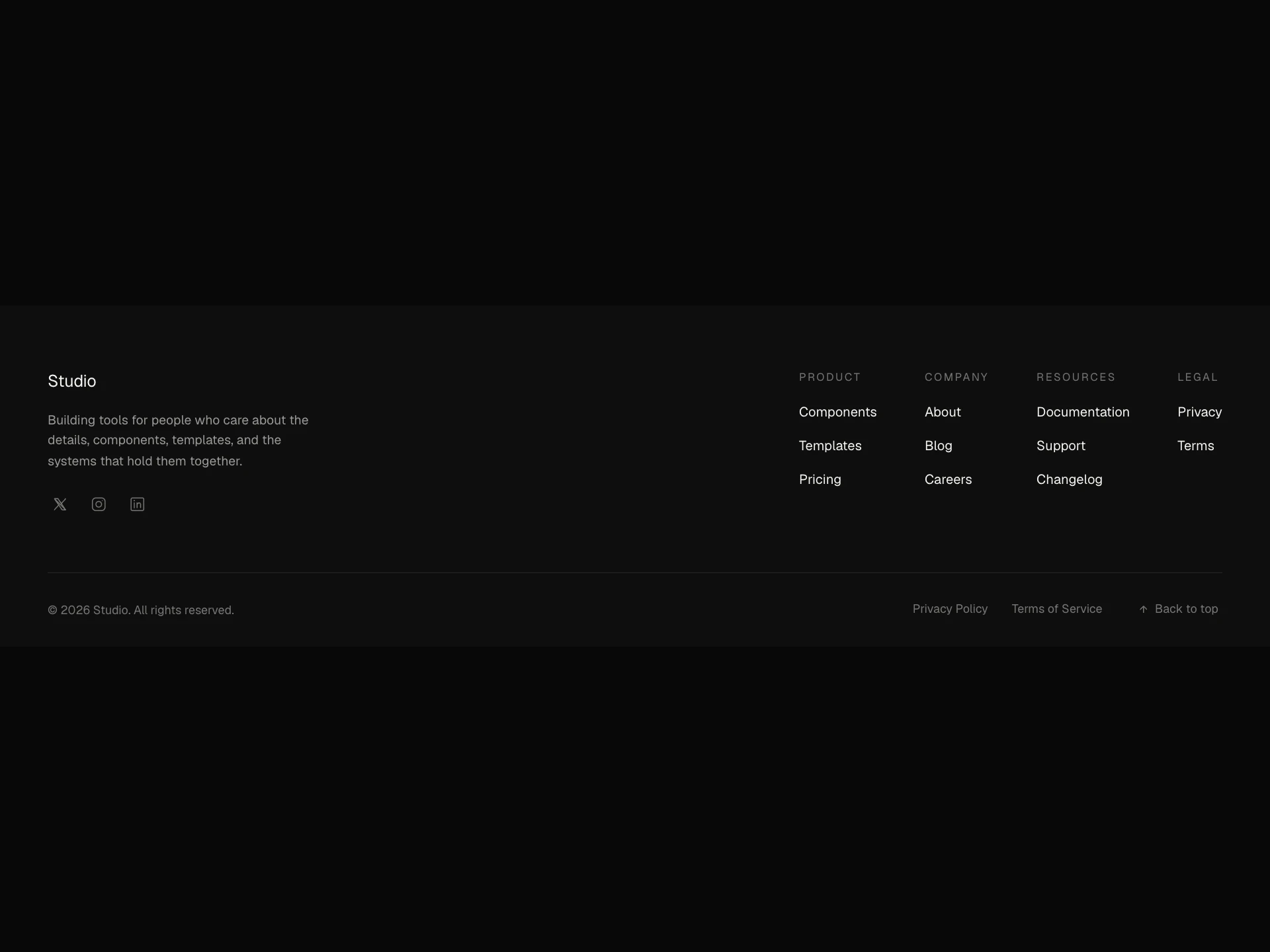
A responsive site footer with a logo, description, social links, multi-column link groups, dark/light theming, and a copyright line.
About the Footer Premium component
Footer Premium is a free, responsive site footer: your logo (an image or a text label) with a short description and a row of social icons on one side, link columns on the other, and a copyright line underneath. An optional pill link under the logo works for a status like "Available for new projects" or a partner badge.
It has dark and light themes with overridable background, text and muted colors, social icons for X, YouTube, Instagram, LinkedIn, TikTok, Facebook, Discord and GitHub, and padding on each side as props.
When to use it
Use it as the footer of a portfolio, studio, SaaS or product site that needs brand, socials and a few groups of links in one clean block.
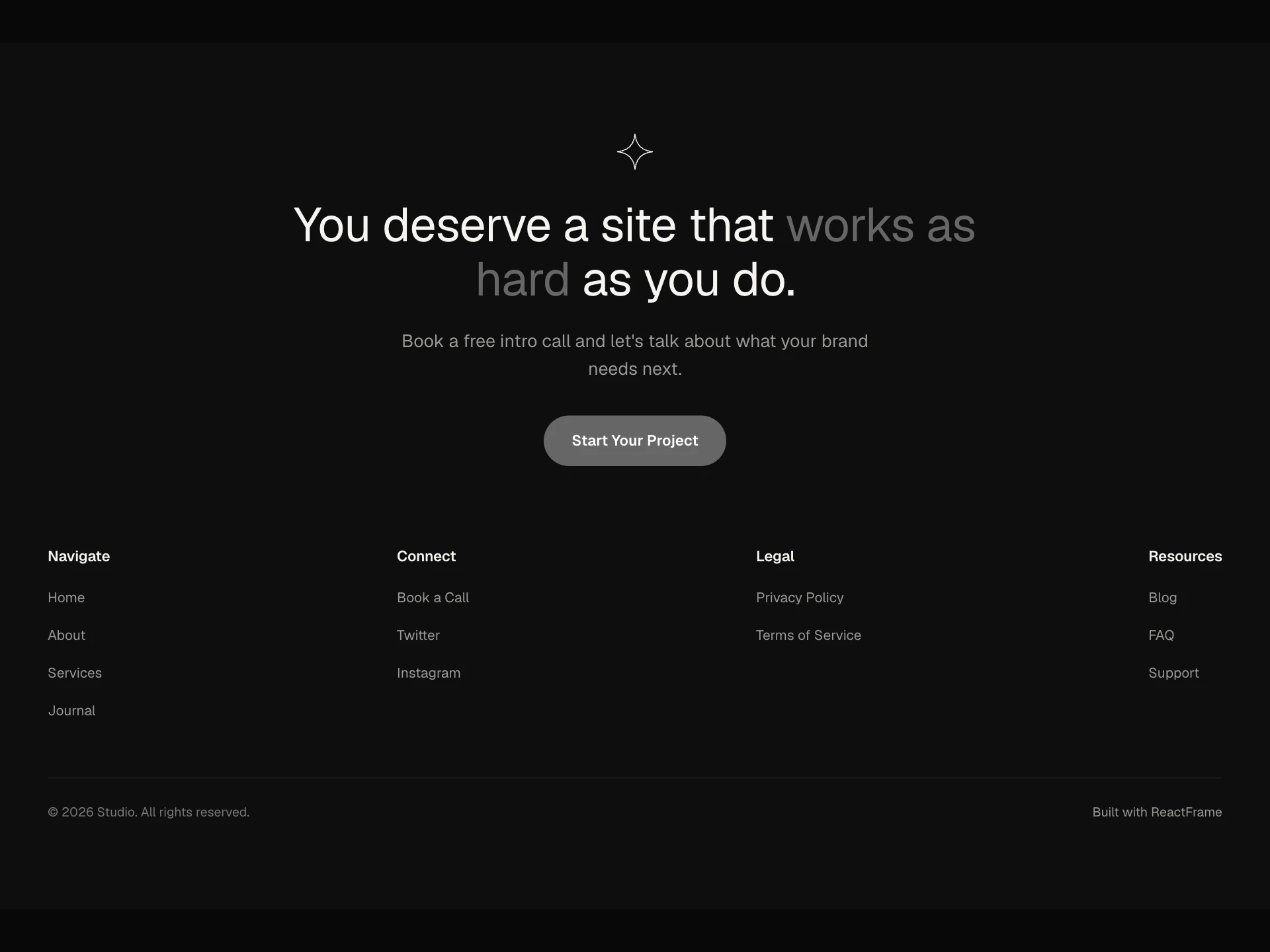
For a footer that also asks for the sale, use Footer CTA; for many link groups, Footer Mega.
Installation
Add the Footer Premium component to your project with the shadcn CLI. It lands in components/footer-premium.tsx as plain React + Tailwind CSS source you own and can edit.
npx shadcn@latest add @reactframe/footer-premiumOr copy the source by hand and install its dependencies:
npm install clsx tailwind-mergeProps
<FooterPremium /> accepts 18 props, all optional. It also accepts the usual <footer> attributes, like className, style, id and aria-*, and passes them to its root element.
| Prop | Type | Default |
|---|---|---|
| theme | "dark" | "light" | "dark" |
| backgroundColor | string | — |
| textColor | string | — |
| mutedColor | string | — |
| logoImage | string | — |
| logoUrl | string | "#" |
| logoLabel | string | "Studio" |
| showPill Shows a pill link (e.g. "Official Partner") below the logo row. | boolean | false |
| pillText | string | "Available for new projects" |
| pillUrl | string | "#" |
| description | string | "Premium, shadcn-compatible components for your next project." |
| socials | { platform: FooterPlatform; url: string }[] | DEFAULT_SOCIALS |
- theme"dark" | "light"Default: "dark"
- backgroundColorstring
- textColorstring
- mutedColorstring
- logoImagestring
- logoUrlstringDefault: "#"
- logoLabelstringDefault: "Studio"
- showPill
Shows a pill link (e.g. "Official Partner") below the logo row.
booleanDefault: false - pillTextstringDefault: "Available for new projects"
- pillUrlstringDefault: "#"
- descriptionstringDefault: "Premium, shadcn-compatible components for your next project."
- socials{ platform: FooterPlatform; url: string }[]Default: DEFAULT_SOCIALS
Show all 18 propsShow fewer
| columns | { title: string; links: FooterColumnLink[] }[] | DEFAULT_COLUMNS |
| copyrightText | string | `Copyright ${new Date().getFullYear()}. All rights reserved.` |
| paddingTop | number | 64 |
| paddingRight | number | 64 |
| paddingBottom | number | 48 |
| paddingLeft | number | 64 |
- columns{ title: string; links: FooterColumnLink[] }[]Default: DEFAULT_COLUMNS
- copyrightTextstringDefault: `Copyright ${new Date().getFullYear()}. All rights reserved.`
- paddingTopnumberDefault: 64
- paddingRightnumberDefault: 64
- paddingBottomnumberDefault: 48
- paddingLeftnumberDefault: 64
Collections
Use-case pages that compare Footer Premium with the other components that do a similar job.
npm dependencies
Installed for you by the shadcn CLI.
Footer Premium FAQ
- Which social networks does it support?
- X, YouTube, Instagram, LinkedIn, TikTok, Facebook, Discord and GitHub. Pass socials as { platform, url } pairs in the order you want them.
- Can I use my own logo?
- Yes. Pass logoImage for an image, or leave it out and logoLabel is shown as text; logoUrl sets where it links.
- How do I add the status pill?
- Set showPill and pass pillText and pillUrl.
- Can I match my site's colors?
- Pick theme="dark" or "light", then override backgroundColor, textColor and mutedColor as needed.