Split Sign In with Testimonial React component
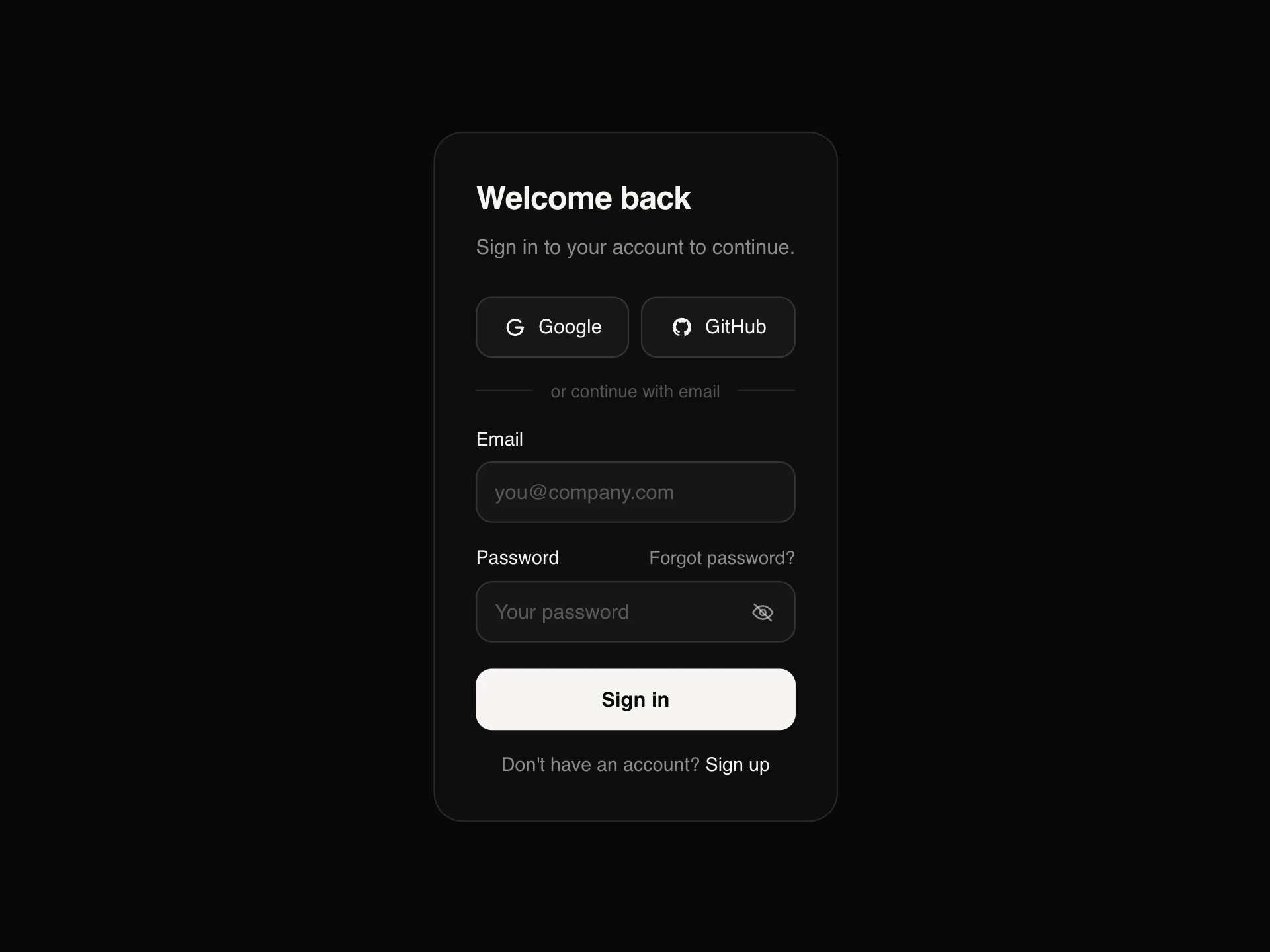
A two-column sign-in page: a form with passkey and single sign-on, domain detection that offers SSO for company emails, show password, keep me signed in and clear errors, next to a testimonial panel that rotates customer quotes with story-style progress bars, pauses on hover, and highlights the matching company in a logo row.
About the Split Sign In with Testimonial component
Split Sign In with Testimonial pairs a complete sign-in form with a panel of customer quotes, so the page that returning users see every day also reassures new ones.
The form covers modern sign-in: passkeys, single sign-on that's offered automatically when someone types a company email, show password, keep me signed in and clear errors. The quotes rotate on their own with story-style progress bars, pause when someone hovers or tabs into them, and light up the matching company below.
When to use it
Use it as the main sign-in page of a B2B or SaaS product, especially one with enterprise customers on single sign-on.
For a compact sign-in inside a modal or a page with its own layout, use Auth Card.
Installation
Add the Split Sign In with Testimonial component to your project with the shadcn CLI. It lands in components/split-sign-in-testimonial.tsx as plain React + Tailwind CSS source you own and can edit.
npx shadcn@latest add @reactframe/split-sign-in-testimonialOr copy the source by hand and install its dependencies:
npm install motion clsx tailwind-mergeProps
<SplitSignInTestimonial /> accepts 8 props, all optional.
| Prop | Type | Default |
|---|---|---|
| testimonials | { quote: string; name: string; role: string; company: string; metric: string; color: string }[] | TESTIMONIALS |
| ssoDomains Email domains with single sign-on, mapped to the company name shown. | Record<string, string> | SSO |
| onSignIn | (data: { email: string; password: string; remember: boolean }) => Promise<string | void> | string | void | — |
| onSso | (email: string) => void | — |
| onPasskey | () => Promise<boolean> | boolean | — |
| interval | number | 6 |
| theme | "dark" | "light" | "dark" |
| className | string | — |
- testimonials{ quote: string; name: string; role: string; company: string; metric: string; color: string }[]Default: TESTIMONIALS
- ssoDomains
Email domains with single sign-on, mapped to the company name shown.
Record<string, string>Default: SSO - onSignIn(data: { email: string; password: string; remember: boolean }) => Promise<string | void> | string | void
- onSso(email: string) => void
- onPasskey() => Promise<boolean> | boolean
- intervalnumberDefault: 6
- theme"dark" | "light"Default: "dark"
- classNamestring
npm dependencies
Installed for you by the shadcn CLI.
Split Sign In with Testimonial FAQ
- How does SSO detection work?
- Pass ssoDomains, a map of email domains to company names. When the typed email matches, the form offers SSO; in SSO mode the password field hides and onSso receives the email to start your redirect.
- How do I show a sign-in error?
- Return a string from onSignIn and it appears as an alert under the form, with the password cleared. Return nothing to show the signed-in state.
- Does passkey sign-in work?
- The button calls onPasskey, where you run your WebAuthn flow and return true or false. The demo pretends to scan for a moment and succeeds.
- Can I change the testimonials?
- Yes. Each needs a quote, name, role, company, a short metric and a color for its accent. interval sets the seconds per quote, and reduced motion turns auto-advance off.
- Is it accessible?
- Inputs are labelled with aria-invalid and helper text, errors use role=alert, the testimonials are a labelled carousel that pauses on focus and only announces changes when paused, and prev / next buttons are labelled.