Gallery Flow React component
A gallery of scattered, gently drifting image cards with random rotation, cursor repel/attract mode, and a click-to-open lightbox.
About the Gallery Flow component
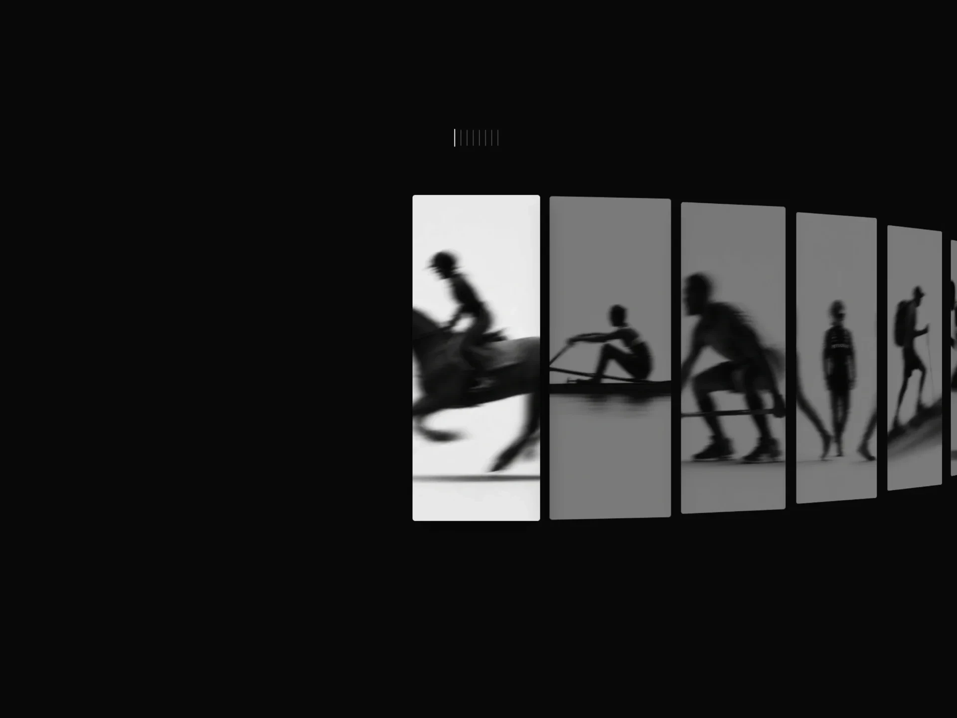
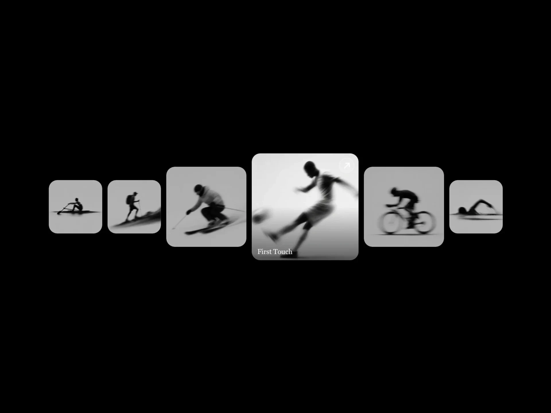
Gallery Flow is a free gallery of scattered image cards that drift slowly in one direction, each at a slight random angle and overlapping the next. The cursor can push cards away (repel) or pull them in (attract), and clicking a card opens it in a lightbox.
Drift direction and speed, card size, rotation, overlap, shadow, corner radius and pause-on-hover behavior are props.
When to use it
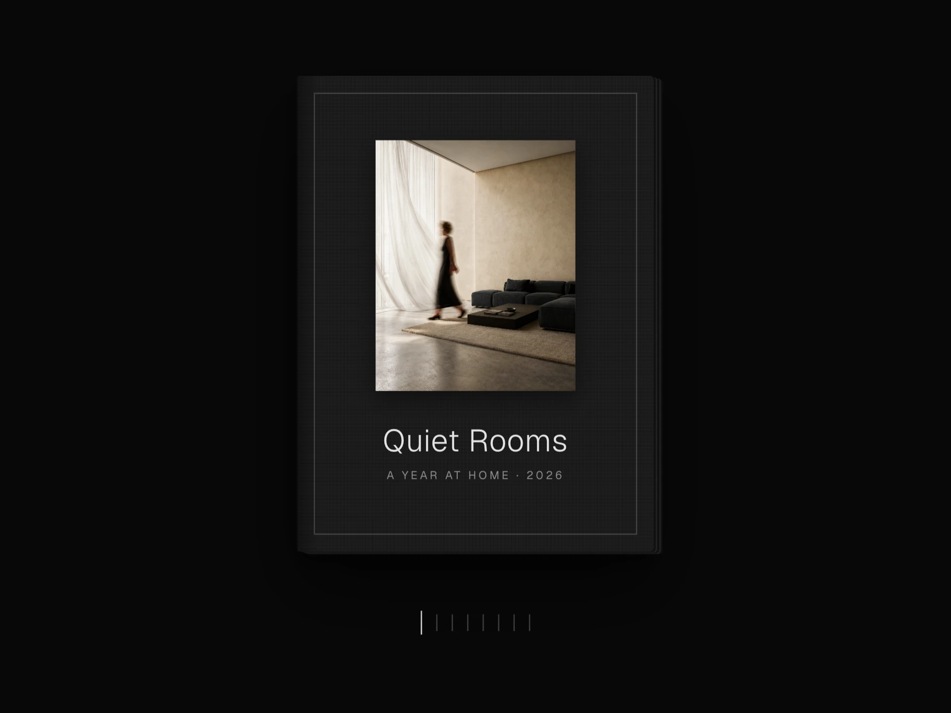
Use it for a relaxed, scrapbook-like collection: travel photos, mood boards, event memories or a behind-the-scenes section.
Installation
Add the Gallery Flow component to your project with the shadcn CLI. It lands in components/gallery-flow.tsx as plain React + Tailwind CSS source you own and can edit.
npx shadcn@latest add @reactframe/gallery-flowOr copy the source by hand and install its dependencies:
npm install clsx tailwind-mergeProps
<GalleryFlow /> accepts 13 props, all optional. It also accepts the usual <div> attributes, like className, style, id and aria-*, and passes them to its root element.
| Prop | Type | Default |
|---|---|---|
| images | string[] | DEFAULT_IMAGES |
| backgroundColor | string | "#ffffff" |
| speed | number | 0.4 |
| cardShadow | boolean | true |
| borderRadius | number | 12 |
| rotationAmount | number | 6 |
| cardSize | "small" | "medium" | "large" | "medium" |
| overlapAmount | number | 0.4 |
| scrollDirection | "up" | "down" | "left" | "right" | "up" |
| pauseOnHover | boolean | true |
| pauseAllOnHover | boolean | false |
| cursorMode | "none" | "repel" | "attract" | "none" |
- imagesstring[]Default: DEFAULT_IMAGES
- backgroundColorstringDefault: "#ffffff"
- speednumberDefault: 0.4
- cardShadowbooleanDefault: true
- borderRadiusnumberDefault: 12
- rotationAmountnumberDefault: 6
- cardSize"small" | "medium" | "large"Default: "medium"
- overlapAmountnumberDefault: 0.4
- scrollDirection"up" | "down" | "left" | "right"Default: "up"
- pauseOnHoverbooleanDefault: true
- pauseAllOnHoverbooleanDefault: false
- cursorMode"none" | "repel" | "attract"Default: "none"
Show all 13 propsShow fewer
| cursorStrength | number | 80 |
- cursorStrengthnumberDefault: 80
Collections
Use-case pages that compare Gallery Flow with the other components that do a similar job.
npm dependencies
Installed for you by the shadcn CLI.
Gallery Flow FAQ
- Which way do the cards move?
- Set scrollDirection to up (default), down, left or right; speed controls how fast.
- What do the cursor modes do?
- cursorMode="repel" pushes nearby cards away from the pointer and "attract" pulls them in; cursorStrength sets how far.
- Does hovering pause it?
- pauseOnHover stops the card under the cursor; pauseAllOnHover stops the whole gallery.