Masonry Photo Gallery React component
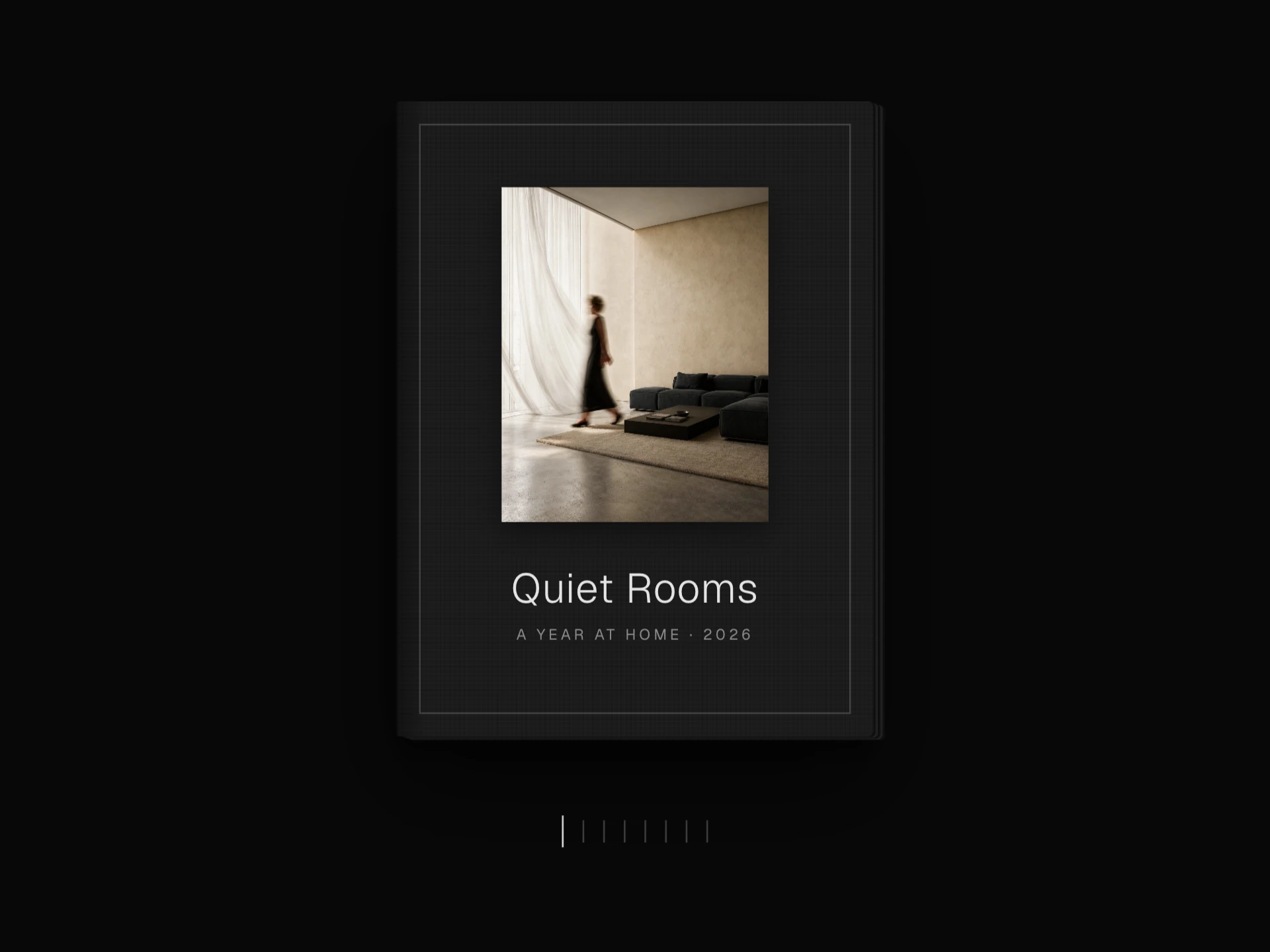
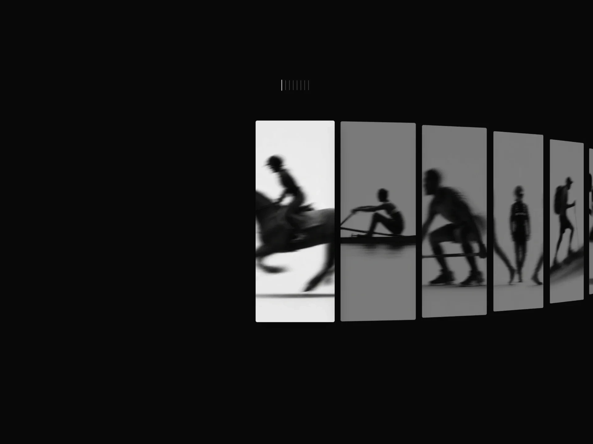
A masonry photo gallery with category tabs under a sliding hairline, photos that glide to their new columns when filtered, hover focus that dims the rest, scroll-in reveals and a captioned keyboard lightbox.
About the Masonry Photo Gallery component
Masonry Photo Gallery lays photos of mixed shapes into tidy columns, each photo dropping into the shortest column so the wall stays even. Category tabs on top filter the set, and the photos that remain glide to their new places instead of jumping.
Hovering a photo dims the others and slides in its caption, photos fade up as they scroll into view, and clicking one opens a lightbox that steps through the current filter with the arrow keys.
When to use it
Use it for a photographer's or studio's portfolio, a press or event gallery, or any collection where photos have different shapes and visitors want to narrow it down by type.
When every image shares one shape, a plain grid reads better; masonry earns its place with mixed portrait and landscape photos.
Installation
Add the Masonry Photo Gallery component to your project with the shadcn CLI. It lands in components/masonry-photo-gallery.tsx as plain React + Tailwind CSS source you own and can edit.
npx shadcn@latest add @reactframe/masonry-photo-galleryOr copy the source by hand and install its dependencies:
npm install clsx tailwind-mergeProps
<MasonryPhotoGallery /> accepts 11 props, all optional. It also accepts the usual <div> attributes, like className, style, id and aria-*, and passes them to its root element.
| Prop | Type | Default |
|---|---|---|
| photos | { src: string; alt?: string; title?: string; category?: string; ratio?: number }[] | DEFAULT_PHOTOS |
| theme | "dark" | "light" | "dark" |
| minColumnWidth Columns are as many of this width as fit, capped by maxColumns. | number | 160 |
| maxColumns | number | 4 |
| gap | number | 10 |
| borderRadius | number | 3 |
| showFilters Category tabs built from the photos' categories. | boolean | true |
| allLabel | string | "All" |
| dimOpacity Opacity of the other photos while one is hovered. | number | 0.4 |
| reveal Fade photos up as they scroll into view. | boolean | true |
| enableLightbox | boolean | true |
- photos{ src: string; alt?: string; title?: string; category?: string; ratio?: number }[]Default: DEFAULT_PHOTOS
- theme"dark" | "light"Default: "dark"
- minColumnWidth
Columns are as many of this width as fit, capped by maxColumns.
numberDefault: 160 - maxColumnsnumberDefault: 4
- gapnumberDefault: 10
- borderRadiusnumberDefault: 3
- showFilters
Category tabs built from the photos' categories.
booleanDefault: true - allLabelstringDefault: "All"
- dimOpacity
Opacity of the other photos while one is hovered.
numberDefault: 0.4 - reveal
Fade photos up as they scroll into view.
booleanDefault: true - enableLightboxbooleanDefault: true
Collections
Use-case pages that compare Masonry Photo Gallery with the other components that do a similar job.
npm dependencies
Installed for you by the shadcn CLI.
Masonry Photo Gallery FAQ
- Do I have to give every photo a ratio?
- No. Without ratio the image is measured when it loads and the layout adjusts. Giving one (width / height) avoids that small shift and lets you crop photos to a chosen shape.
- How are the columns decided?
- As many minColumnWidth-wide columns (160px by default) as fit, up to maxColumns (4). That gives two columns on most phones and four on a desktop.
- Where do the filter tabs come from?
- From each photo's category, in the order they first appear, with All in front. Turn them off with showFilters={false}.
- Can I switch off the scroll-in animation?
- Yes, reveal={false} shows every photo straight away.