Spiral Gallery React component
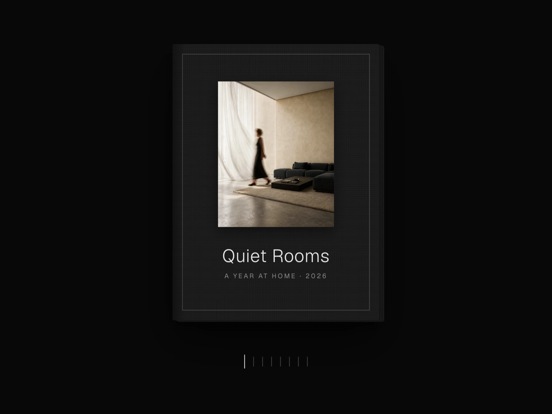
Photo cards wound around an endless 3D helix that turns and climbs with the wheel, a drag or the arrow keys, with the far strand glowing faintly through, a big index and caption, and line indicators to jump anywhere.
About the Spiral Gallery component
Spiral Gallery winds photo cards around a tall 3D helix. Scrolling, dragging or the arrow keys turn the spiral so the next card comes round to the front while the whole column climbs, and the cards on the far side stay faintly visible through the gap. The spiral has no end: it wraps around to the first card.
The current number, title and caption sit in the corner, a column of line indicators on the right jumps to any card, and tapping the front card opens it in a lightbox.
When to use it
Use it for a lookbook, a series of portraits, a studio journal or a collection page where moving through the set one piece at a time, with a name and caption for each, is the experience.
Because it takes over the wheel while the pointer is over it, give it its own section of the page, or pass wheelSensitivity={0} and let people drag or use the indicators instead.
Installation
Add the Spiral Gallery component to your project with the shadcn CLI. It lands in components/spiral-gallery.tsx as plain React + Tailwind CSS source you own and can edit.
npx shadcn@latest add @reactframe/spiral-galleryOr copy the source by hand and install its dependencies:
npm install clsx tailwind-mergeProps
<SpiralGallery /> accepts 15 props, all optional. It also accepts the usual <div> attributes, like className, style, id and aria-*, and passes them to its root element.
| Prop | Type | Default |
|---|---|---|
| photos | { src: string; alt?: string; title?: string; caption?: string }[] | DEFAULT_PHOTOS |
| theme | "dark" | "light" | "dark" |
| height | number | 620 |
| cardWidth Card size in px on wide screens; everything scales down on narrow ones. | number | 168 |
| cardHeight | number | 222 |
| radius Distance of the cards from the spiral's axis. | number | 290 |
| angleStep Turn between neighbouring cards, in degrees. | number | 36 |
| rise Climb between neighbouring cards, in px. | number | 30 |
| smoothing 0–1, how quickly the spiral catches up. | number | 0.085 |
| wheelSensitivity | number | 1 |
| autoPlay Seconds between automatic steps; 0 turns it off. | number | 0 |
| borderRadius | number | 3 |
- photos{ src: string; alt?: string; title?: string; caption?: string }[]Default: DEFAULT_PHOTOS
- theme"dark" | "light"Default: "dark"
- heightnumberDefault: 620
- cardWidth
Card size in px on wide screens; everything scales down on narrow ones.
numberDefault: 168 - cardHeightnumberDefault: 222
- radius
Distance of the cards from the spiral's axis.
numberDefault: 290 - angleStep
Turn between neighbouring cards, in degrees.
numberDefault: 36 - rise
Climb between neighbouring cards, in px.
numberDefault: 30 - smoothing
0–1, how quickly the spiral catches up.
numberDefault: 0.085 - wheelSensitivitynumberDefault: 1
- autoPlay
Seconds between automatic steps; 0 turns it off.
numberDefault: 0 - borderRadiusnumberDefault: 3
Show all 15 propsShow fewer
| showLines | boolean | true |
| showCaption | boolean | true |
| enableLightbox | boolean | true |
- showLinesbooleanDefault: true
- showCaptionbooleanDefault: true
- enableLightboxbooleanDefault: true
Collections
Use-case pages that compare Spiral Gallery with the other components that do a similar job.
npm dependencies
Installed for you by the shadcn CLI.
Spiral Gallery FAQ
- Does it stop the page from scrolling?
- While the pointer is over it the wheel turns the spiral. Pass wheelSensitivity={0} to give the wheel back to the page; dragging, the arrow keys and the line indicators still work.
- How do I make the spiral tighter or looser?
- angleStep sets how far each card turns from the last (36° by default) and rise how far it climbs (30px). Smaller values pack the cards closer together.
- Can it play on its own?
- Yes, autoPlay={4} steps to the next card every four seconds and pauses for a moment after anyone scrolls, drags or clicks.
- How many photos does it need?
- It works with any number, but about ten or more fill both strands of the spiral; with very few, the same cards appear on the front and back.