Modal React component
An accessible modal dialog with a blurred backdrop, focus trap, Escape and backdrop close, scroll lock, focus restore, 3 sizes and scale, slide-up and fade animations.
About the Modal component
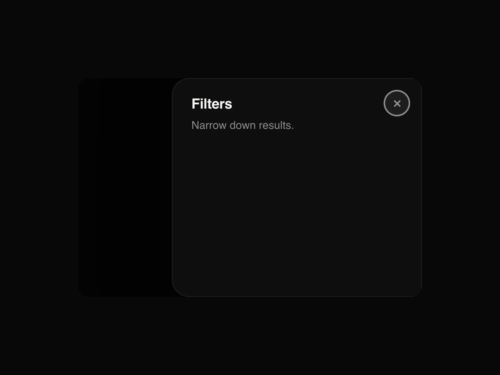
Modal is a dialog that opens over the page, dims and blurs everything behind it and keeps the focus inside until it closes. It has a title, a description, your content and an optional footer for buttons, plus a close button in the corner, and it opens with a scale, a slide up or a fade. Page scrolling is locked while it is open.
open and onOpenChange control it, or defaultOpen lets it manage itself. title, description, children and footer fill it, size picks sm, md or lg (380, 480 or 640px wide) and animation the opening motion. closeOnBackdrop and closeOnEscape decide whether a click outside or Escape closes it, showCloseButton toggles the corner button and blur the backdrop blur. It renders into document.body, or inside its nearest positioned parent with contained.
When to use it
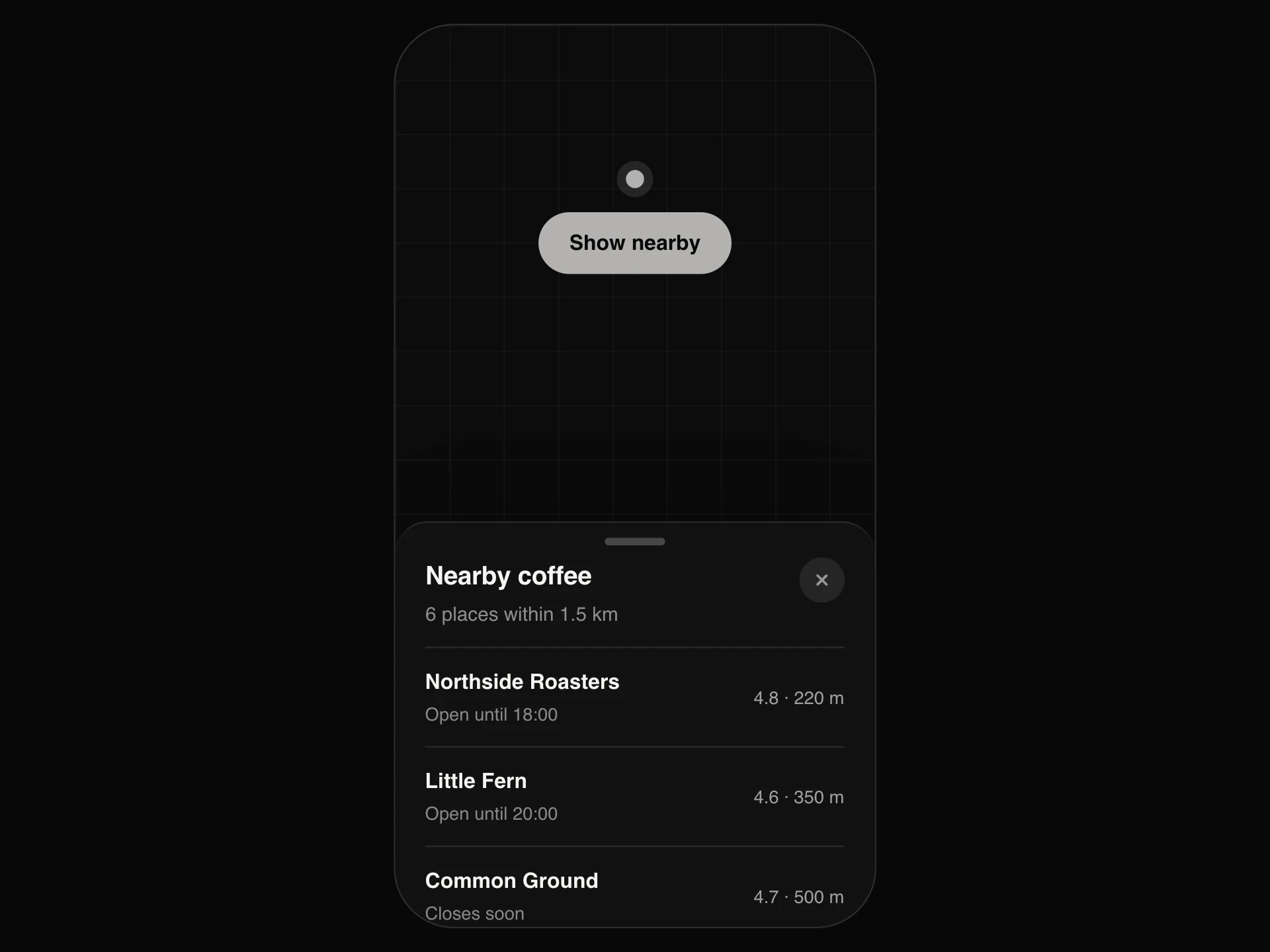
Use Modal when an action needs the visitor's full attention before they carry on: confirming a delete, editing a record, signing in. It traps focus inside the dialog, locks page scroll and returns focus to the trigger when it closes.
For secondary content people want to glance at while keeping their context, a Drawer usually fits better.
Installation
Add the Modal component to your project with the shadcn CLI. It lands in components/modal.tsx as plain React + Tailwind CSS source you own and can edit.
npx shadcn@latest add @reactframe/modalOr copy the source by hand and install its dependencies:
npm install motion clsx tailwind-mergeProps
<Modal /> accepts 16 props, all optional.
| Prop | Type | Default |
|---|---|---|
| open | boolean | — |
| defaultOpen | boolean | false |
| onOpenChange | (open: boolean) => void | — |
| title | React.ReactNode | — |
| description | React.ReactNode | — |
| children | React.ReactNode | — |
| footer | React.ReactNode | — |
| size | "sm" | "md" | "lg" | "md" |
| animation | "scale" | "slide-up" | "fade" | "scale" |
| theme | "dark" | "light" | "dark" |
| closeOnBackdrop | boolean | true |
| closeOnEscape | boolean | true |
- openboolean
- defaultOpenbooleanDefault: false
- onOpenChange(open: boolean) => void
- titleReact.ReactNode
- descriptionReact.ReactNode
- childrenReact.ReactNode
- footerReact.ReactNode
- size"sm" | "md" | "lg"Default: "md"
- animation"scale" | "slide-up" | "fade"Default: "scale"
- theme"dark" | "light"Default: "dark"
- closeOnBackdropbooleanDefault: true
- closeOnEscapebooleanDefault: true
Show all 16 propsShow fewer
| showCloseButton | boolean | true |
| blur | boolean | true |
| contained | boolean | false |
| className | string | — |
- showCloseButtonbooleanDefault: true
- blurbooleanDefault: true
- containedbooleanDefault: false
- classNamestring
npm dependencies
Installed for you by the shadcn CLI.
Modal FAQ
- Is the modal accessible?
- Yes. It renders role="dialog" with aria-modal, labels itself from title and description, traps Tab focus, closes on Escape and restores focus to the element that opened it.
- How do I stop it closing when people click outside?
- Set closeOnBackdrop={false}. closeOnEscape works the same way for the Escape key.
- Can I render it inside a container instead of over the whole page?
- Yes. Set contained and it is positioned inside its nearest positioned parent instead of being portaled to the document body.
- How do I open it from a button?
- It has no trigger of its own. Keep a boolean in state, set it to true in your button's onClick, and pass it as open with onOpenChange={setOpen} so the close button, Escape and the backdrop can close it.