Onboarding Checklist Widget React component
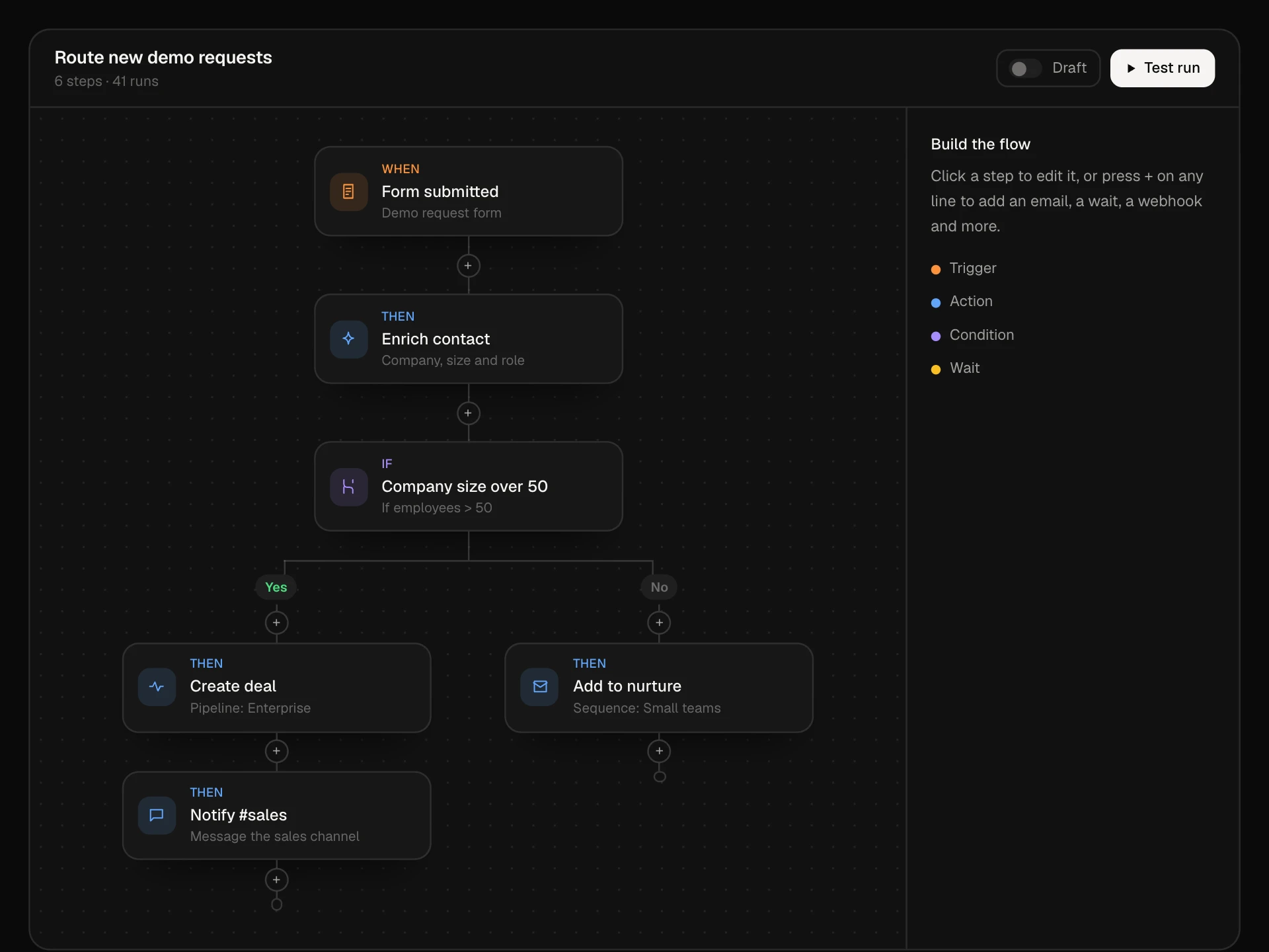
A floating setup guide for the corner of an app: a progress ring that shrinks into a pill showing the next step, steps grouped into sections with their own counts, one step open at a time with its time estimate and action button, Skip for now, a reward for finishing, confetti, and dismiss with a way back.
About the Onboarding Checklist Widget component
Onboarding Checklist Widget is a setup guide that lives in the corner of your app while people use it. A ring shows how far they are, the steps are grouped into short sections, and only the next step is open, with a one-line explanation, how long it takes and a button that does it.
Minimize it and it becomes a small pill that still shows progress and the next step. Steps can be skipped for later, finishing everything throws a little confetti and unlocks a reward, and the guide can be dismissed and brought back.
When to use it
Use it for trial and new-account onboarding in SaaS apps, admin panels and site builders.
Keep it to five to eight steps that each take a few minutes, and mark steps done from real data so it never asks for something already finished.
Installation
Add the Onboarding Checklist Widget component to your project with the shadcn CLI. It lands in components/onboarding-checklist-widget.tsx as plain React + Tailwind CSS source you own and can edit.
npx shadcn@latest add @reactframe/onboarding-checklist-widgetOr copy the source by hand and install its dependencies:
npm install motion clsx tailwind-mergeProps
<OnboardingChecklistWidget /> accepts 9 props, all optional.
| Prop | Type | Default |
|---|---|---|
| title | string | "Get started" |
| sections | { id: string; title: string; steps: OnboardingStep[] }[] | DEFAULT_SECTIONS |
| reward Shown as the reward for finishing everything. | string | "14 more days of trial" |
| onStep Run a step. Resolve when it is done; without it, steps complete after a short delay. | (id: string) => Promise<void> | void | — |
| onDismiss | () => void | — |
| defaultOpen Start open (otherwise the widget is a small pill). | boolean | true |
| showBackdrop Draw a sample dashboard behind the widget. | boolean | true |
| theme | "dark" | "light" | "dark" |
| className | string | — |
- titlestringDefault: "Get started"
- sections{ id: string; title: string; steps: OnboardingStep[] }[]Default: DEFAULT_SECTIONS
- reward
Shown as the reward for finishing everything.
stringDefault: "14 more days of trial" - onStep
Run a step. Resolve when it is done; without it, steps complete after a short delay.
(id: string) => Promise<void> | void - onDismiss() => void
- defaultOpen
Start open (otherwise the widget is a small pill).
booleanDefault: true - showBackdrop
Draw a sample dashboard behind the widget.
booleanDefault: true - theme"dark" | "light"Default: "dark"
- classNamestring
npm dependencies
Installed for you by the shadcn CLI.
Onboarding Checklist Widget FAQ
- How is this different from the Checklist component?
- The Checklist is an inline card for a page. This widget floats over your app, collapses into a progress pill, groups steps into sections and celebrates when everything is done.
- How do steps get marked as done?
- Pass done: true from your data on load. When someone presses a step's button, onStep runs; when its promise resolves, the step is checked and the next one opens.
- What does Skip for now do?
- It closes the current step and opens the next unfinished one. The skipped step stays unfinished and can be opened again from the list.
- Can I put it in my real layout?
- Yes. Set showBackdrop={false} and place the section where it can float, or lift the inner widget into a fixed-position container in your app shell.
- Is it accessible?
- The panel is a labelled region, steps are buttons with aria-expanded, progress text updates politely, the minimized pill says how many steps are done, and confetti and morphing are turned off for reduced motion.