Radio Group Cards React component
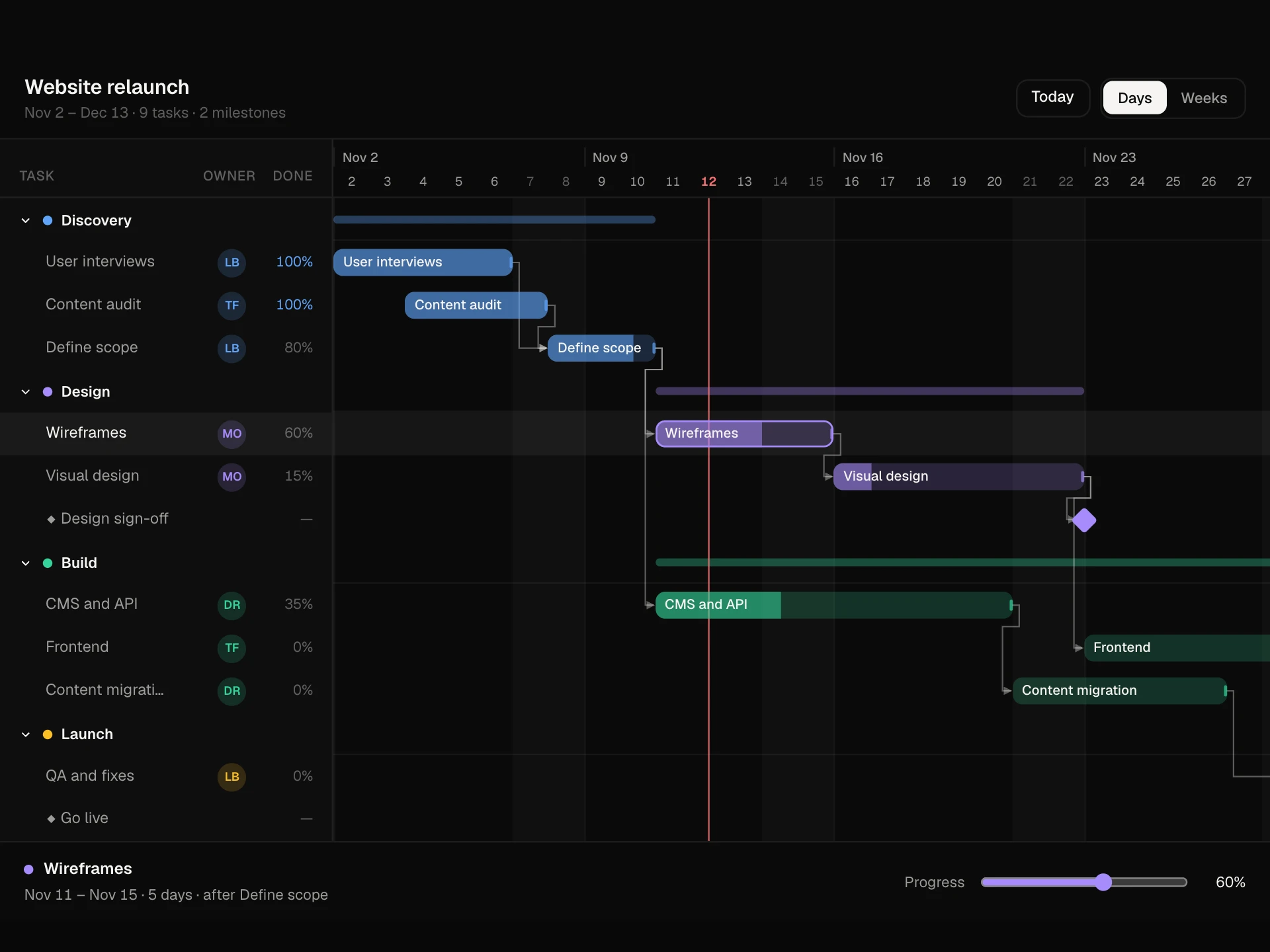
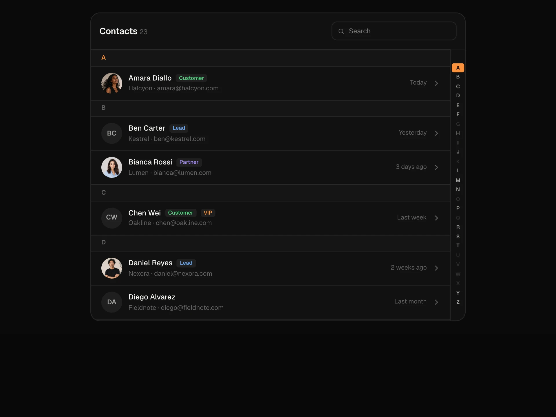
A create-resource screen built from radio card groups: plan cards with prices and features, region cards with latency bars and one at capacity, and compute size cards that lock on the free plan. A sliding selection outline moves between cards, a monthly or yearly switch reprices everything, and a summary with an animated total creates the database.
About the Radio Group Cards component
Radio Group Cards turns a set of choices into big, readable cards. This block is a full create screen for a database: pick a plan, a region and a compute size, and see the price add up as you go.
Each card is a real radio button inside a label, so clicking anywhere on it works and arrow keys move through a group. A selection outline slides from card to card, cards that can't be picked are disabled, and the summary on the right updates with an animated total.
When to use it
Use it when options need more than a word: plans with prices, regions with latency, sizes with specs, shipping speeds or delivery slots.
Keep each group to two to six cards. For longer lists, use a select or a searchable list instead.
Installation
Add the Radio Group Cards component to your project with the shadcn CLI. It lands in components/radio-group-cards.tsx as plain React + Tailwind CSS source you own and can edit.
npx shadcn@latest add @reactframe/radio-group-cardsOr copy the source by hand and install its dependencies:
npm install motion clsx tailwind-mergeProps
<RadioGroupCards /> accepts 4 props, all optional.
| Prop | Type | Default |
|---|---|---|
| defaultValue | Partial<RadioGroupCardsSelection> | — |
| onSubmit | (selection: RadioGroupCardsSelection & { monthlyTotal: number }) => Promise<void> | void | — |
| theme | "dark" | "light" | "dark" |
| className | string | — |
- defaultValuePartial<RadioGroupCardsSelection>
- onSubmit(selection: RadioGroupCardsSelection & { monthlyTotal: number }) => Promise<void> | void
- theme"dark" | "light"Default: "dark"
- classNamestring
npm dependencies
Installed for you by the shadcn CLI.
Radio Group Cards FAQ
- Are these real radio buttons?
- Yes. Each card wraps a native radio input that is visually hidden. Groups share a name, so Tab enters a group, arrow keys change the choice and disabled cards are skipped.
- How do rules between groups work?
- The demo has one rule: Starter only runs on Micro. Choosing Starter switches compute to Micro, locks the bigger sizes and shows a short note. Add your own rules in the same handler.
- How is the yearly price worked out?
- Yearly charges ten months for twelve, so monthly prices are shown at 10/12 and the summary shows the yearly amount. Change perMonth to match your pricing.
- How do I create the resource?
- Pass onSubmit. It receives the plan, region, compute, billing period and monthly total. Return a Promise to keep the Creating… state until your API answers.
- Is it accessible?
- Every group is a fieldset with a legend, cards are labels for native radios, focus shows as a ring around the whole card, the at-capacity region is disabled with a reason, and the total is announced politely when it changes.