Sales Ticket Popup React component
A corner-anchored promo popup shaped like a torn event ticket, with 5 themes, a zigzag badge stub, immediate/delay/scroll triggers, auto-hide, and dismiss-memory.
About the Sales Ticket Popup component
Sales Ticket Popup is a free promotional card styled like a torn event ticket: a large kicker, a badge stub with zigzag edges showing the offer, a short description and a full-width button, animating into a corner of the screen. It can appear immediately, after a delay or once the visitor scrolls far enough, hide itself after a while and remember that it was closed.
The content props are emoji, kicker, badgeText, description (wrap words in **double asterisks** to bold them), and buttonLabel with buttonHref or onButtonClick. The look is set by theme (dark, light, gradient, neon, outline), accent, radius, texture and maxWidth. corner, offsetX and offsetY place it. trigger with delaySeconds or scrollPercent decides when it shows, and animationStyle is slide, scale or bounce. autoHide, dismissible, rememberDismiss and dismissKey handle closing. fixed={false} renders it inline instead of pinned to the viewport.
When to use it
Use it for a site-wide sale, a launch discount, a free-shipping threshold or an early-bird event offer that should stay visible without blocking the page.
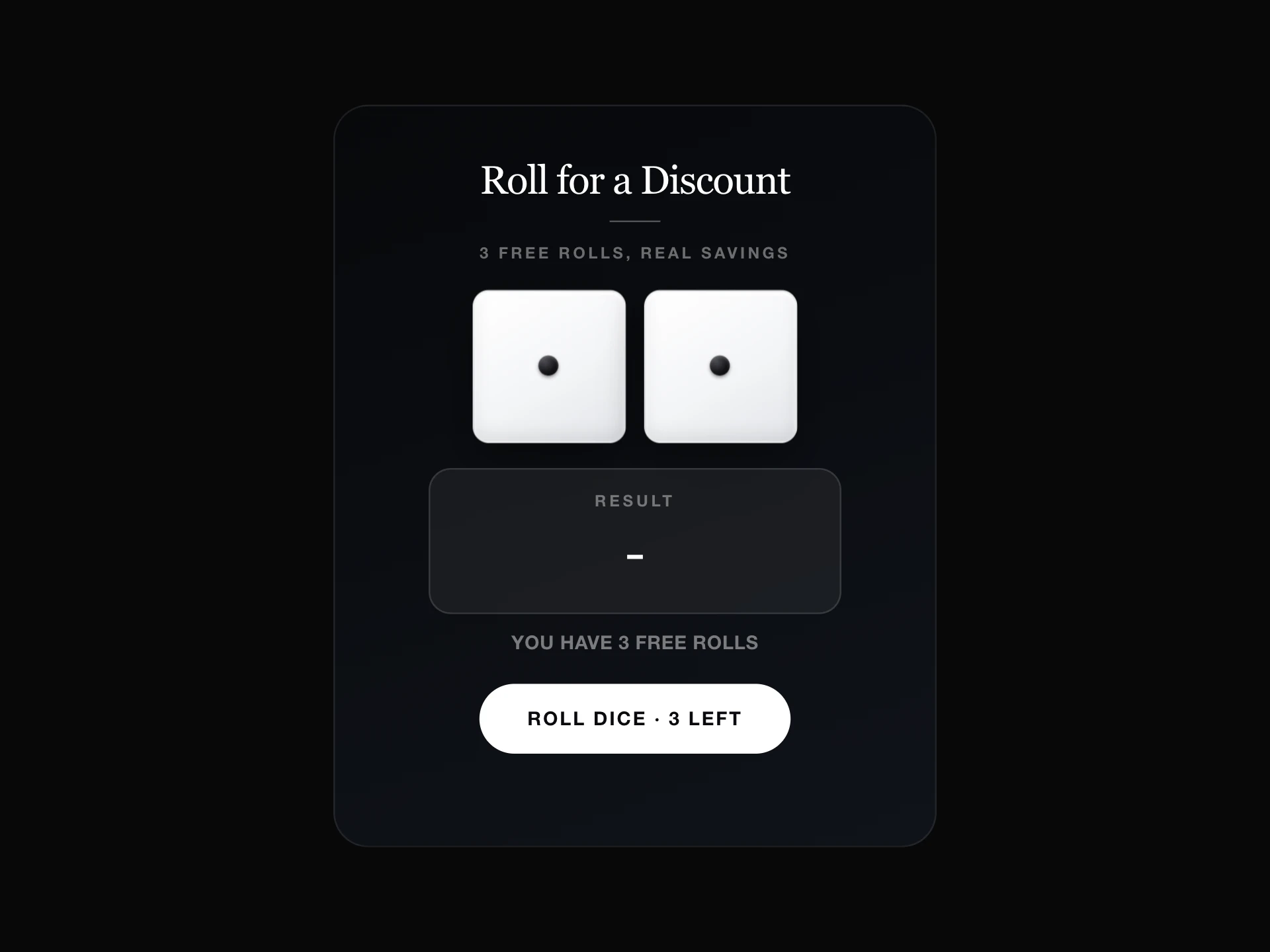
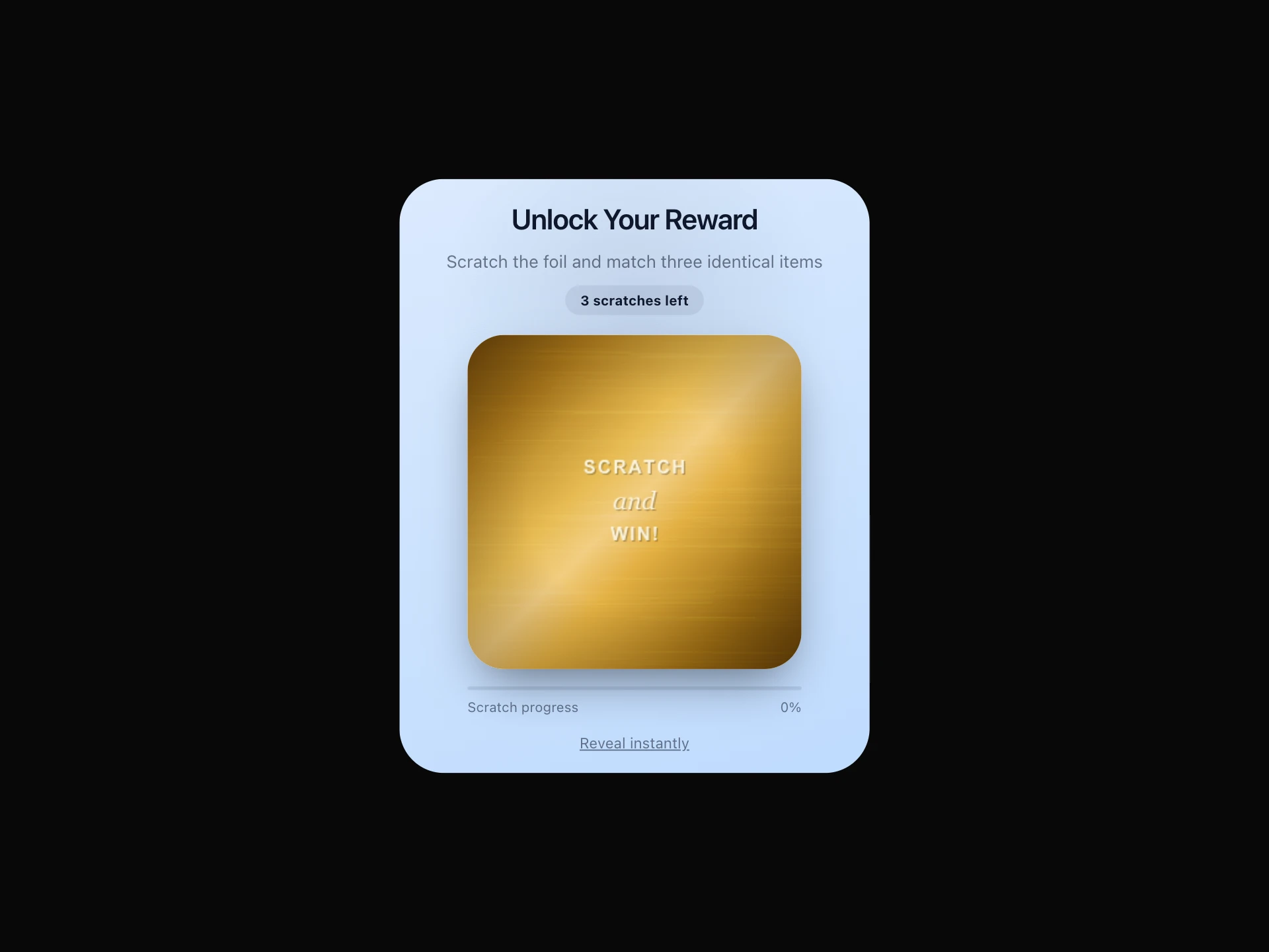
To hand out a code through a game, use Dice Discount Popup or Scratch Card Popup. For a full-width strip, use Announcement Banner.
Installation
Add the Sales Ticket Popup component to your project with the shadcn CLI. It lands in components/sales-ticket-popup.tsx as plain React + Tailwind CSS source you own and can edit.
npx shadcn@latest add @reactframe/sales-ticket-popupOr copy the source by hand and install its dependencies:
npm install motion clsx tailwind-mergeProps
<SalesTicketPopup /> accepts 27 props, all optional.
| Prop | Type | Default |
|---|---|---|
| fixed | boolean | true |
| emoji | string | "" |
| kicker | string | "SALE" |
| badgeText | string | "30% OFF" |
| description | string | "Checkout to enjoy **30% off** your order." |
| buttonLabel | string | "Buy Now" |
| buttonHref | string | "" |
| onButtonClick | () => void | — |
| onClose | () => void | — |
| theme | "dark" | "light" | "gradient" | "neon" | "outline" | "dark" |
| accent | string | "" |
| radius | number | 26 |
- fixedbooleanDefault: true
- emojistringDefault: ""
- kickerstringDefault: "SALE"
- badgeTextstringDefault: "30% OFF"
- descriptionstringDefault: "Checkout to enjoy **30% off** your order."
- buttonLabelstringDefault: "Buy Now"
- buttonHrefstringDefault: ""
- onButtonClick() => void
- onClose() => void
- theme"dark" | "light" | "gradient" | "neon" | "outline"Default: "dark"
- accentstringDefault: ""
- radiusnumberDefault: 26
Show all 27 propsShow fewer
| texture | boolean | true |
| corner | "bottom-right" | "bottom-left" | "top-right" | "top-left" | "bottom-right" |
| offsetX | number | 24 |
| offsetY | number | 24 |
| maxWidth | number | 270 |
| trigger | "immediate" | "delay" | "scroll" | "delay" |
| delaySeconds | number | 2 |
| scrollPercent | number | 50 |
| animationStyle | "slide" | "scale" | "bounce" | "slide" |
| dismissible | boolean | true |
| autoHide | boolean | false |
| autoHideSeconds | number | 8 |
| rememberDismiss | boolean | false |
| dismissKey | string | "sales-ticket-dismissed" |
| className | string | — |
- texturebooleanDefault: true
- corner"bottom-right" | "bottom-left" | "top-right" | "top-left"Default: "bottom-right"
- offsetXnumberDefault: 24
- offsetYnumberDefault: 24
- maxWidthnumberDefault: 270
- trigger"immediate" | "delay" | "scroll"Default: "delay"
- delaySecondsnumberDefault: 2
- scrollPercentnumberDefault: 50
- animationStyle"slide" | "scale" | "bounce"Default: "slide"
- dismissiblebooleanDefault: true
- autoHidebooleanDefault: false
- autoHideSecondsnumberDefault: 8
- rememberDismissbooleanDefault: false
- dismissKeystringDefault: "sales-ticket-dismissed"
- classNamestring
Kits
Sets of components designed to be used together on one site, Sales Ticket Popup included.
Collections
Use-case pages that compare Sales Ticket Popup with the other components that do a similar job.
npm dependencies
Installed for you by the shadcn CLI.
Sales Ticket Popup FAQ
- Does it apply the discount?
- No, badgeText and description are just text. Applying and validating the offer happens in your checkout. The popup only points people there.
- Where does the button go?
- onButtonClick runs first. Then, if buttonHref is set, it opens in a new tab with window.open. Leave buttonHref empty to handle navigation yourself.
- How does rememberDismiss work?
- Closing the popup, or letting it auto-hide, writes "1" to localStorage under dismissKey (default "sales-ticket-dismissed"), and later visits skip it. Use a new key for a new campaign so it shows again.
- When does the scroll trigger fire?
- Once the page has been scrolled scrollPercent percent (default 50) of its scrollable height.